Composition/Farm Shop Retail
This post includes The Elements of Composition in Art
Claremont Farm
Good Example

Who Are Claremont Farms?
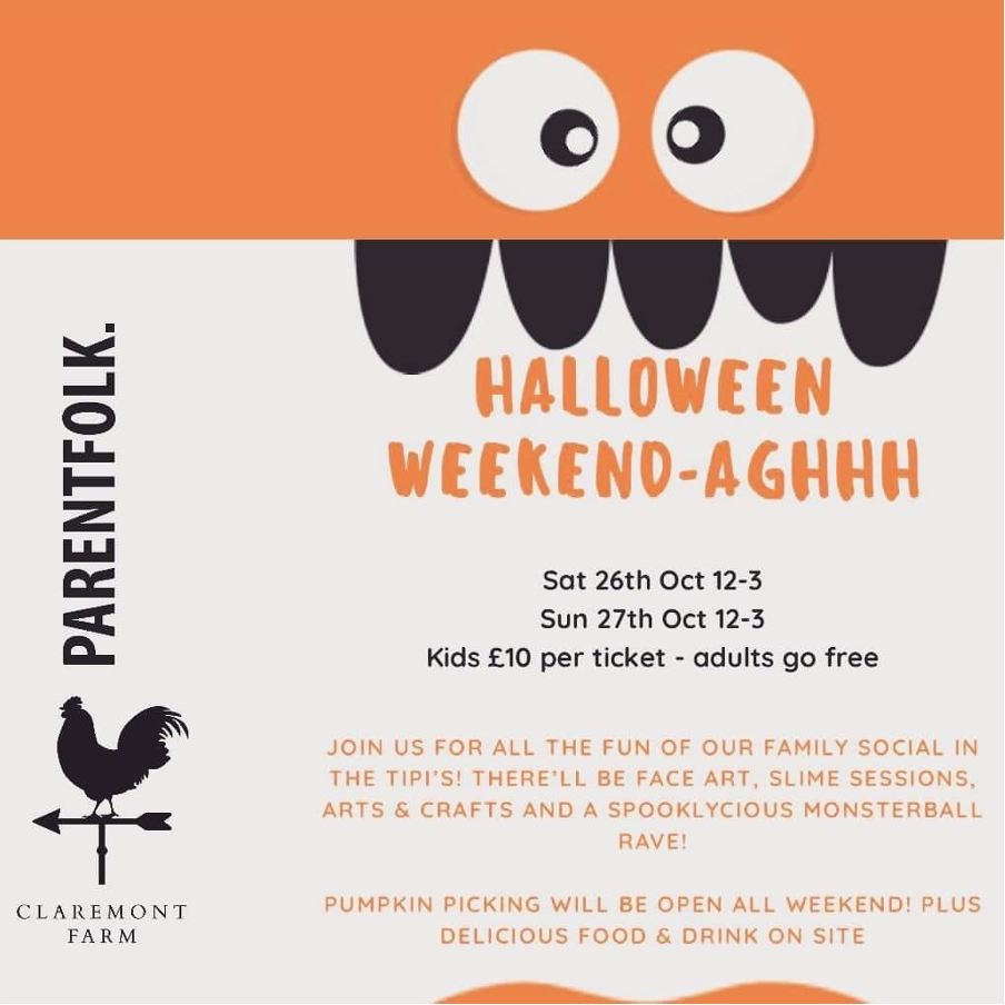
Claremont Farm is a family run business based in Bebington, a town situated on the border of Wales. The business is a café and farm shop, the business grows their own produce which they sell in the farm shop and use within the kitchens of the café. Claremont Farm support local businesses by selling their produce alongside their own. The farms sells their meat through their butchery counter, run by local butchers. The farm hosts many events which are seasonal, Figure 1 shows a leaflet for a Halloween event hosted on the farm.
The Leaflet
Figure 1 shows a themed promotional leaflet cantered around Halloween and pumpkin picking. The colours on the leaflet are meticulously thought out, they are well suited to the theme. The orange accent within the leaflet is a great use of colour, creating a link between the leaflet and pumpkins. Orange is an attractive colour, it makes it stand out to the human eye, for that reason it is commonly used on promotional leaflets. The light background and black text helps to make the leaflet pop with its high contrast. The leaflet uses a simple design which is easy to follow and makes the information clear.
Redcliffe Farm Shop
Bad Example

About Redcliffe Farm Shop
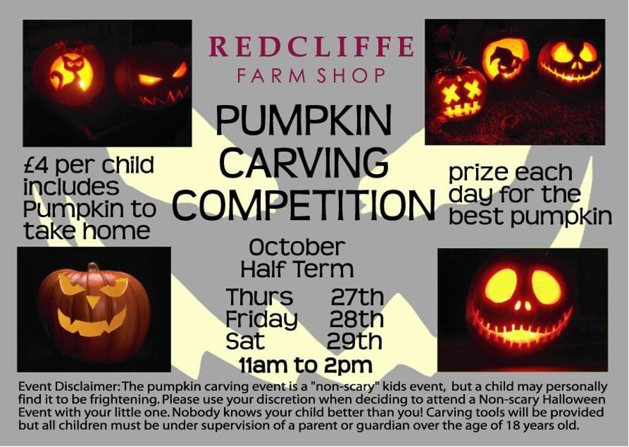
The Redcliffe Farm Shop based in Scarborough, North Yorkshire is a family run business. The farm began by selling eggs before becoming a wholesale business. They supply around the local area of Scarborough. The farm expanded from wholesale to selling fruit and vegetables along with having a butchers counter. Redcliffe Farm Shop supports small businesses by selling their produce in their shop. Along with also having a cafe, Redcliffe Farm Shop holds events such as the flyer shown in Figure 2, which is for a pumpkin carving competition.
The Leaflet
The leaflet shown in Figure 2 doesn’t make the best use of the surface area. The layout of the leaflet isn’t strategic, it is promoting something but has been restricted to where the text is positioned because of the layout. This leads to the leaflet looking messy and confusing as there is a lack of flow between text. The limited colour isn’t eye-catching compared to the Claremont Farm leaflet. This makes the leaflet not stand out due to the bland use of colours.
Redcliffe Farm Shop Redesign

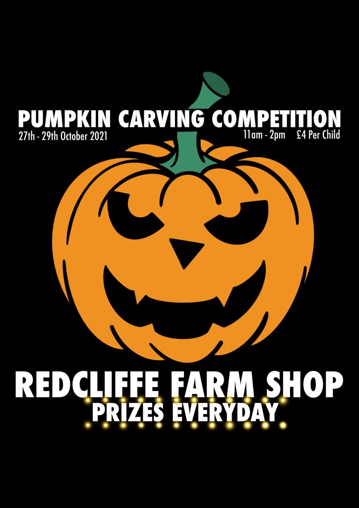
Figure 3 shows the redesign of the Redcliffe Farm Shop leaflet. The leaflet has had a complete overhaul. The design is visually clearer and better laid out. The image of the pumpkin was inspired by a promotion held on their website and used within the redesign. The background is blacked out to symbolise the night sky of Halloween night. The blacked out background also allows the colour and text to pop. Parts of the text has been bolded to make them stand out and creates a high contrast from the black background. The redesigned layout allows for the text to flow more seamlessly. By removing the images from the leaflet, it has allowed the redesign to follow a more simplistic approach. The light effect around the “Prizes Everyday” is to make the words stand out from everything else as it is a selling point of the event.
The Elements of Composition in Art
Composition in art consists of eight main elements. These are:
- Pattern
- Proportion
- Balance
- Focus
- Unity
- Rhythm
- Contrast
- Movement
Pattern
Majority of art has some form of pattern involved. A pattern is the repetition of colours, shapes, or lines. There are two main types of patterns, natural and man-made. Natural patterns are found within nature, examples of these include lines on a leaf or stripes on a tiger. Sometimes these natural patterns have some symmetry to them, but this isn’t always the case. Man-made patterns are an art form created by humans. These are primarily used for decorative purposes and are often composed of colours, shapes, and lines. Humans find patterns attractive as they are used everywhere throughout the environment around us.
Rhythm
The rhythm within art relates to patterns. Each pattern holds a rhythm and is used to create a sense of harmony. This can be portrayed as colour, shapes, or texture and it is the relationship between those that creates the rhythm.
Proportion
Proportion is used in many aspects. In art, the meaning of proportion is the relationship between height, length, and width. A great example of proportion would be a portrait. For a portrait to look lifelike, each element of the face must be correctly proportioned. Each element of the face must algin with each other, to make the piece lifelike. Each face is different, so the proportions are also different. If the proportions of a portrait are not quite right, the image will look like a face, but it won’t look lifelike, and something will feel wrong about the portrait.
Balance
Balance like proportion refers to the weight and volume of each element. Types of balance include symmetrical and asymmetrical.
Focus
Within every piece of art, there is a focal point. This is the element of the artwork where the most focus is drawn to. The focal point is what attracts an audience to the piece. For example, a monochrome piece of art with a dash of red, the dash of red would be the focus point of the piece.
Unity
The definition of unity is the state of being joined. This true within people, animals, and elements within art. The meaning in art is the same. The unity is the joining of elements to create a piece and it all to come together as one. All elements can work together for the piece to be more appealing.
Contrast
The contrast of art is mainly covered within the Principles of Colour. Contrast is when two colours from opposite ends of the colour wheel are sat side by side. For example, black and white. This is the most commonly seen contrast. Contrast can be used to help accentuate the focal point of piece to help it stand out from the background and surrounding elements.
Movement
Movement within art refers to the change in style. Architecture is a good example, their movement in styles appear more drastic. Movements are in relation to different eras, world events and periods of time. Movement happens over several years; however, older and traditional art is still desired.
References
Crowdspring. 2017. 4 Psychology-Based Design Tips For Eye-Catching Packaging Design. [ONLINE] Available at: https://www.crowdspring.com/blog/packaging-design-tips-psychology/. [Accessed 1 November 2021].
Figure 1. Facebook. 2019. Claremont Farm. [ONLINE] Available at: https://www.facebook.com/ClaremontFarm/photos/a.168966009809686/2677575885615340/?type=3. [Accessed 1 November 2021].
Figure 2. Facebook. 2011. Redcliffe Farm. [ONLINE] Available at: https://www.facebook.com/RedcliffeFarmShop/photos/a.133234463408094/222453354486204/?type=3. [Accessed 1 November 2021].
The National Gallery. n.d. Glossary. [ONLINE] Available at: https://www.nationalgallery.org.uk/paintings/glossary/composition. [Accessed 1 November 2021].
Redcliffe Farm Shop. n.d. About. [ONLINE] Available at: https://www.redcliffefarmshop.co.uk/about. [Accessed 1 November 2021].
TextielMuseum. 2020. Black & White | Symbolic Meaning in Art & Design. [ONLINE] Available at: https://textielmuseum.nl/en/tentoonstellingen/black-white/. [Accessed 1 November 2021].
Verywell Mind. 2021. The Color Psychology of Orange. [ONLINE] Available at: https://www.verywellmind.com/the-color-psychology-of-orange-2795818. [Accessed 1 November 2021].
Thoughtco.. 2019. The 8 Elements of Composition in Art. [ONLINE] Available at: https://www.thoughtco.com/elements-of-composition-in-art-2577514. [Accessed 1 November 2021].
BBC Bitesize. N.d. Pattern. [ONLINE] Available at: https://www.bbc.co.uk/bitesize/guides/z3c4jty/revision/1. [Accessed 1 November 2021].
BBC Bitesize. N.d. Proportion. [ONLINE] Available at: https://www.bbc.co.uk/bitesize/guides/zxpnb82/revision/1. [Accessed 1 November 2021].
Boundless.com. n.d. Definition of focus in Art History. [ONLINE] Available at: http://kolibri.teacherinabox.org.au/modules/en-boundless/www.boundless.com/art-history/definition/focus/index.html. [Accessed 1 November 2021].
Resoundsound. 2018. Why Focus is So Important for an Artist (and how to improve it). [ONLINE] Available at: https://resoundsound.com/why-focus-is-important/. [Accessed 1 November 2021].
Artist Network. N.d. Let’s Talk About the Focal Point in Art. [ONLINE] Available at: https://www.artistsnetwork.com/art-techniques/lets-talk-about-the-focal-point-in-art-part-1/. [Accessed 1 November 2021].
BBC Bitesize. N.d. Unity. [ONLINE] Available at: https://www.bbc.co.uk/bitesize/guides/zy4mmnb/revision/1. [Accessed 1 November 2021].
BBC Bitesize. 2018. Rhythm. [ONLINE] Available at: https://www.bbc.co.uk/bitesize/guides/zpht6fr/revision/1. [Accessed 1 November 2021].
Dictionary.com. n.d. Unity Definition & Meaning. [ONLINE] Available at: https://www.dictionary.com/browse/unity. [Accessed 1 November 2021].
Neuberger Museum of Art. N.d. Rhythm. [ONLINE] Available at: https://www.purchase.edu/live/files/3445-activity-principles-of-art-rhythm. [Accessed 1 November 2021].
Etchr Lab. 2020. The Power of Contrast in Art. [ONLINE] Available at: https://etchrlab.com/blogs/news/the-power-of-contrast-in-art. [Accessed 1 November 2021].
Artland. N.d. The Most Famous Art Movements and Styles. [ONLINE] Available at: https://magazine.artland.com/art-movements-and-styles/. [Accessed 1 November 2021].
The Visual Instructor. 2018. Movement – A Principle of Art. [ONLINE] Available at: https://thevirtualinstructor.com/blog/movement-a-principle-of-art. [Accessed 1 November 2021].
