TYPOGRAPHY 1: Exploring Type as Image & Working with Type in Adobe Illustrator.
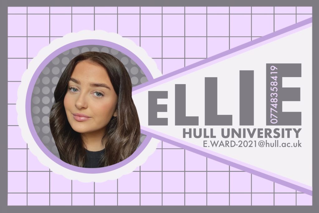
Personal Calling Card

Figure 1 is a personal calling card. the card was heavily inspired by Frans Ferdinand and his album cover, You Could Have It So Much Better. His album cover displays a great example of Constructivism in art which was replicated in the personal calling card. The font used through out the piece is Futura, there is two styles, bold and medium. Due to the colour palette being light/pastel, the more important text was capitalised and in bold to stand out from the rest of the work. The shade of grey was used for the text as it was the best contrast colour in the palette (taken from Colour Hunt).
Cottingham Springboard Poster

Figure 2 displays a promotional poster for the Cottingham Springboard Festival for 2022. The poster contains three colours Black, White and Red. This allows the text on the poster to stand out as there is a clear contrast between all three.
The fonts used are as follows:
- Galvji
- Hoefler Text
- DIN Alternate
- Kohinoor Bangla
- Noto Sans Myanmar
- Noteworthy
- Courier New
- Chalkboard SE
References
Figure 1:
colour Hunt. 2021. Color hunt. [ONLINE] Available at: https://colorhunt.co/palette/f3f1f5f0d9ffbfa2db7f7c82. [Accessed 11 January 2022].
Band Logo Juke Box. Unknown. F2 — Franz Ferdinand. [ONLINE] Available at: https://www.bandlogojukebox.com/blog/2020/5/20/f2-franz-ferdinand. [Accessed 11 January 2022].
Figure 2:
Cottingham Springboard. 2021. COTTINGHAM SPRINGBOARD FREE LIVE MUSIC FESTIVAL 2022. [ONLINE] Available at: http://cottinghamspringboard.com. [Accessed 11 January 2022].
