TYPOGRAPHY 2: Deconstruction and Illegibility.
Personal Typeface

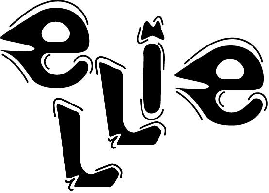
Figure 1 shows an original typeface design, the intention was to have a futuristic theme whilst also having a street font look to it. The letters have been distorted and reshaped and lines were added in particular places on each letter. This was created using Adobe Illustrator on iPad.
ASFF 2022 Cover

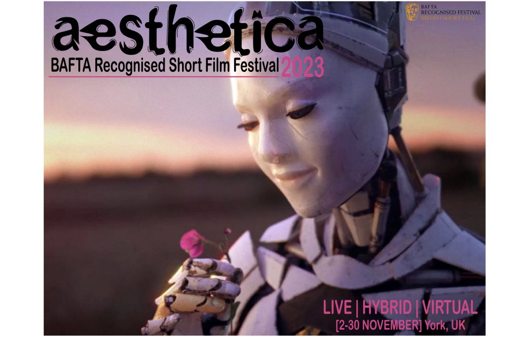
Figure 2 is a design for a ASFF 2022 cover. The background image is a screenshot taken directly from a previous short film. This image was chosen to add to the futuristic theme of the personal typeface. The personal typeface was used for the cover for the main title, it was made black and bold in order to stand out and to make it clear to the viewer. The remaining text on the piece is Arial Rounded MT Bold Regular. The pink text is a direct colour match to the flower held by the figure in the image. This cover was heavily inspired by a previous Aesthetica cover (in references).
Exit Velocity.22 Post Card

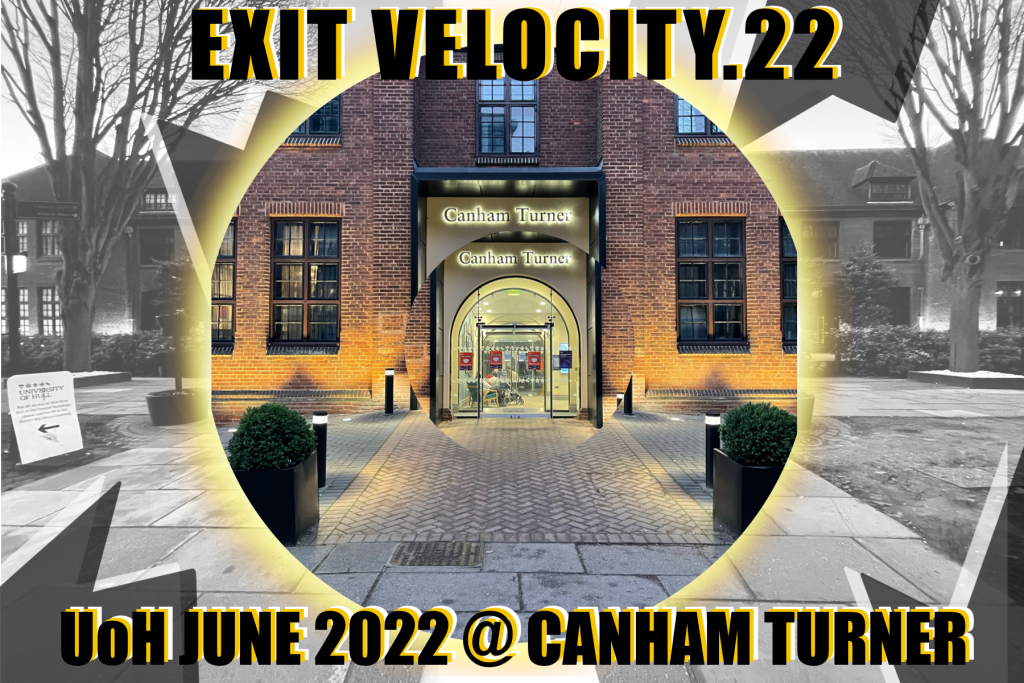
Figure 3 is a design for the promotion of the Graphic Design course at Hull University. There was an effort to portray Deconstruction in the postcard by adding in shapes and cutting out the images. The images within the piece are of the Canham Turner building on the University of Hull’s campus. The centre image is in colour whilst the background is in black and white, this is to allow the image of the building to stand out. Surrounding the middle image, an illuminance brush on Adobe Photoshop has been used to create an allusion that the back of the image is lit up. The font used is ‘Impact’, this was used to make the text clear, along with the offset of the orange and white text.
Figure 2:
- Gravity Media. 2021. GRAVITY HOUSE EXHIBITS AT AESTHETICA SHORT FILM FESTIVAL 2021. [ONLINE] Available at: https://www.gravitymedia.com/news-and-blogs/2021/gravity-house-
- Iris Prize. 2021. Festival. [ONLINE] Available at: https://irisprize.org/lgbt-film-festival/. [Accessed 12 January 2022].
