Dev Blog 4: Multi Channel Customer Experience
Using a subscription or membership form of marketing is good practice for any brand. This function allows the brand to tailor their content towards particular users, making it feel personalised to them. It will enable them to deliver promotions, discount offers and updates digitally. It also encourages users to revisit the website.
This task aimed to create a subscription popup using Mailchimp and Royal Addons. Mailchimp is a marketing platform that allows me to manage and engage with customers who subscribe to my blog’s newsletter, and Royal Addons is an extension that makes the popup happen.
Step One
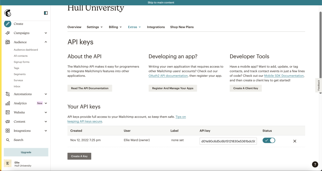
The initial step was to create a Mailchimp account; I selected API Keys from the dashboard to create one. Doing this allows me to view my application data and see the users who have subbed to my newsletter.
Step Two
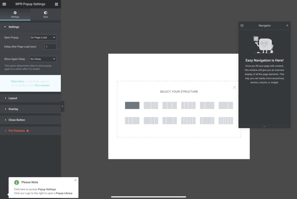
After completing what I needed with Mailchimp, I headed back to my WordPress site and installed the Royal Addons plugin. From there, I created a post to edit using Elementor.
Step Three
Once a post was created, I selected the single column, which will be the base of the popup.
Step Four
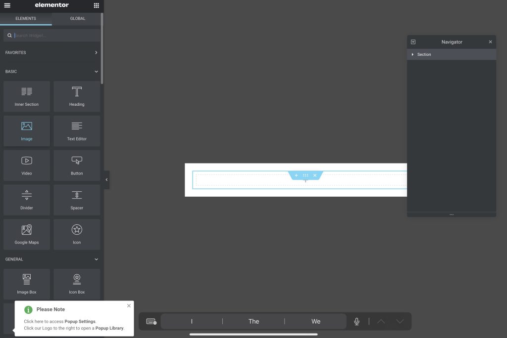
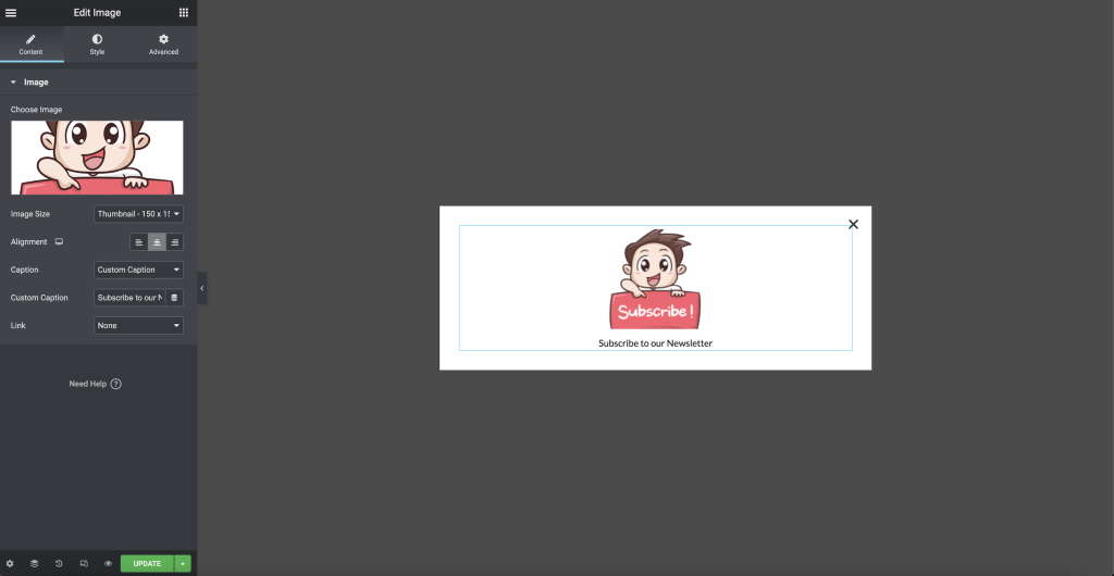
The fourth step was to insert an image widget to insert the image provided.
Step Five
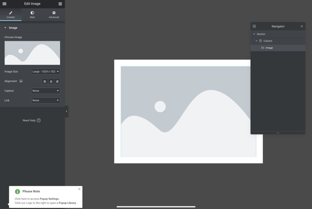
Following the previous step, I inserted the image, adjusted its size to a thumbnail, and altered the caption.
Step Six
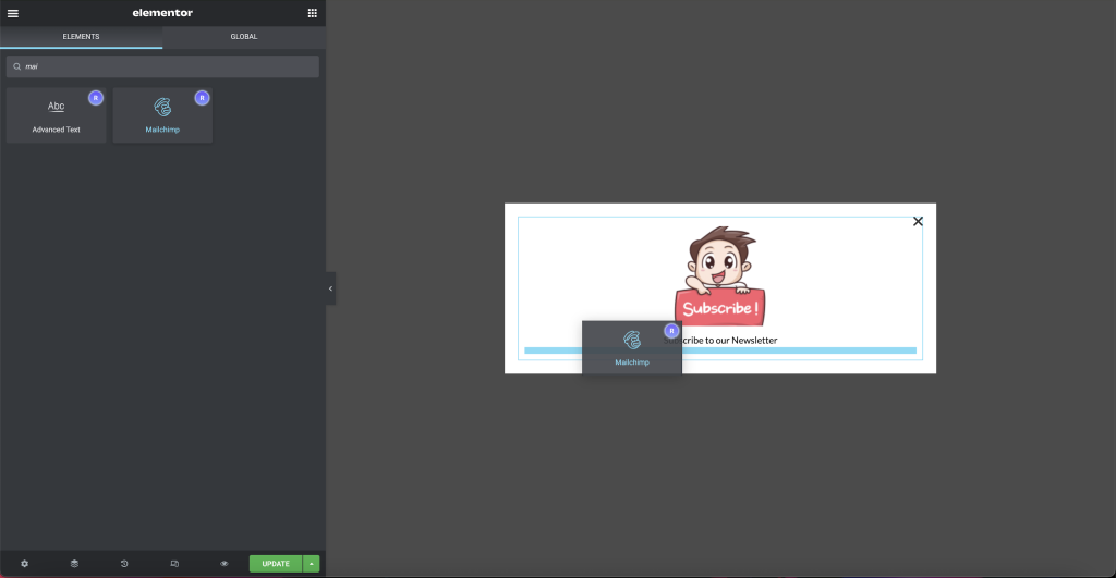
Here I inserted the Mailchimp widget below the image, allowing the subscribe feature to appear.
Step Seven
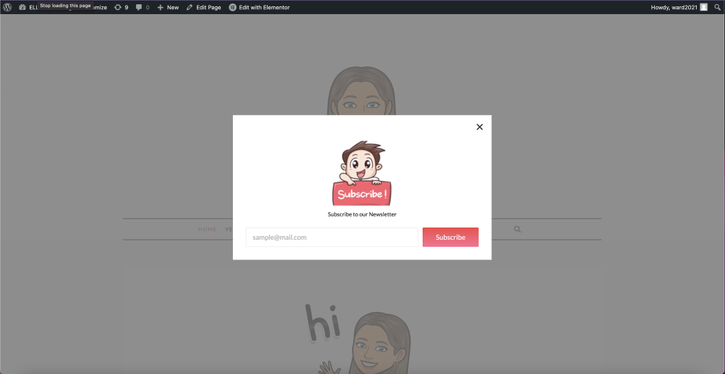
Once I had added the Mailchimp widget, the popup feature was complete. I then set it to go live and tested it to ensure it worked. Below is a preview of the finished product.
Further Exploration
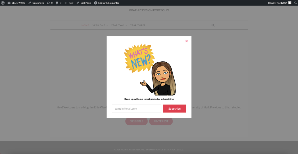
Beyond the test, I took the pop-up I had made and personalised it to my blog. I used the same imagery I use across my site to maintain consistency. I searched through Bitmoji to find the most appropriate image for the subject. I then altered the colours again to keep the character flowing. I changed the caption as the old one didn’t fit my intentions.
References
- https://kinsta.com/blog/how-to-use-mailchimp/

