Dev Blog 5: Greeting Cards
As a group, the task was to think/create a concept to develop an onboarding for a business. The business specialises in providing a niche range of greeting cards to be sold online.
The class was given a list of steps to take to complete the task. The list is as follows:
- thought shower a concept – 10 mins
- decide on one that seems to have legs – 3 mins
- agree on your target audience 2 mins
- work individually on a draft of the onboarding sequence sketch books only – quantity not quality – 45 mins
- compile the best ideas into one idea – work together on this 30 minutes ( you will need to come up with a way of combining ideas visually)
- chose a spokesperson to present your work to the class
My group
Due to being unable to attend the class when the task was given, I joined Rana, who was also absent, and we formed a group. Although we didn’t participate, we still adhered to the time scale that the class was given. We both understood the importance of creating a design which engages the customer.
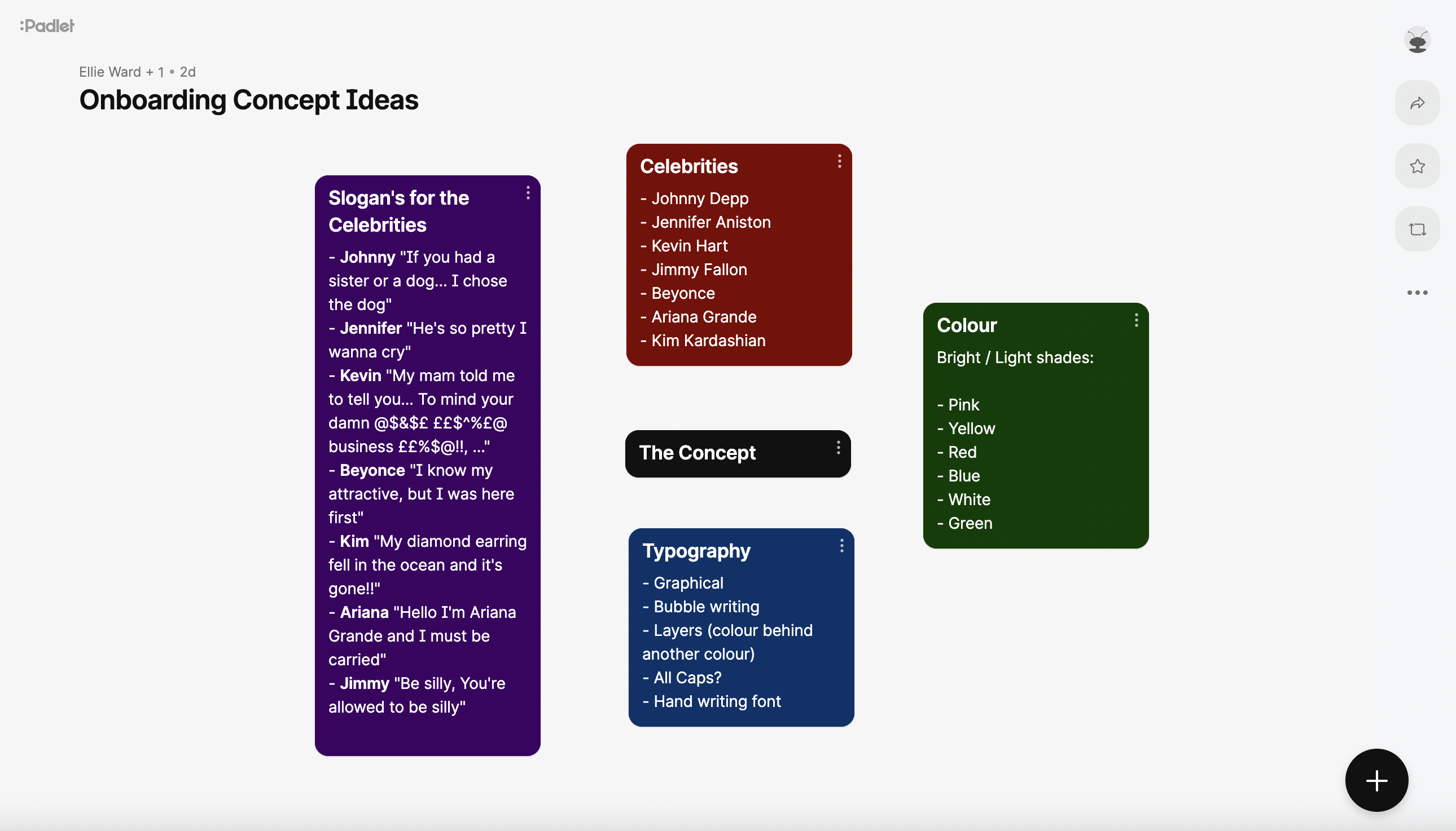
As we couldn’t be there to create a physical mind map, I set up a Padlet where we would both add our ideas for a concept whilst also being on a video call, discussing ideas simultaneously.
Our Concept
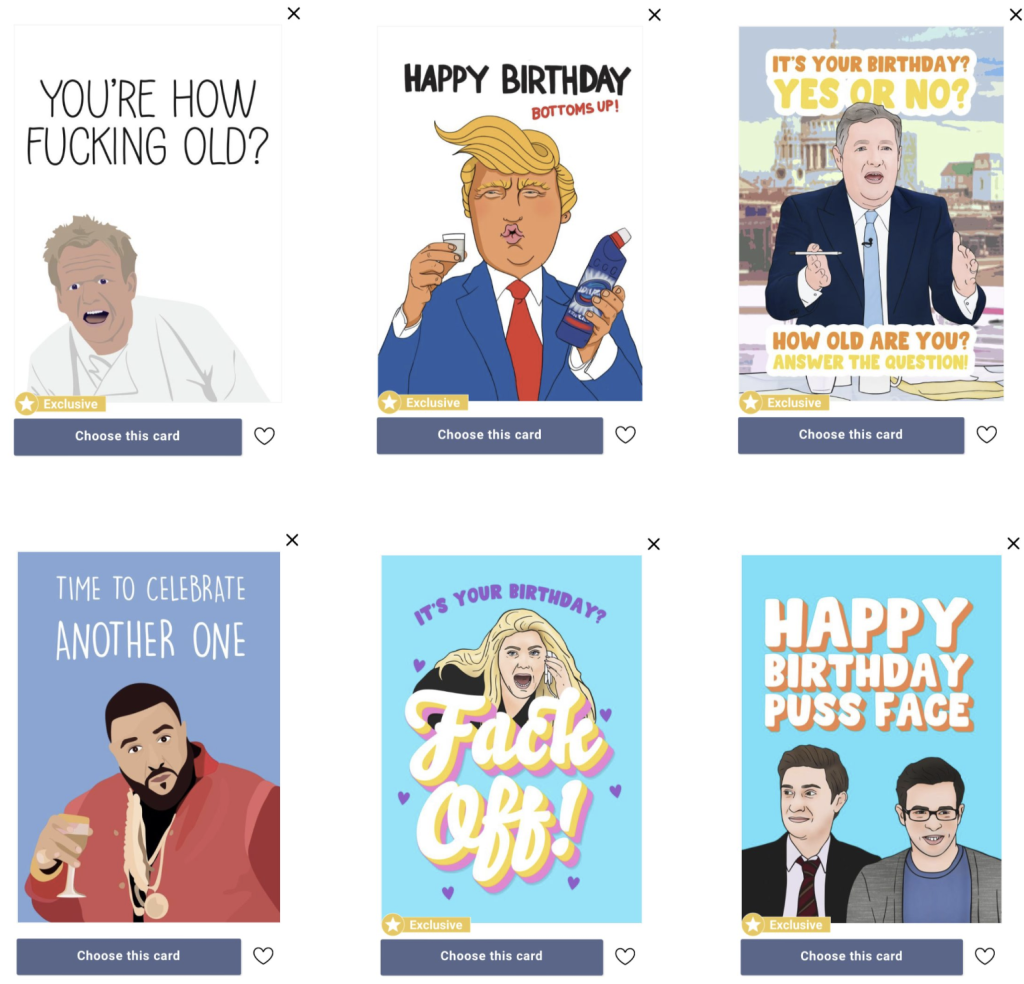
After we gained plenty of ideas, we chose our final concept for the project. The genre of greeting cards would be based on celebrities with famous catchphrases and text using their personalities.
The target audience would be 18, and over due to the adult/dark humour the cards would have.
Research
Now that we have decided on a concept and a target audience, I scoured the internet to find examples of the type of cards the business would sell. This would help us in the project when we design our onboarding sequence. Although these aren’t examples of an onboarding sequence, they gave Rana and me a greater understanding of the type of business were are aiming to create onboarding for.
Logo designs
Before we began the onboarding designs, we had to name the business and produce a quick logo. Simple sketches of logo ideas were sent through discord, and we combined our ideas. I then decided to design the chosen logo officially, as seen in figure 3.

Why we designed the logo the way we did
The colours used in the logo were meticulously thought out. The primary colour used was bright yellow, as, according to Picmonkey, yellow is associated with humour. Humour is the energy we aim for in the concept we create, which is why this colour was chosen.
The typography was black, as it is the darkest shade of colour. This would represent the dark humour in the contents of the greeting cards.
Onboarding Sketches
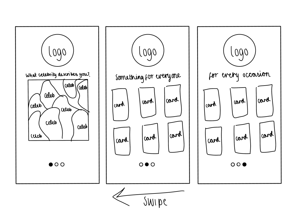
Once we understood everything surrounding the concept, we individually spent roughly 30 minutes creating many onboarding designs. The design I was most happy with being potential is below in figure 4.
My designs were created on a digital sketchbook using my iPad instead of a paper sketchbook. This was accessible to me when doing the task and made it easier to send some of the designs to Rana to get her opinions.
Onboarding design
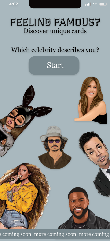
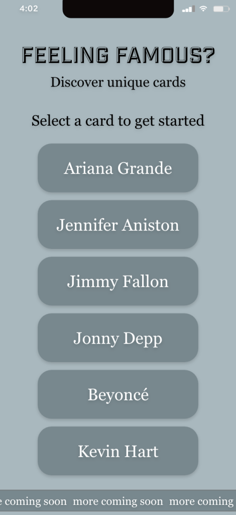
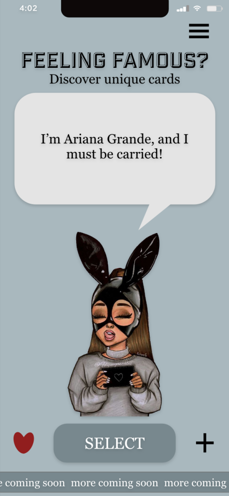
Expanding on the sketches and prototypes we both produced, we used a design of mine that Rana liked and a design of Rana’s that I liked and combined them. This created our final design of the onboarding sequence for the business.
When making the final onboarding sequence, our logo didn’t fit the design when we built the final product, so we dismissed it.
What was achieved as a group overall
Regardless of the circumstances, with Rana and I unable to attend the class, I firmly believe we worked well together. We both had equal positions in the group as we were only a pair. This benefitted us both as it was much easier to communicate just between the two of us. We both listened to each other’s ideas and considered them when doing all the designs.
If I were to change anything about the group dynamic, I would’ve preferred to have done this task face to face, as communication would’ve been much quicker. At some points in the task, we were both waiting for the other to respond, which slowed down our progress.
References
- Picmonkey. 2021. Color Meanings: A Guide to Choosing Color Based on Symbolism. [ONLINE] Available at: https://www.picmonkey.com/blog/color-meanings-design-guide. [Accessed 18 October 2022].
- Thortful. 2022. Funny Birthday Cards. [ONLINE] Available at: https://www.thortful.com/card/5bd498cac5b4fb06fa5bd72b. [Accessed 18 October 2022].
- Thortful. 2022. Funny Birthday Cards. [ONLINE] Available at: https://www.thortful.com/card/5b888c43b093d76e08f25fc5. [Accessed 18 October 2022].
- Thortful. 2022. Funny Birthday Cards. [ONLINE] Available at: https://www.thortful.com/card/5eb0a303a55f9d0001c3049b. [Accessed 18 October 2022].
- Thortful. 2022. Funny Birthday Cards. [ONLINE] Available at: https://www.thortful.com/card/5ec12bf4277ce500015bd587. [Accessed 18 October 2022].
- Thortful. 2022. Funny Birthday Cards. [ONLINE] Available at: https://www.thortful.com/card/5efdf4e8f99709000131b912. [Accessed 18 October 2022].
- Thortful. 2022. Funny Birthday Cards. [ONLINE] Available at: https://www.thortful.com/card/59d6116ce4b08d0d933040e2. [Accessed 18 October 2022].

2 thoughts on “Dev Blog 5: Greeting Cards”
Comments are closed.