EX2: Web and graphic design using the Elementor Plugin for WordPress
Exploring Elementor
The first task of the exercise was to explore Elementor. By doing this, it allows time to test widgets and settings that WordPress don’t offer as a standard before designing the campaign website. It was essential to understand the software entirely to enhance the final design.
Global Colours
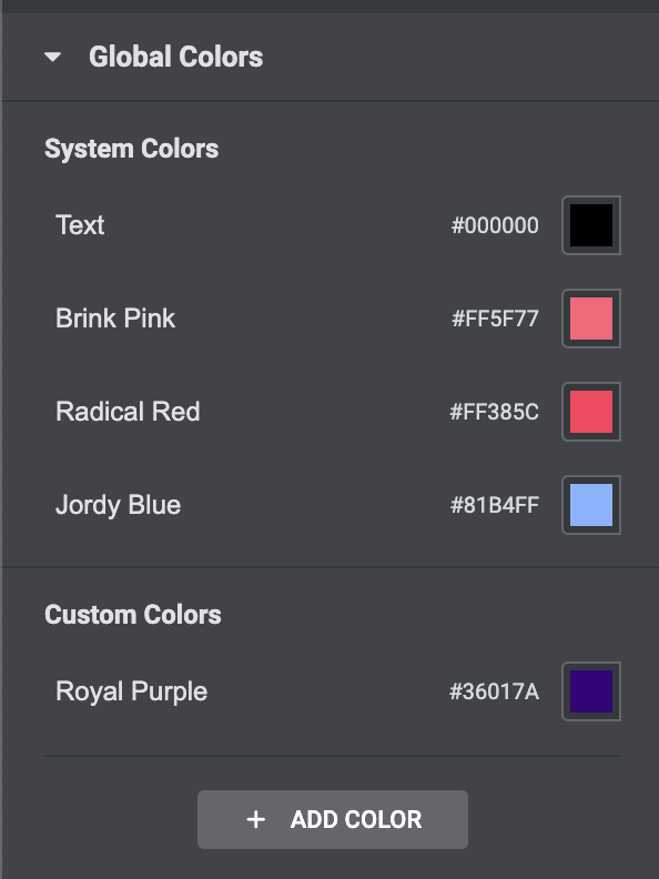
The initial step to exploring Elementor was to adjust the site settings. From my mood board, I altered the global colours to fit the theme of my campaign. By doing so, it would mean the entirety of my site would conform to a set colour scheme, thus avoiding mistakes and inconsistencies in the design.
Typography
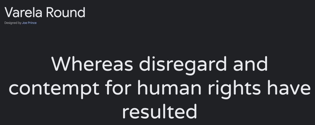
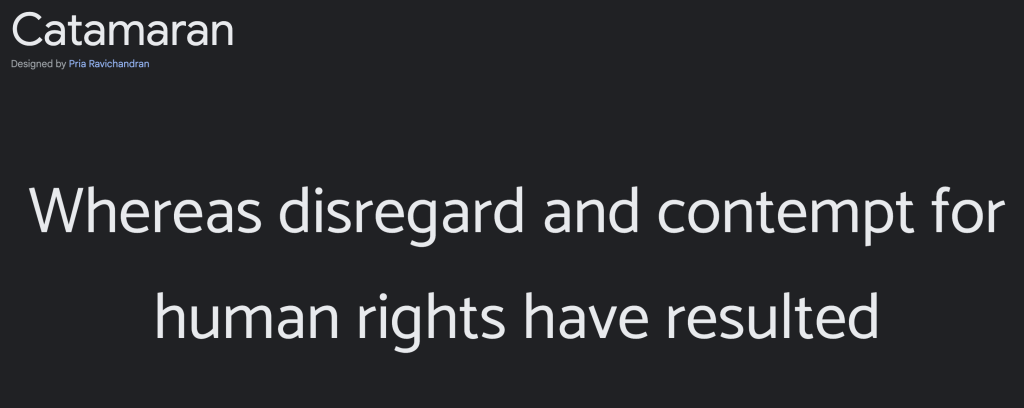
I took to google fonts to find an appropriate font I felt would fit the theme of my campaign. Since the meaning behind my campaign sits heavy, I prefer a rounded style font in an attempt to soften some of the intense content.
I opted for the Verela Round font and set this as my global font. As stated above, this will promote consistency in the design.
Exploring Elements
Inserting an image
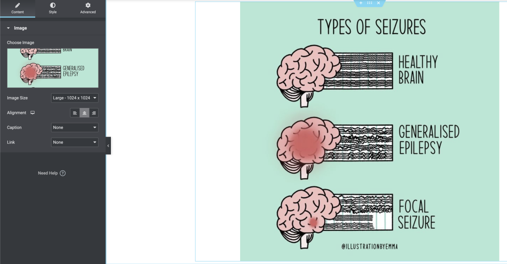
The image widget was the first element I explored on Elementor. I uploaded a picture that was already on my media files and experimented with the settings. These settings are much more complex in comparison to what WordPress offer as standard. It is particularly useful having the advanced setting, custom css as this allows the designer to completely customise this element. This advanced setting is available on all of the Elementor widgets.
Creating a carousel
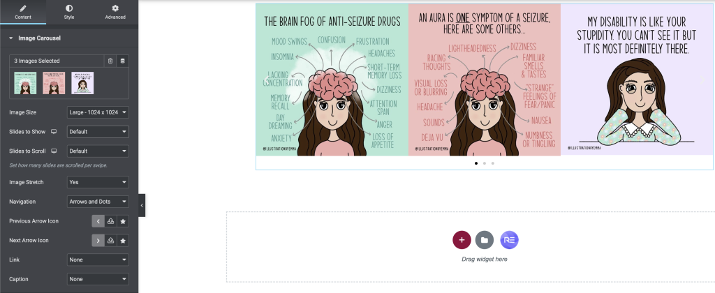
Following on from the image widget, I next discovered the carousel. The settings are extensive, allowing the designer to customise it to their preference. They have the option to adjust the workings of the carousel along with its appearance. It can range from the sizes of the images, to the speed at which they rotate.
This tool would fit perfectly in portfolio designs as it could be used to display creative work, such as art and photography. When redesigning my blog, this is a feature I will heavily consider taking advantage of.
Advanced Slider
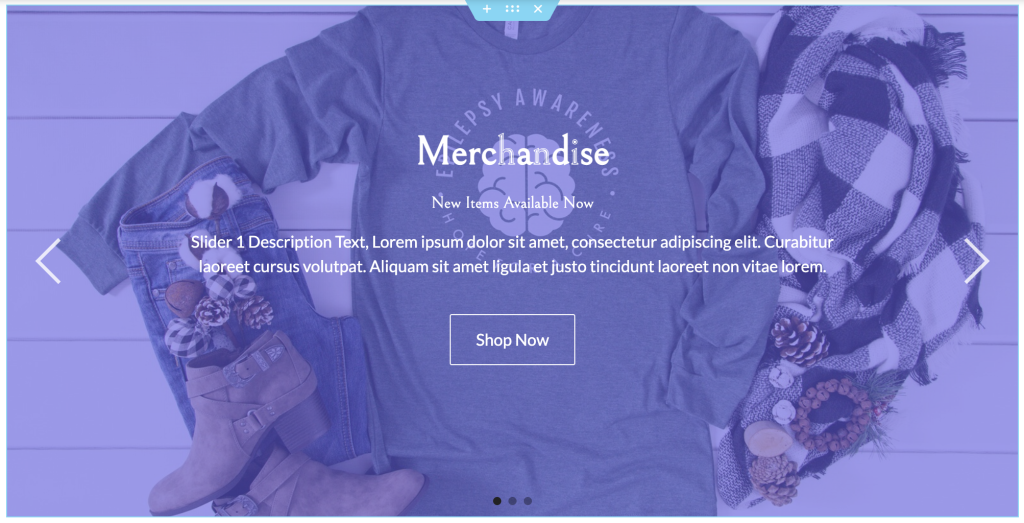
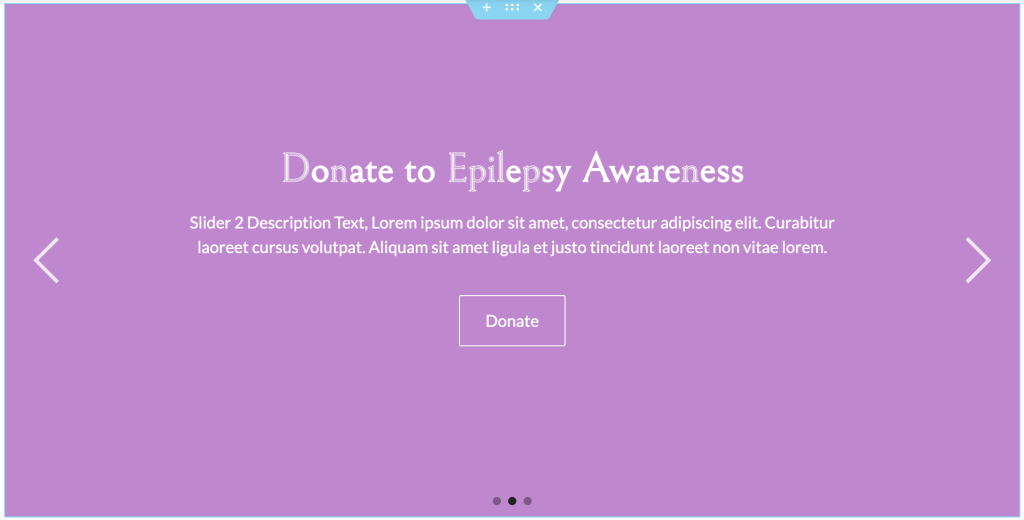
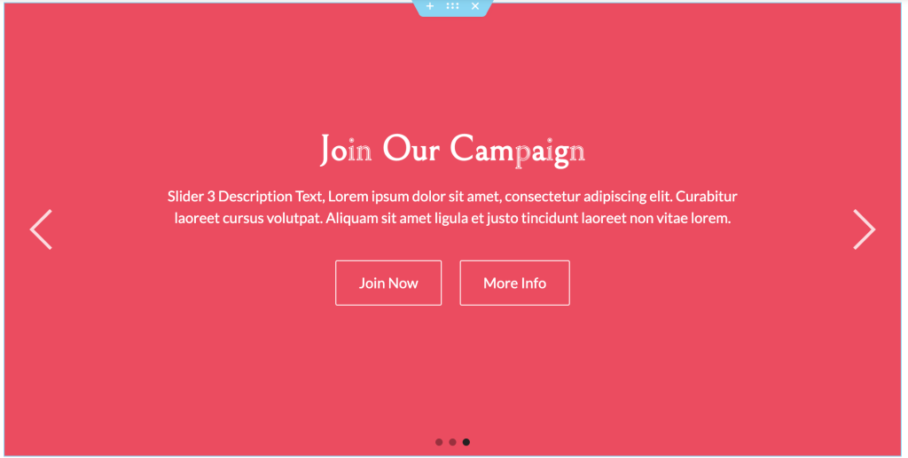
The advanced slider widget is available through Royal Addons. This widget works similarly to the carousel, with the images constantly rotating. The slider allows the designer to insert buttons with any choice of destination, thus making it a great tool since the user has other forms of page navigation other than using the menu. It is a perfect way to display promotions and parts of the website hidden in a menu, such as merchandise.
Figures 6, 7 and 8 show examples that could be made useful when designing my campaign website.
Progress Bar
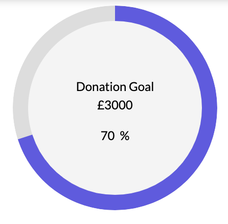
An additional widget I was eager to explore was the progress bar, this could be of great use in the design of my campaign website. This widget is a great tool to display the progress of a goal, such as tracking donations.
Countdown
Another widget I was keen on was the countdown. In some cases, this could fall hand in hand with the progress bar. For example, it could act as a timer counting down towards the completion of a goal. Another great use would be the preparation for an event. Many festivals use this tool for that reason.
Elementor Plugins
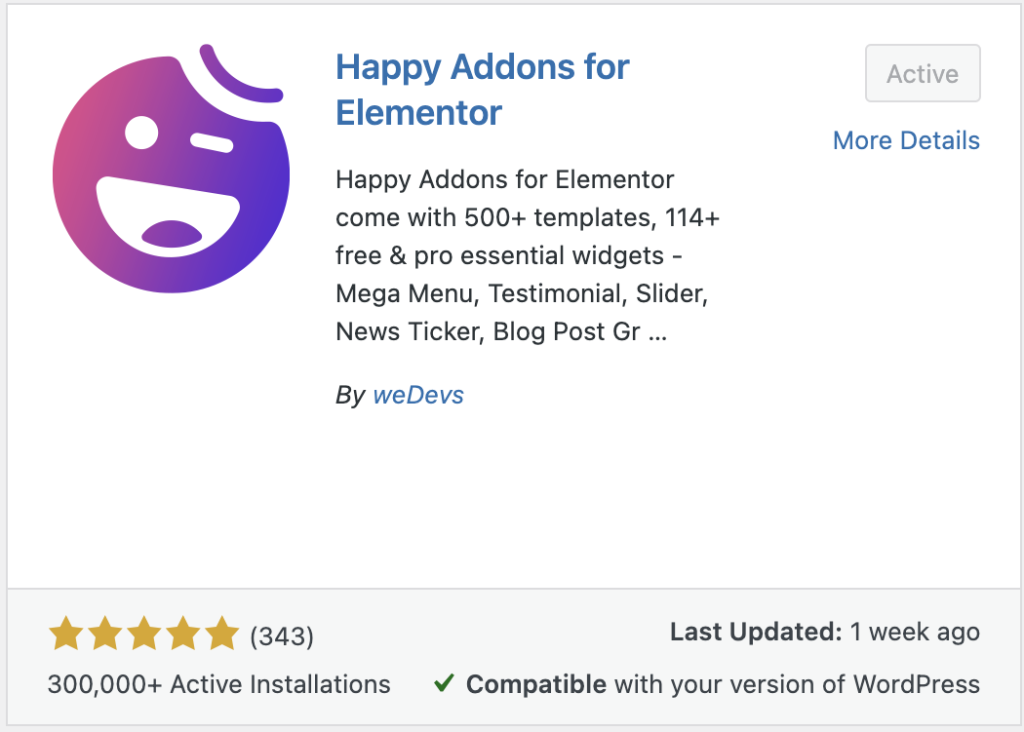
Beyond the tasks set, I decided to explore Elementor deeper, resulting in installing new plugins. These plugins offer additional widgets which could further enhance my designs.
Design Portfolio Mood board
The second task for the exercise was to develop a mood board for a chosen campaign for the design portfolio.
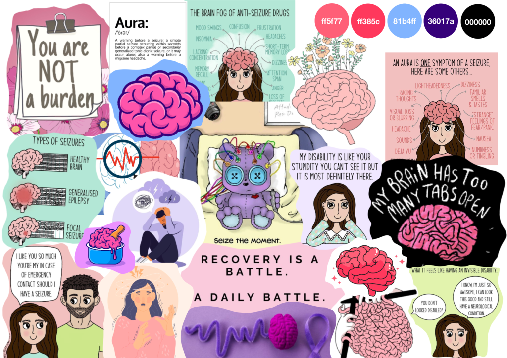
My chosen campaign is based on how Epilepsy affects mental health, a subject which I feel passionate about. Each image on the mood board was taken directly from Pinterest and constructed in Procreate.
I also included a colour palette inspired by the images on the mood board which could potentially be included in the design of my website.
