Dev Blog 6: Using interactive elements with Elementor
Exercise 1
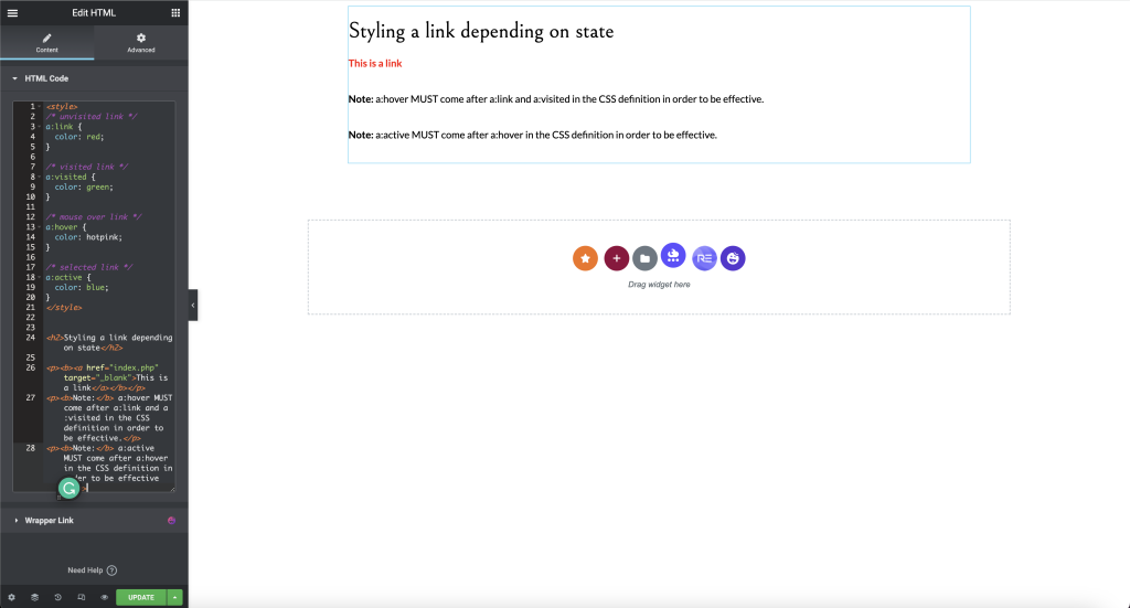
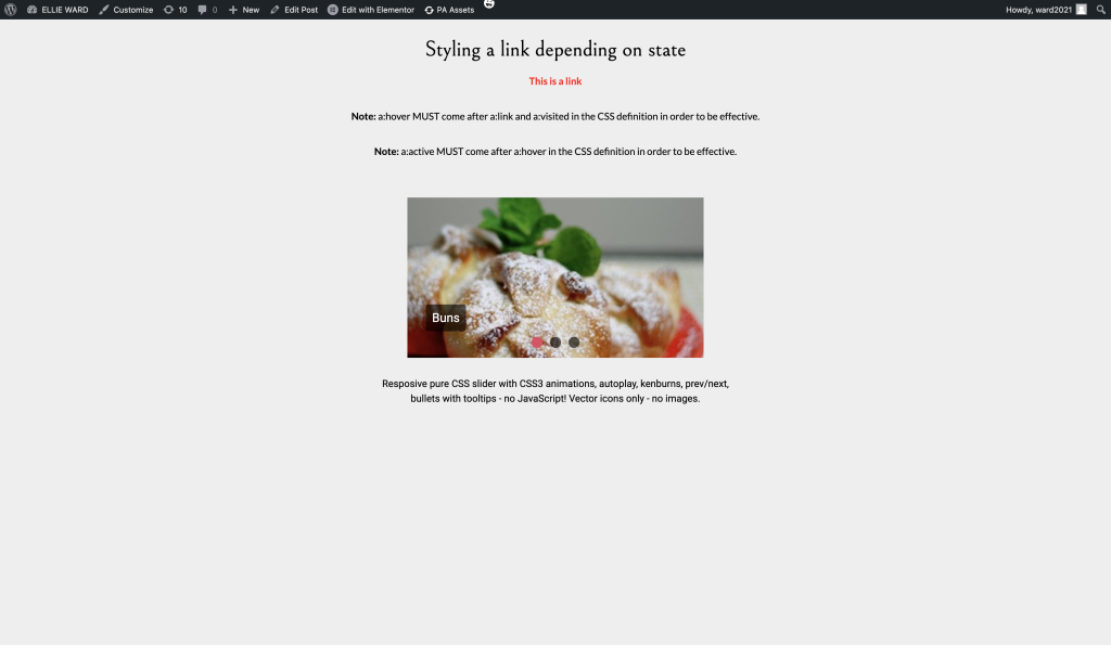
I began this task by inserting the HTML widget into a single-column structure. From here, I added the code that was provided.
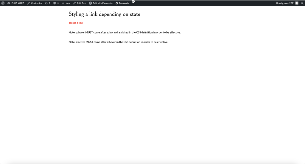
Figure 2 displays the results of the code.
Exercise 2
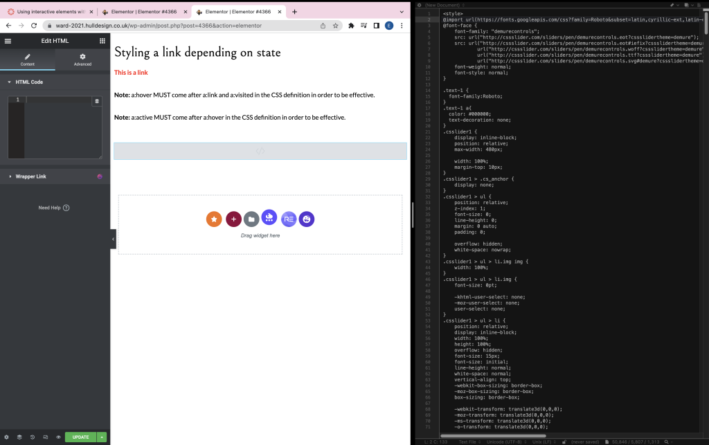
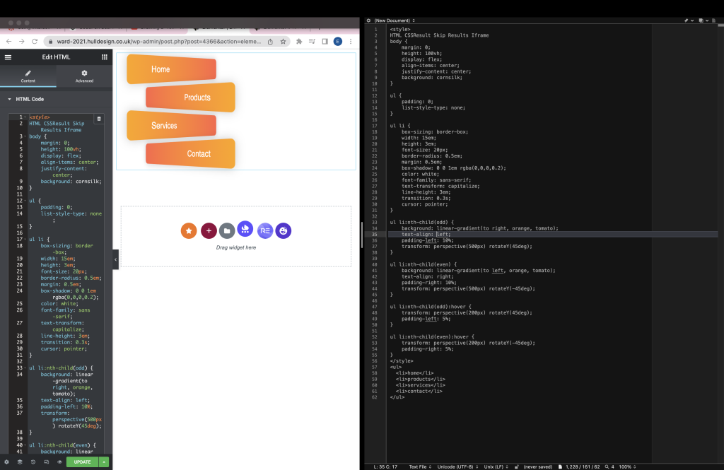
Exercise 2 is where we further experimented with code using CSS animations to move images. I retrieved the code from the Codepen link I was provided and inserted it onto BBEdit, combining the HTML and CSS before adding it to my Elementor.
Just like exercise 1, I added the HTML widget to a single-column structure and inserted the code directly from BBEdit.
Exercise 3
In exercise 3, we were allowed to explore Codepen for ourselves. I enjoyed discovering fun and different elements that I could potentially use for my campaign that aren’t available on Elementor.
I took an interest in a unique button component and explored this further in Elementor.
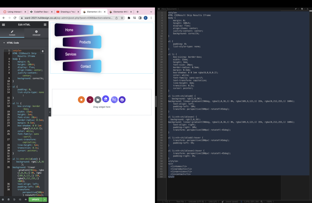
After experimenting with the element, I decided to take it further by altering the buttons’ colours. I did so by visiting the CSS gradient slider website. I selected similar colours to the drafted colour palette of my campaign to see what it would look like if I were to use it.
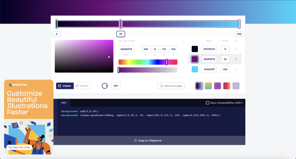
I headed back to BBEdit, where my code for the element was. I copied the website’s CSS and used this to replace the code for the old colour scheme.
Figure 8 shows the results after making alterations
Figure 8 is a demonstration of how the element works.
Exercise 4
The final task was to explore Chrome Experiments, a virtual showroom where coders can share their unique experiments. I chose five experiments that I enjoyed the look of.
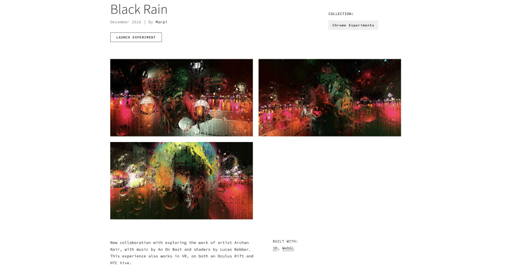
Experiment 1 – Black Rain by Marpi
Black Rain is a unique experience. The camera circles around a chromatic object, rainfall fills the screen, and as the mouse moves over the screen, it wipes the rain away. Black Rain fits into a cyberpunk theme. It feels dystopian with the rain and futuristic with the chromatic objects and neon lights in the background. The rainfall on the screen could be used for many different websites. It would make a great landing page.
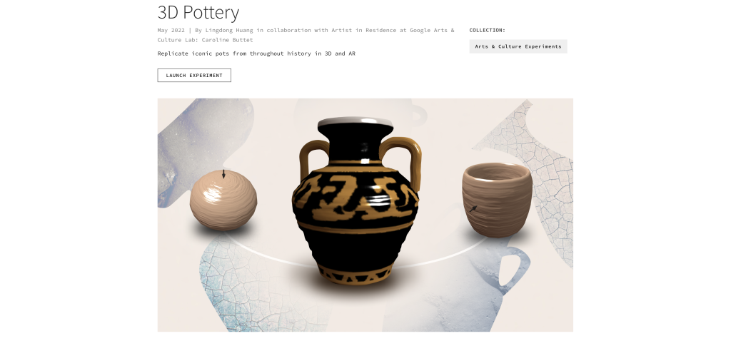
Experiment 2 – 3D Pottery by Lingdong Huang
The second experiment that was chosen was 3D pottery. This experiment relays heavily on user interaction. The experiment challenges its users to recreate and paint pottery, and they are graded on their accuracy. This experience could be used to allow users to design pottery and have the ability to order what they have created at the end. No matter how unrealistic.
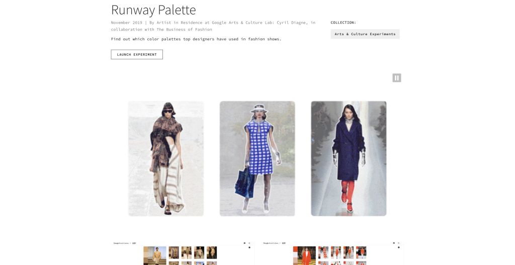
Experiment 3 – Runway Palette
The Runway Palette is a unique art experience. Palettes of five colours are displayed in a 2D or 3D space to create a piece of art. You can then select a palette within the piece of art, which returns an outfit worn on a runway that matches the chosen colour palette. The ability to find outfits based on a colour palette is genius and could be utilised on any clothing retail website.
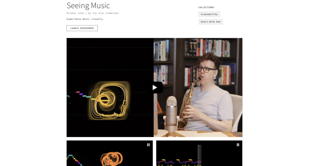
Experiment 4 – Seeing Music by Jay Alan Zimmerman
Seeing Music is an excellent audio visualisation. It provides many different ways of visualising microphone inputs. It analyses the audio frequency in real time to draw the visualisation. This would be a great alternative to regular audio visualisations, which often are only based on how loud the audio is.
Experiment 5 – Aesthetic by Ted
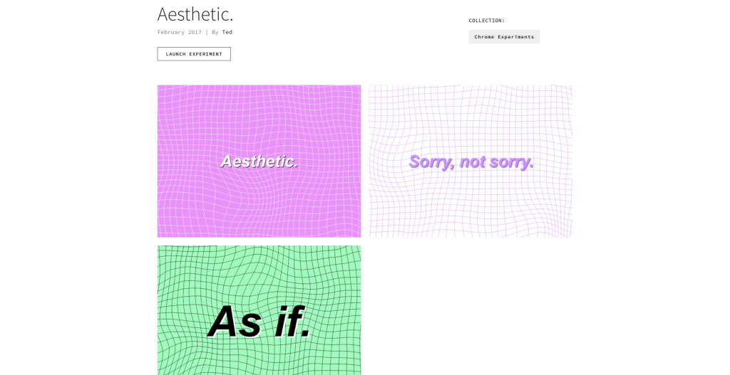
Aesthetic is a fun experiment. It randomly generates aesthetically pleasing animations that can be altered. Interestingly, the interface to change the animation settings is based on the Windows XP popup. These randomly generated animations would make a remarkable landing page before entering someone’s website.
References
https://experiments.withgoogle.com/black-rain
https://experiments.withgoogle.com/business-of-fashion
https://experiments.withgoogle.com/3d-pottery
