Dev Blog 7: Responsive Design
This task aimed to understand and utilise the use of responsive mode in Elementor. This feature will allow me to view my design from multiple devices, ensuring it is well-suited to them all. With the plugin, I can adjust particular design aspects per device, which allows me to remove or add elements on different devices.
Exercise One
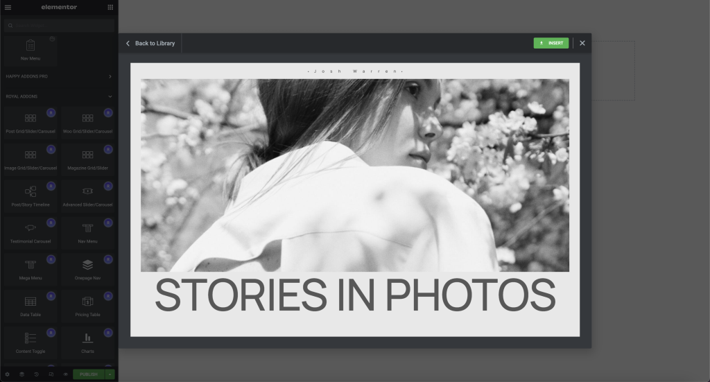
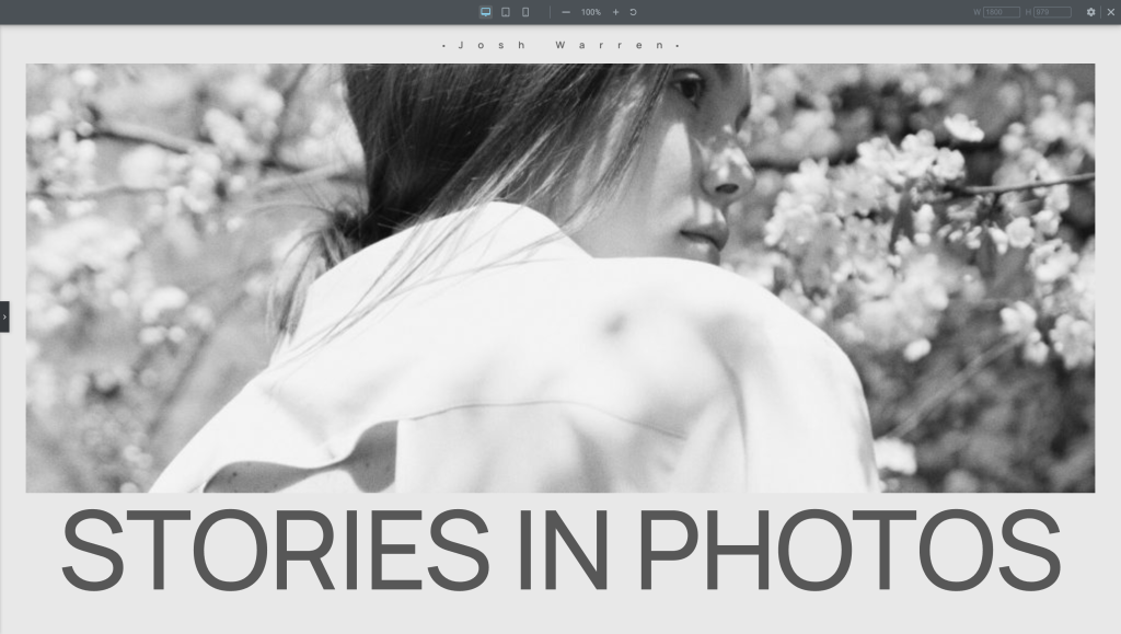
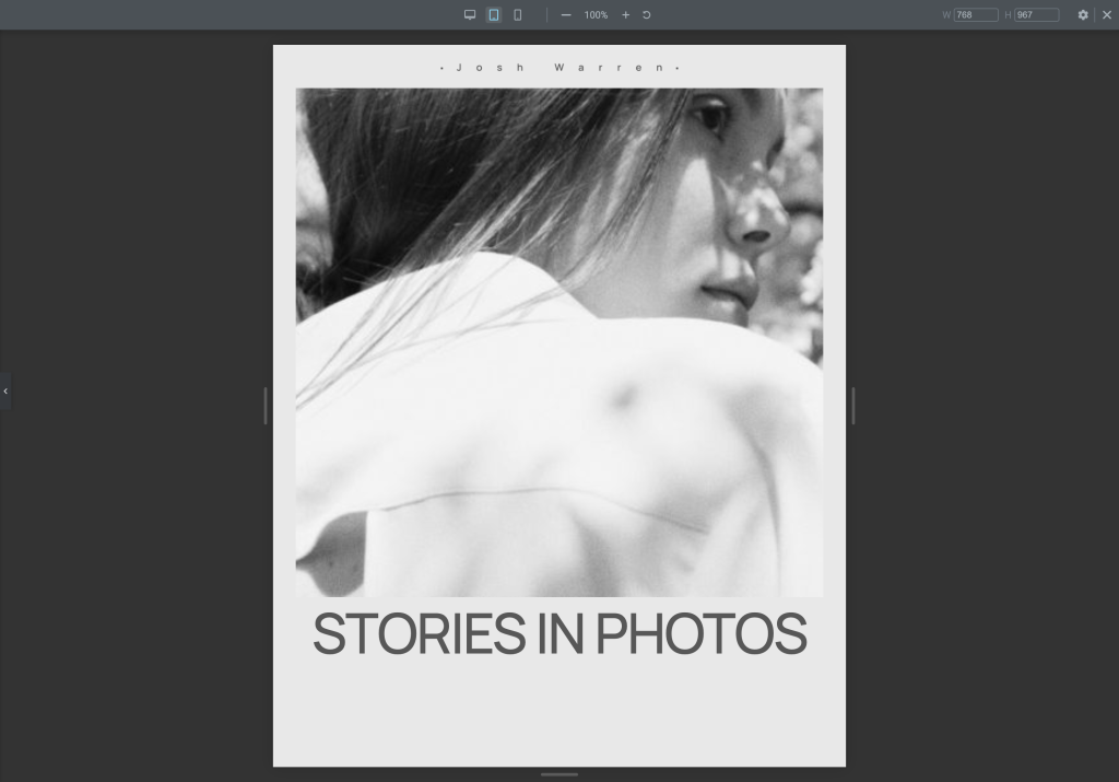
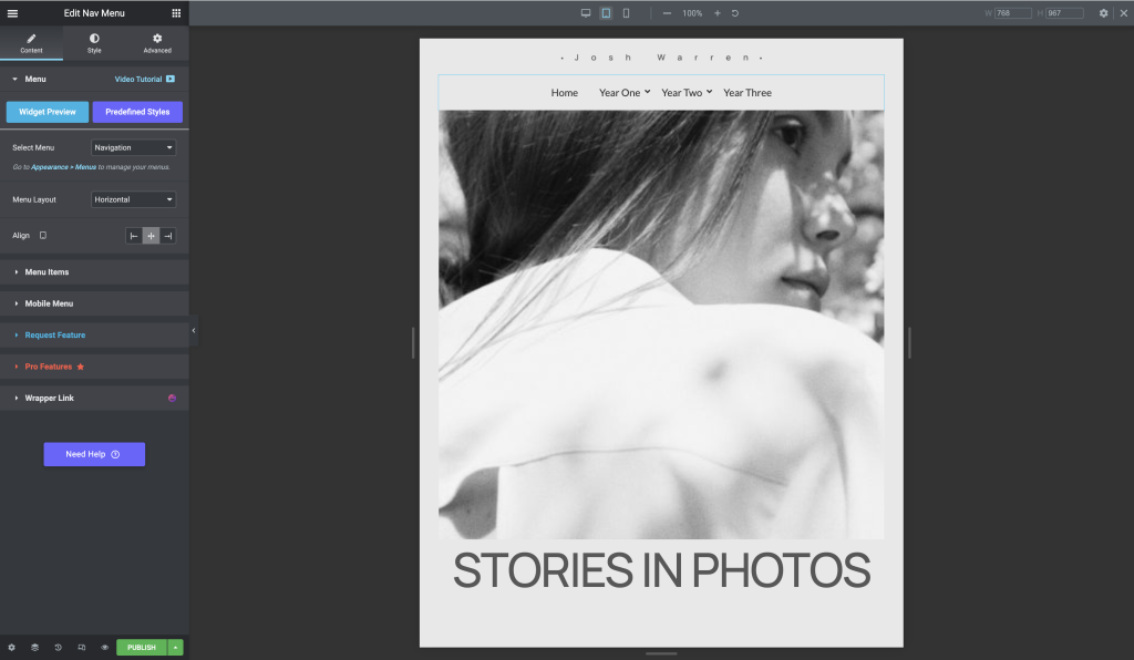
I inserted a photography template for the first exercise and trialled the menu options and settings. There were many advanced settings that aren’t available on the standard WordPress elements, so it was interesting to see what I could adjust in the design. The figures below display experimenting with those settings.
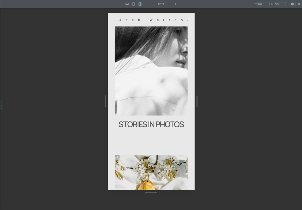
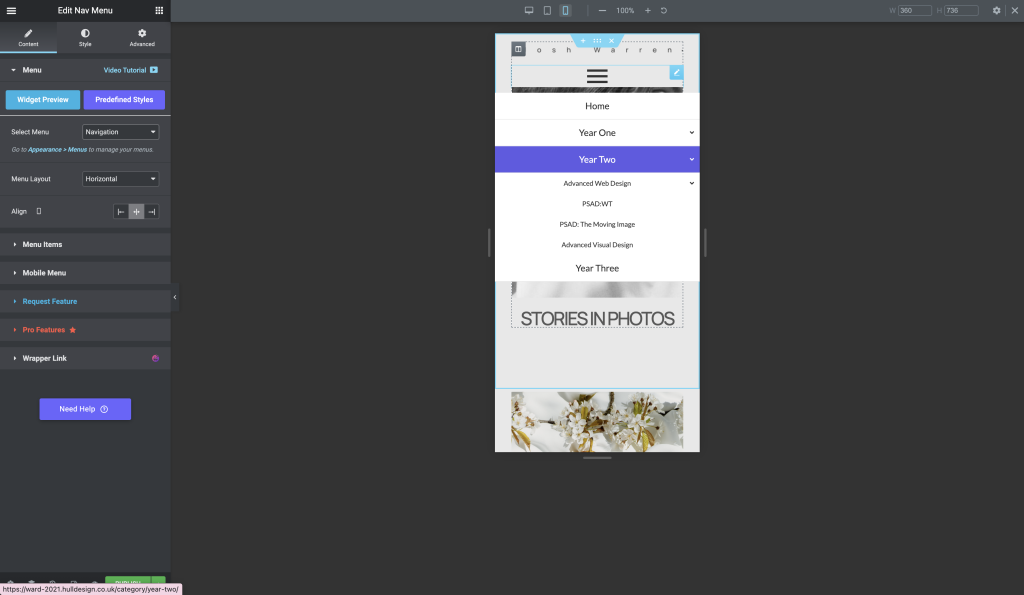
After that, I tested the hamburger menu on the mobile view and played with those settings. A hamburger menu increases the amount of space as it is more compact, which benefits smaller screened devices. Some of the following figures show my exploration.
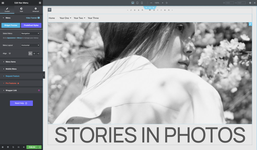
After inserting the template, I searched for the menu widget and added it.
Switch on the responsive mode within elementor.
To practice adjusting the hamburger menu icon break point you will need to use the NAVMENU from the Royal Addons.
The following shows how you can hide content according to you device dimensions. It is available on other widgets such as images.
The Nav Menu style allows you to edit drop down menu, sub menu and mobile formating.
The mobile menu can be edited to tell elementor when you want the hamburger menu to replace the normal menu.
Exercise two
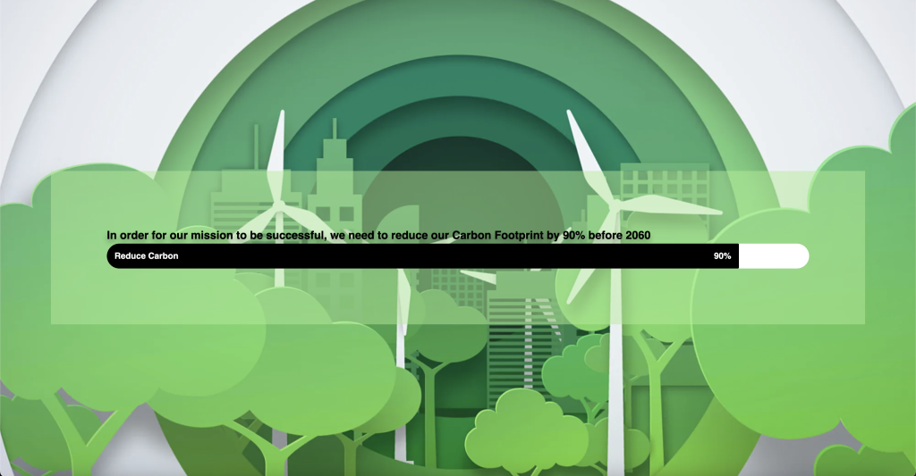
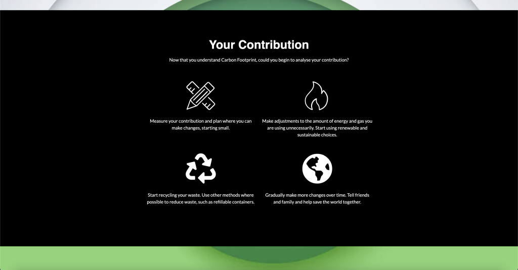
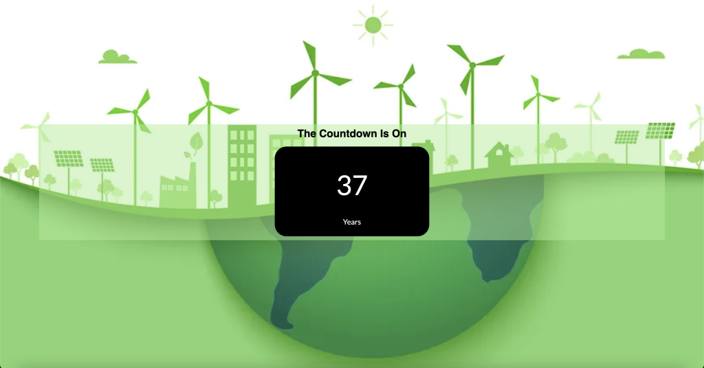
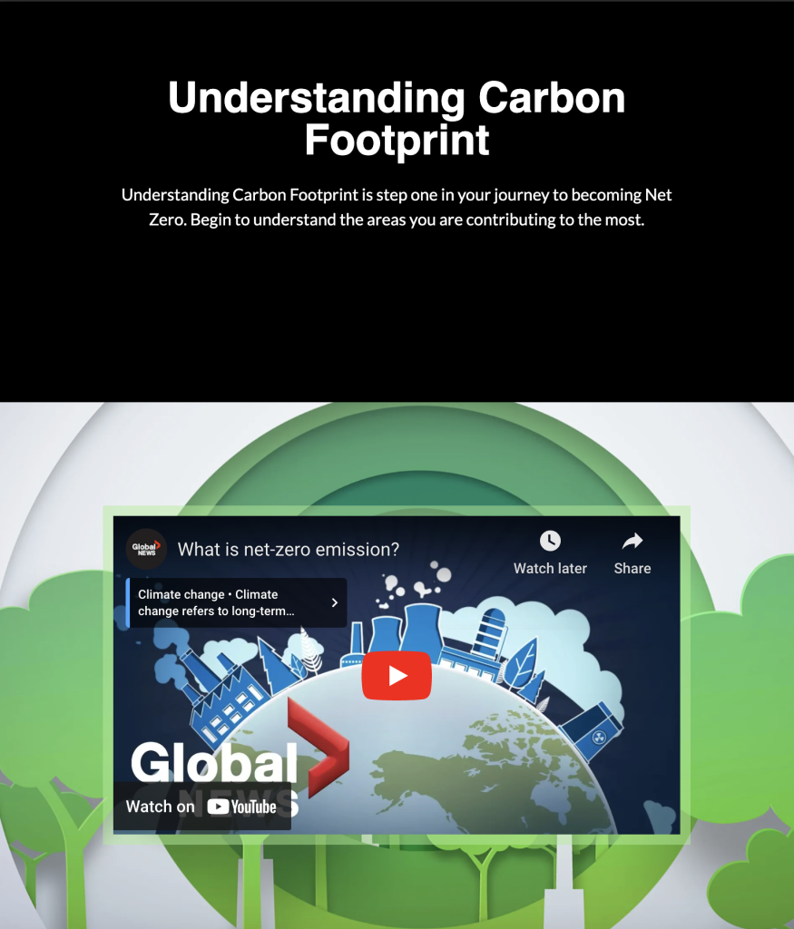
Exercise two was to create a responsive design centred around the idea of becoming carbon neutral and the importance of it. We were tasked to create a different design on each device giving a different UX.
Desktop Design
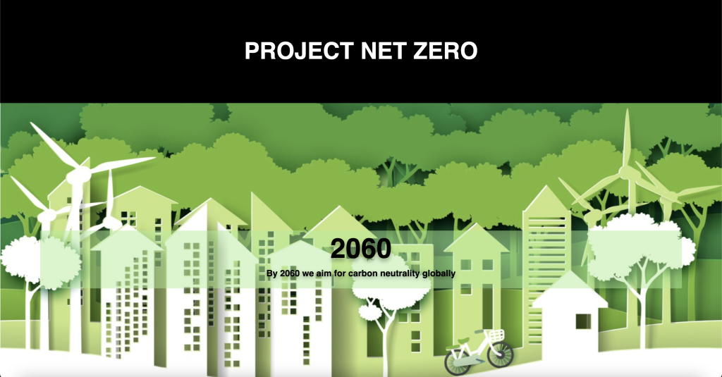
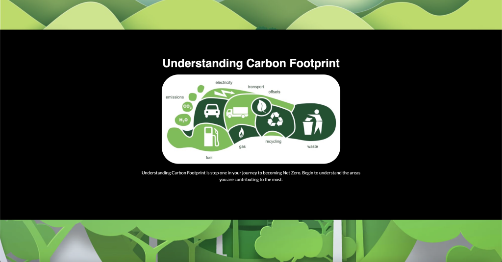
The desktop site aimed to provide the majority of information. I attempted to display the data by using a more comprehensive range of elements that aren’t necessarily suitable for tablet and mobile devices.
Tablet Design
The tablet design contains two youtube videos on becoming carbon neutral and information on emissions. The overall design has followed from the desktop site. I also allowed the user to redirect to the desktop site with additional information.
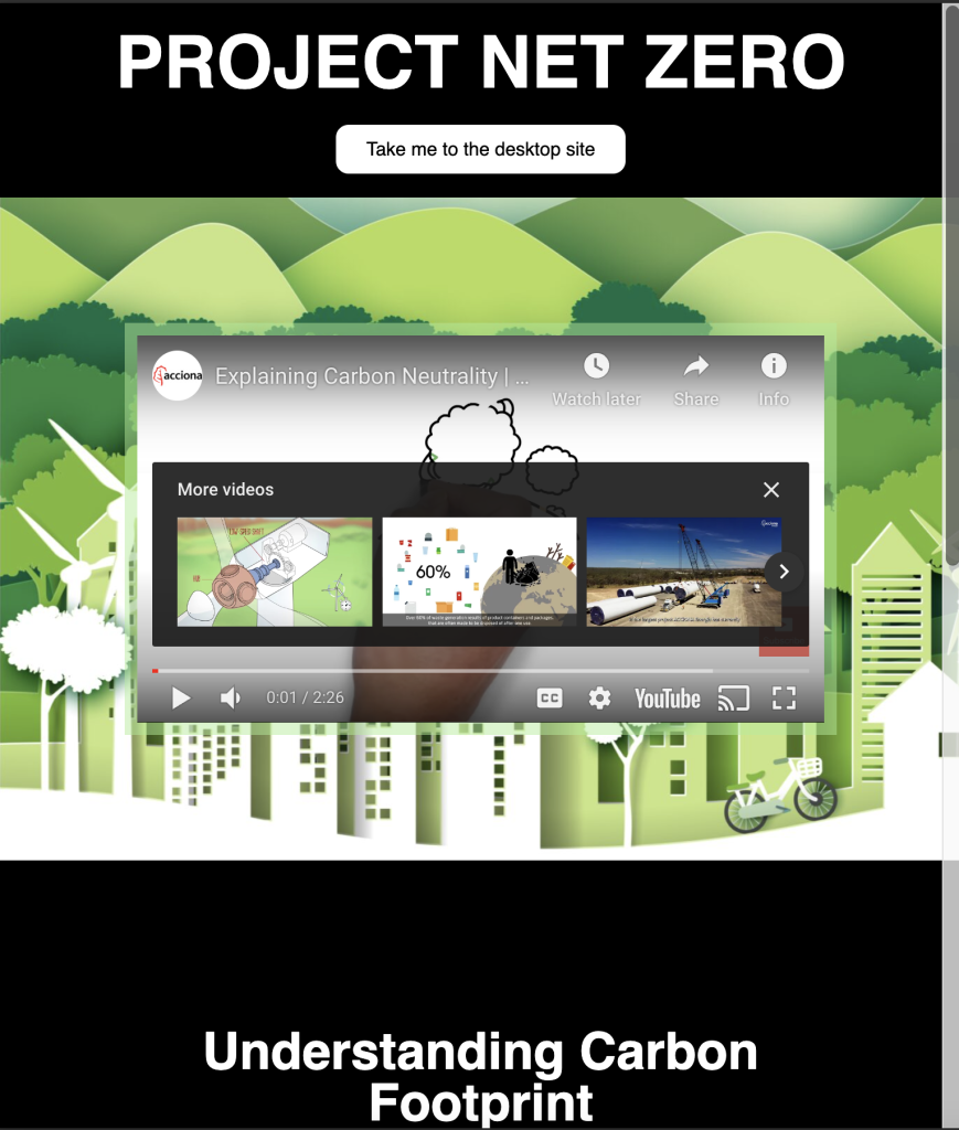
Mobile Design
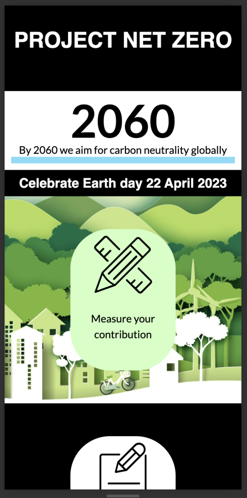
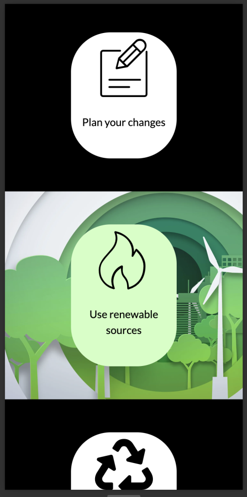
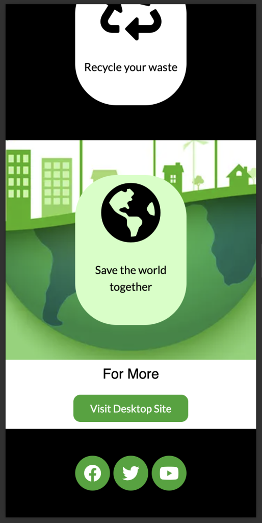
Just like the tablet version, the mobile follows the UI of the desktop site. The information provided on mobile has been taken from the desktop design, but the appearance has been altered to fit the screen size.
