Dev Blog 8: SpellZone
The group task aimed to work together to analyse the Spellzone website pre-login. The analysis was primarily based on the onboarding and the design overall. We approached the task as individuals to understand the website’s purpose, allowing us to pick up on aspects we believe could be improved. We then came together to discuss what we had found and formed a collective agreement on how we would approach those changes.
Purpose
The purpose of Spellzone is to educate and assist students in improving their spelling. It allows teachers to monitor progress directly to tailor learning to each individual. Spellzone also caters towards those with accessibility issues such as Dyslexia.
Target Market
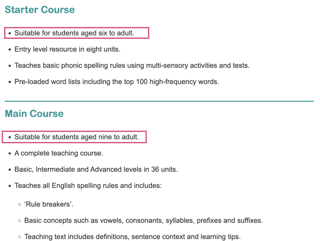
Upon researching the website, we discovered that the age group was quite broad.
There were conflicting age ranges which are highlighted in figure 1, but overall, we established the age range to be six years to adult.
Analysis of the Spellzone website.
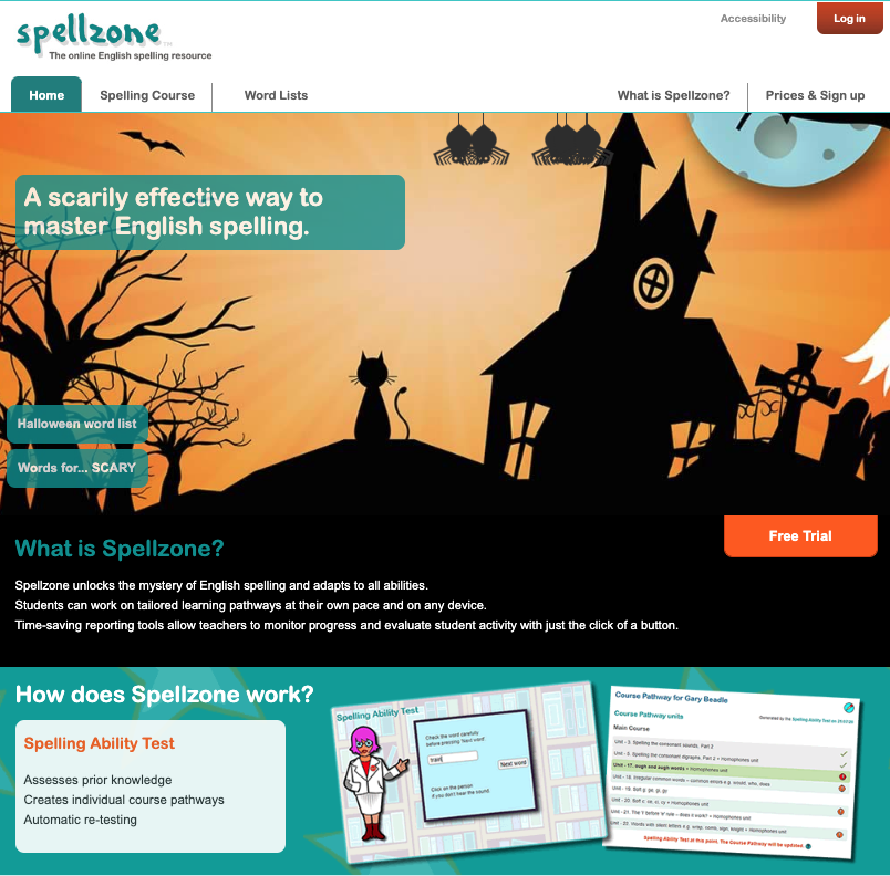
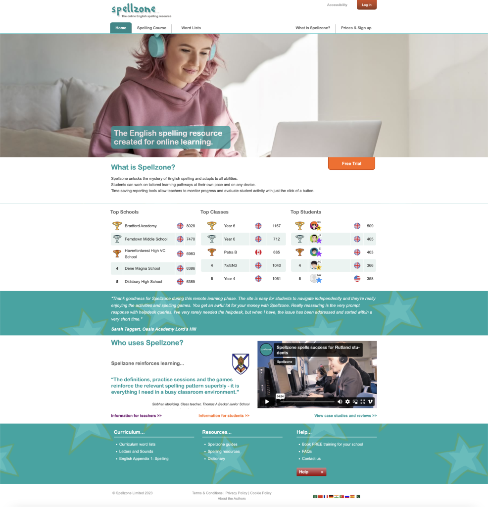
Figure 2 displays the user’s view once they open up the website. After establishing the purpose and target audience, I picked each element apart.
The website as a whole felt dated compared to the designs of websites currently on the web.
The overall design was unsuitable for all ages because it used child-like imagery. Due to the imagery used, the design would drive me away from the website as an adult. It feels slightly patronising.
As stated in the website’s purpose above, it can be tailored towards individuals with accessibility issues such as dyslexia. The accessibility option is not as apparent as I feel it should be; I would adjust this to be the accessibility icon used universally.
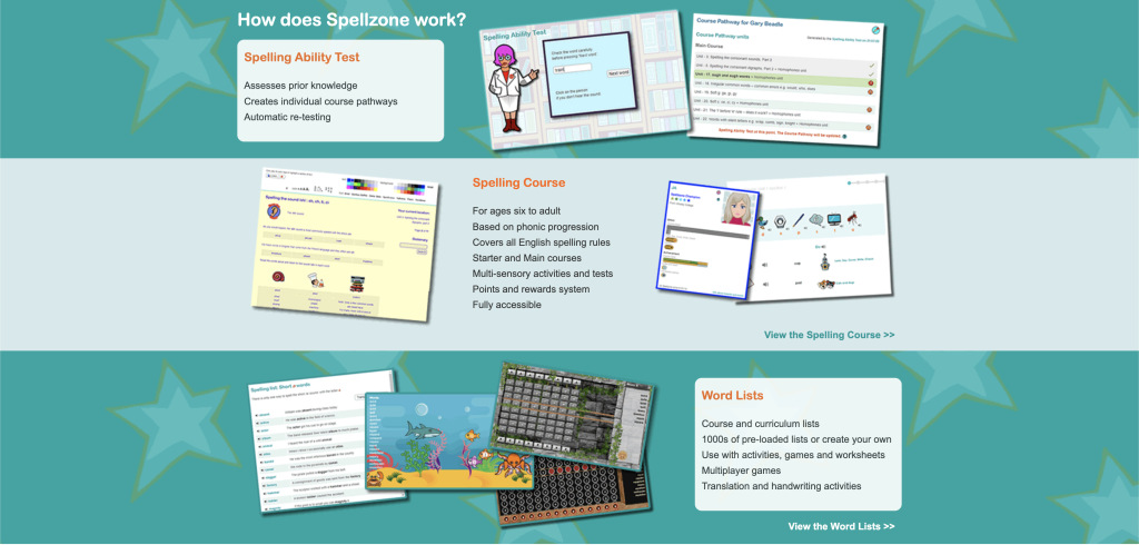
As the user scrolls further down the site, they are greeted by random pieces of Information, not to mention the strange placement of the images and their lack of quality. I feel this information doesn’t belong on this particular part of the website; it could take place in the About us section, where it is more suited.
As the user scrolls further down the page, there is a leaderboard where schools, year groups and students compete. This is a significant element to have, but I feel it doesn’t belong there and should appear further up the homepage.
Beneath the leaderboard is a dictionary search bar which I find slightly pointless, and its placement is odd. Expanding on that, in the same section is a series of certifications from different educational companies that should be at the page’s footer.
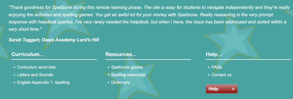
The footer of the homepage contains reviews from users. This should be more visible for new users, which leads me to think it should have a higher placement on the homepage.
Re-Design
I used Adobe XD to redesign the website using content from the original Spellzone Homepage.
Onboarding
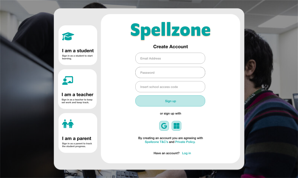
Pre-login, there is no existing onboarding sequence. This could be a beneficial element upon entering the website. This would allow adjusting designs and content according to the audience.
Group 2 gave an excellent example when presenting their ideas for the onboarding sequence during class. My group didn’t discuss this, as we were focused on the website’s overall design. Nevertheless, I took inspiration from this idea and developed it beyond our lesson.
The idea is to make the website design more appropriate for the right audience and provide a different onboarding sequence depending on the type of audience. I wanted to stick to the same colour scheme to keep consistency but make it user-friendly for everyone.
When I explored similar websites with the same purpose, non of them provided an onboarding sequence. However, I did take away their designs and the imagery they used to implicate them into my onboarding design.
