Animation Storyboard
The final step before creating the stop-motion animation was to plan it. I decided to research how other brands use 3D product animations to market and advertise their products. Whilst the following videos aren’t stop motion, It was helpful to see their approach to gain some ideas for my own.
Existing Product Animations
Animation One
This 3D Product Animation was my top inspiration. They kept the same colour palette and imagery as the packaging design but ensured the product stood out during the animation. How they used the bubbles and water portrayed freshness, and even though the strawberries were part of the flavour, they also helped portray the drink’s freshness.
Animation Two
The second animation is very similar to the first, where they used the water element, fruit and the same colour palette they carried through from the packaging design. One aspect of the animation that stood out was the text behind the can around the third-second mark in the video, effectively portraying the drink’s freshness.
The transitions between each scene were very fast-paced but seamless. Whilst this is a great video to take inspiration from, the overall animation was quite overwhelming; there were a lot of things happening in such a short space of time.
Between the two animations, there was a common theme of using fruit and the same colour palette as what is on their product in the video. These design aspects are something to keep in mind when designing my storyboards.
Stop Motion Storyboard
In preparation for the final stop-motion animation, I created three different storyboards. Remembering the requirements, such as time when exploring different ideas, was essential.
Idea One
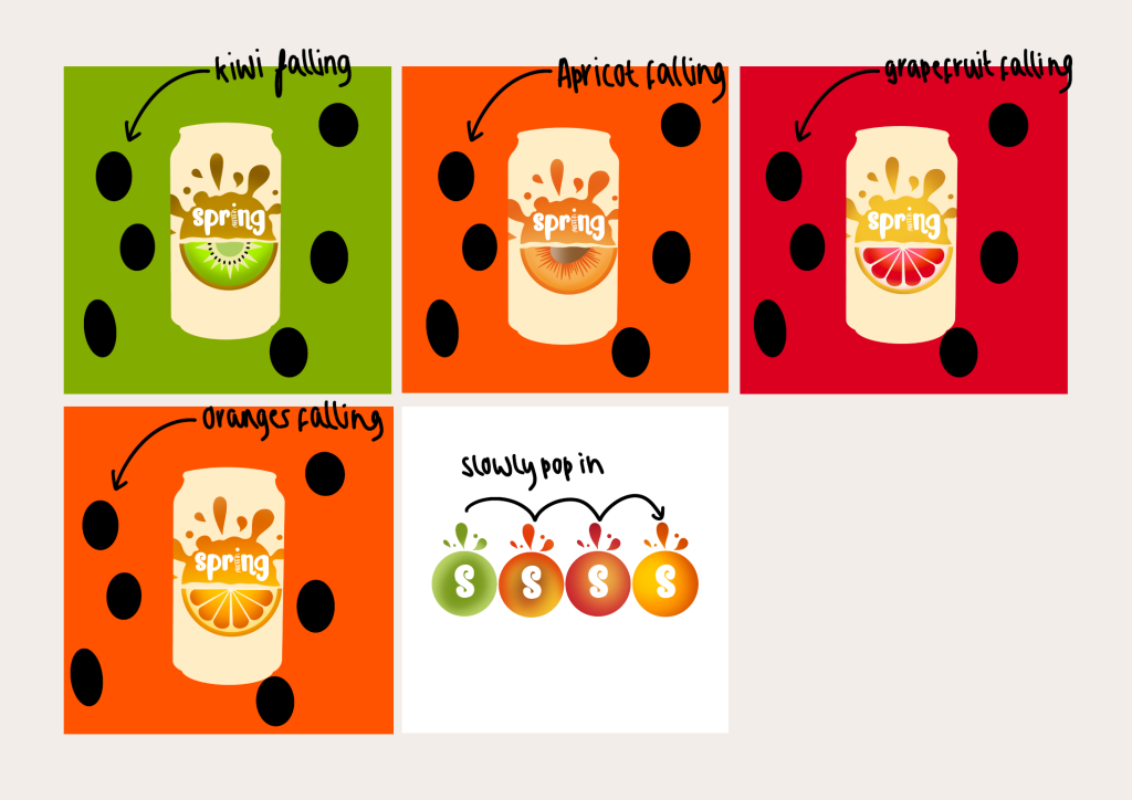
The first idea was rejected. This was heavily inspired by the video in figure two, where they included falling fruit. I enjoy this idea, but when attempting to design it, I found it difficult to follow it through, as importing images in Substance Stager proved to be very challenging.

Idea Two
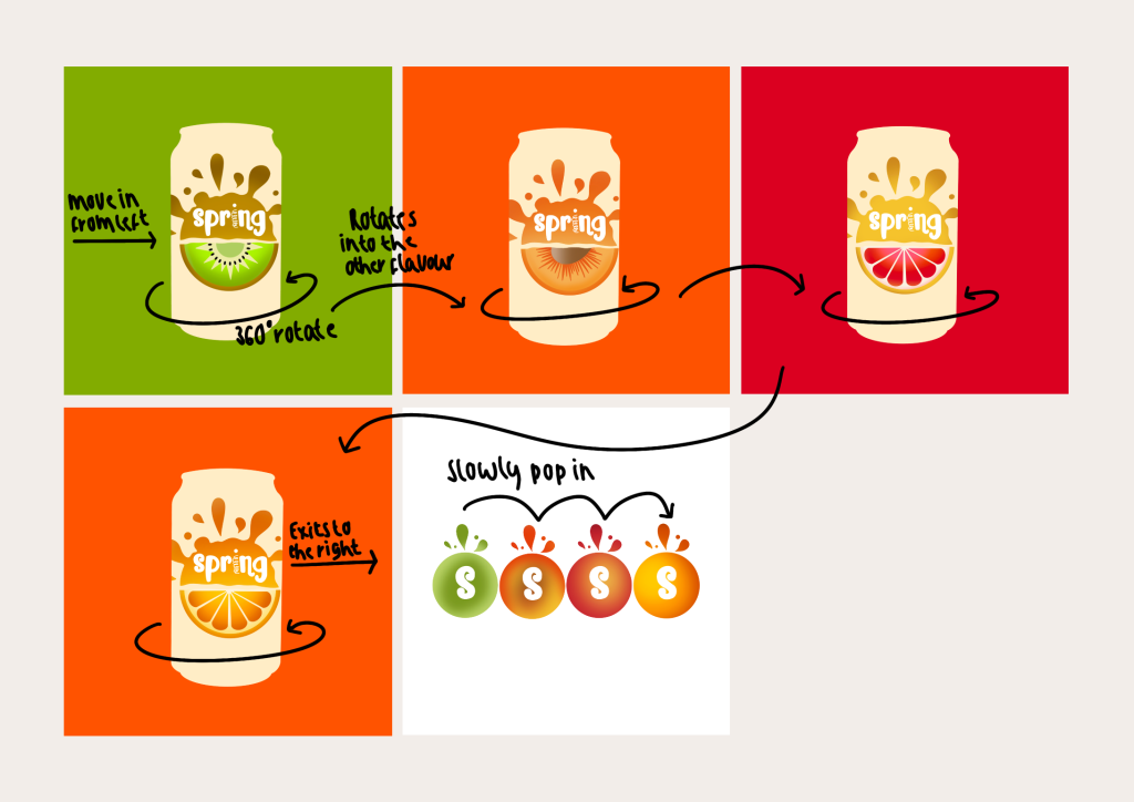
Idea two is also a rejected design. I attempted to animate this idea, but after the first scene, the time was already at four seconds. This would disregard the time requirements. Another reason the idea was rejected was that other peers in the class had shared their animations/ideas, and I found it was too similar to those that had already done their animation.

Idea Three
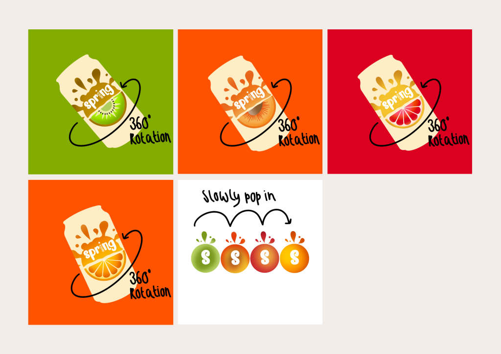
Storyboard three is the idea I decided to use. Again, this is a simple animation, but it meant that the requirements were met. I enjoyed the idea of the 45-degree angle of the cans as opposed to being in a 0-degree orientation. This idea would make the animation much smoother between each rotation, as the cans will all be positioned in the same area instead of moving them across the screen.

References
- Trevor Parenteau. 2022. AHA Sparkling Water Commercial. [Online]. Available at https://www.youtube.com/watch?v=HB-CCqfpCaU [24 February 2023].
- Salraz. 2022. Motion Graphics video for energy drink | 3D Product animation. [Online]. Available at https://www.youtube.com/watch?v=1nNz_58fEb4 [24 February 2023].
