RP 4 – Responsive websites
Responsive website design is an important aspect of designing a website. With modern age technology, content is consumed on varying-sized screens, from tiny mobile screens, folding smartphones, tablets, laptops, computer monitors, ultrawide monitors and TVs to name some.
The screen size and resolution of these devices can vary immensely. However, the design of a website is required to be viewed on all these different screens and maintain its useability. In this blog post, different websites will be discussed for their useability and design at varying screen sizes. Along with, if their design could be improved for certain sized screens.
Tesla
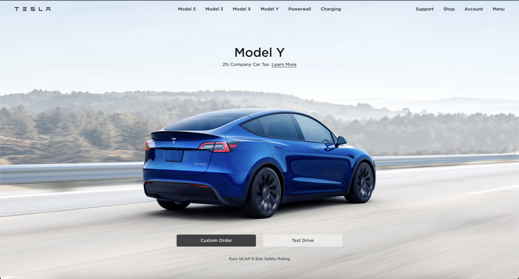
Tesla the American car maker has an undeniably beautiful but simple website design as seen in figure 1. They take advantage of this transparent navigation bar at the top, allowing the landing page to take full focus of the viewer. This landing page has two simple call to actions, custom order a Tesla or book a test drive.
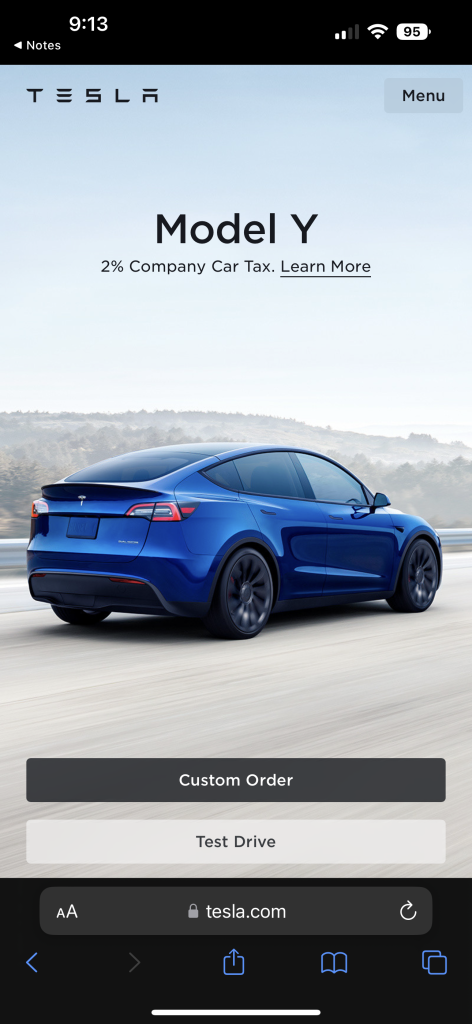
The same page has been optimised for smaller devices. The navigation bar is still transparent but moves all the links that were previously centred and right-aligned into a right-aligned menu icon. This menu button will open a vertical menu for all those links
The landing image has been cropped to put the focus onto the car but keeps with the same image.
The call-to-action buttons are still front and centre but have been moved into a vertical alignment compared to the horizontal alignment previously used.
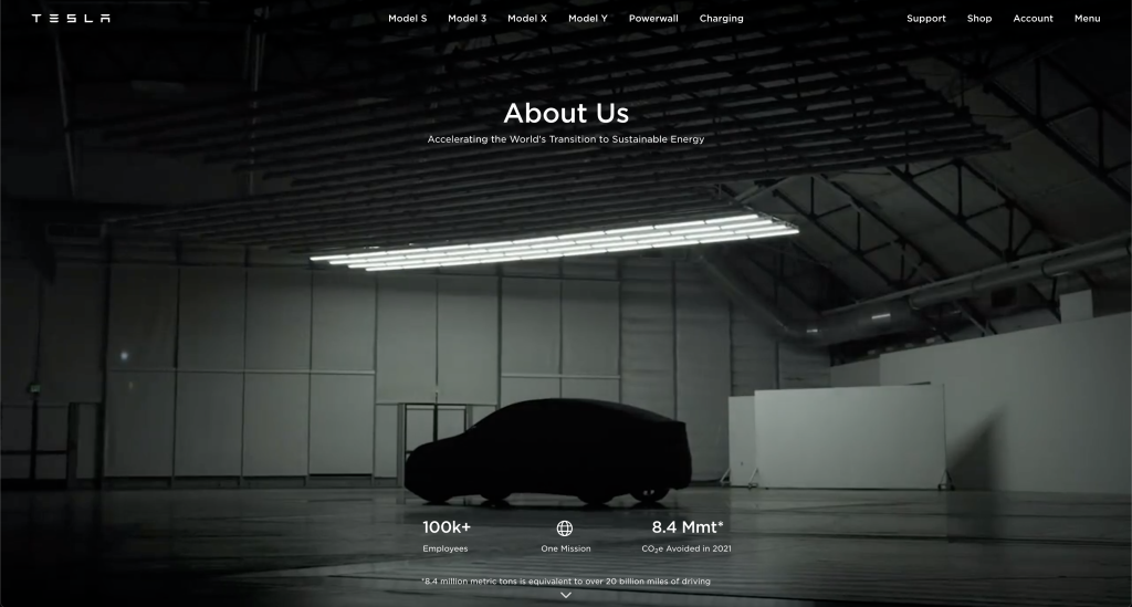
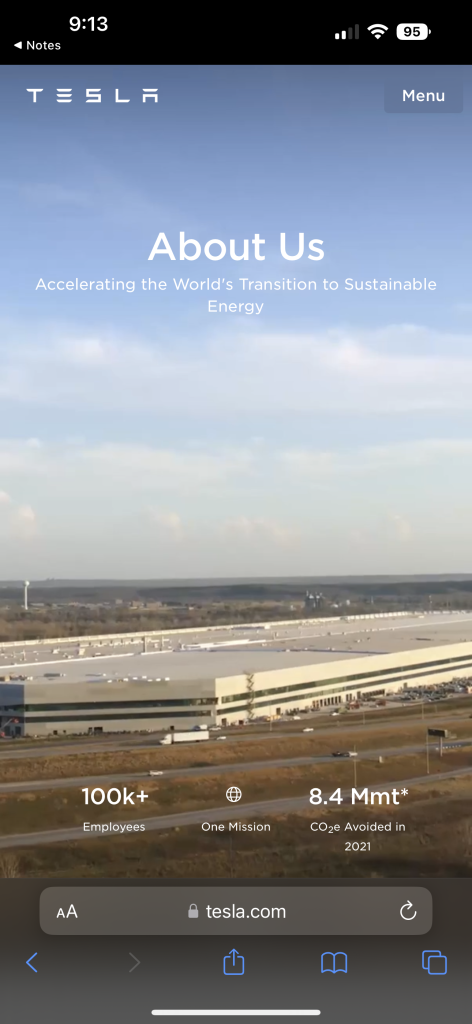
Looking at other pages on the Tesla website, they keep with this trend of using full screen images and videos when you navigate to different pages and keeping the text content simple, prompting the users to scroll.
They follow the same principles on all their mobile pages, shrinking the navigation into a single button that will display a vertical menu, cropping the images/videos to still be full screen but keeping the focus of the content front and centre.
The Tesla website is not only beautifully designed, but a lot of thought has gone into the responsiveness of their website. With great attention to detail being shown, ensuring the content is useable and looks great on both larger screens and smaller screens.
Panic
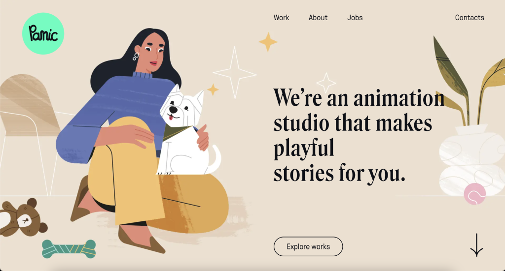
The panic website is an animation centric website as shown in figure 5. Similarly, to Tesla, it makes use of larger screens real-estate to show off their beautiful animation work. This is a great example of making sure every inch of the screen is made to good use.
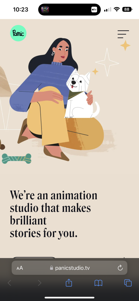
Panic follows very similar principles to Tesla, it crops the content to the main focus, and hides the navigation bar into a hamburger-style menu that loads content vertically when loaded on a smaller device as shown in figure 6.
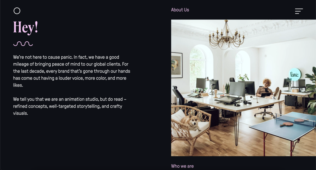
Panic continues to make use of its larger screen real estate as shown in figure 7. It displays an image and text content side by side when the screen is large enough.
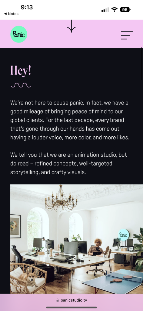
However, when the screen size does not have room for the text and image to be display side by side, the content moves so the text is above the image as shown in figure 7.
None of the content through Panics website has changed but instead has just been optimised for smaller and larger screens.
A lot of thought has clearly been given to the design of the panic’s website, it is incredibly interactive and works amazingly on both larger screens and mobile.
In Zayn
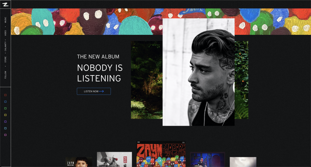
In Zayn is a single-page website. It is sectioned into five different parts which are hyperlinked on the left-hand navigation page that will automatically scroll to that section of the page when clicked.
The content on this page is relatively centred with large margins on both the left and right on a larger screen as shown in figure 9. This is somewhat hidden due to the body of the content and the margins using the same background.
The page makes use of horizon scrolling content and the vertical scroll is used to go between the different sections on larger screens.
As shown in figure 10, the content moves from horizontal scrolling to fully vertical, the text has moved below the images rather than sitting alongside.
The navigation bar remains the same on both the large screen site and mobile site expect for one change, the social media links have been completely removed as clearly the screen is not big enough to house all the links in this format.
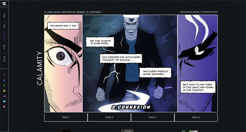
As shown in figure 11, this is another part of the In Zane website which includes a comic. This comic is a slideshow with the links to each image being laid horizontally
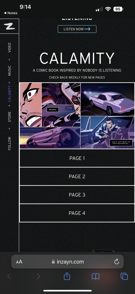
In comparison, figure 12 shows the same part of the website on mobile. The links have now been laid out vertically and the comic has shrunken dramatically.
Unlike the other two websites, the In Zane website does not hide its navigation links when on the mobile site, taking up room all the time when not necessary, especially since this is a one-page site and the links are just a form of quick scrolling. This results in the content being much smaller, like the comic shown in figure 12
This mobile site has not been as well thought out compared to the other two. The comic could of even been broken up into more pages with the same content, to allow the comic to take up more screen real-estate like it does on the larger screen site.
Responsive Principles & Tools
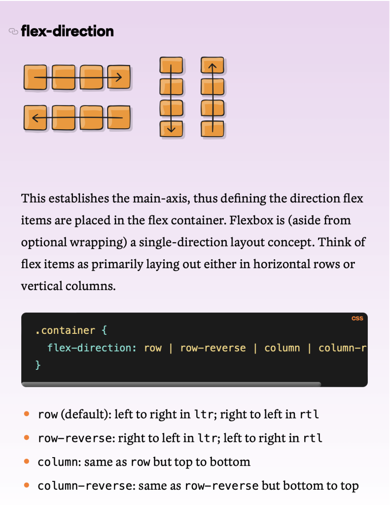
Responsiveness is enabled by the CSS files of the website. Functions such as display flex exist within CSS that can then be used to enable the content to automatically lay itself out depending on the screen sizes and where the content should move to.
Flexbox as it’s commonly known- is a powerful set of functions within CSS. An example of this can be seen in figure 13. With great documentation on how to use it and to get the best out of it. Some of these functions have been replicated within Figma and Adobe XD to make it easier to prototype auto-layouts as they would work within the real website.
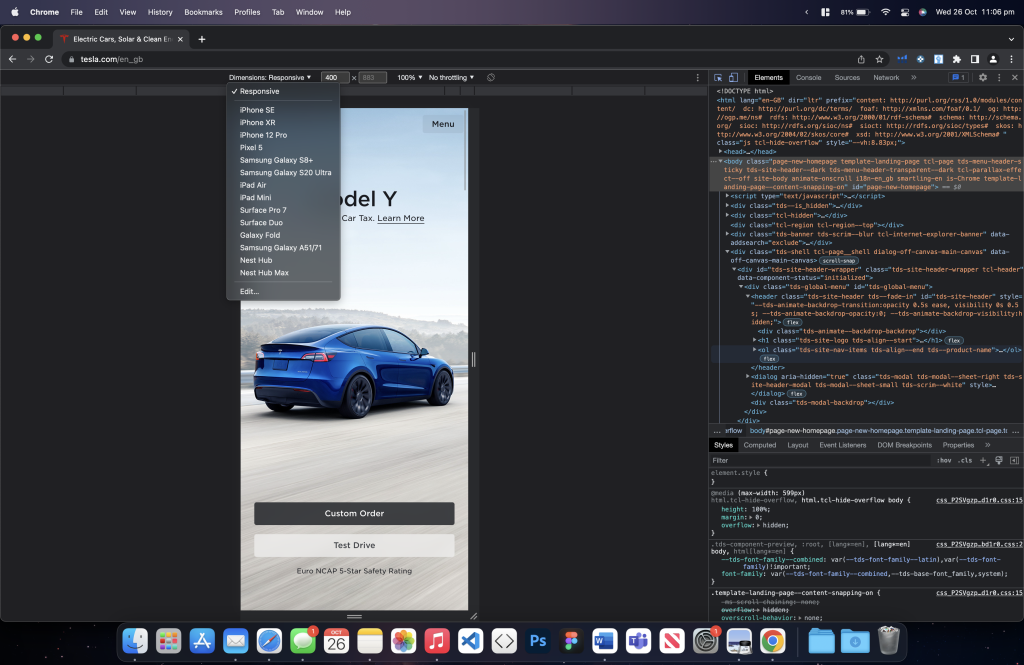
The majority of web browsers on computers have development tools that among other things, allows you to test your site’s responsiveness in a majority of different screen sizes without actually having to own these devices. Google Chrome being among one of the most popular browsers lists a large range of different devices and screen sizes to emulate within the browser as shown in figure 14.
References
- Chrome Developers. 2022. Simulate mobile devices with Device. [ONLINE] Available at: https://developer.chrome.com/docs/devtools/device-mode/. [Accessed 26 October 2022].
- CSS-Tricks. 2022. A Complete Guide to. [ONLINE] Available at: https://css-tricks.com/snippets/css/a-guide-to-flexbox/. [Accessed 26 October 2022].
- Panic. 2022. Loud stories. Exceptional craft. [ONLINE] Available at: https://panicstudio.tv. [Accessed 26 October 2022].
- Tesla. 2022. Electric Cars, Solar & Clean Energy. [ONLINE] Available at: http://tesla.com/en_gb. [Accessed 26 October 2022].
- ZAYN. 2022. ZAYN. [ONLINE] Available at: http://inzayn.com/. [Accessed 26 October 2022].
