RP5 – Breaking the rules
What are the rules?
In order to understand how websites break the rules, it is important to know the basic rules. According to XD, the following is a summary of rules used in web design.
- Keep your interface consistent
- Design easy-to-use navigation
- Change the colour of visited links
- Make it easy to scan your pages
- Take content seriously
- Check your website for errors
- Minimize the number of choices
- Engage users to scroll
- Label buttons according to what they do
- Make things look like they work
- Make your website responsive
- Test your design
Codea Studio
We are an independent agency focused on projects that create social and human meaningful value. Everything we do is digital and thought provoking, we love to flip things around.
Codea Studio, LinkedIn
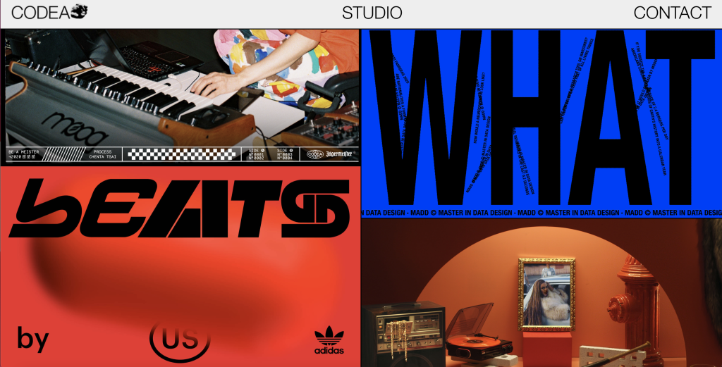
Codea exploits the use of imagery and uses grids to do so. The website almost appears chaotic as some of the grids contain bold animations, which can be quite overwhelming to the user’s eyes.
Codea makes use of some clever Javascript to make the page seem like it is infinitely scrolling. It achieves this effect when a user scrolls to the bottom of the page, the Javascript jumps back to the top of page, creating this infinite scrolling effect.
This website is restricted on text, this only appears when hovering over the images on the landing page, and by clicking on studio or contact on their open menu at the top of the page. Even then, the text is sparse.
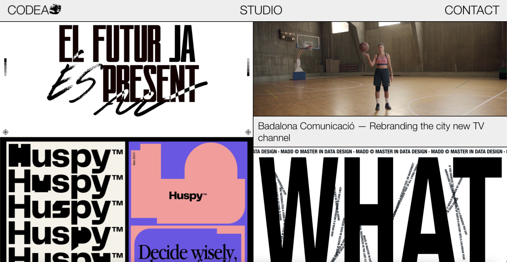
In regards to how responsive Codea is, out of the three chosen brutalist websites, this website adapts well to many screen sizes. The appearance of the design changes the smaller the device is. The open menu was redesigned into a hamburger menu in order to fit the screen adjustments- and the landing page doesn’t offer the same split-screen infinite scrolling design.
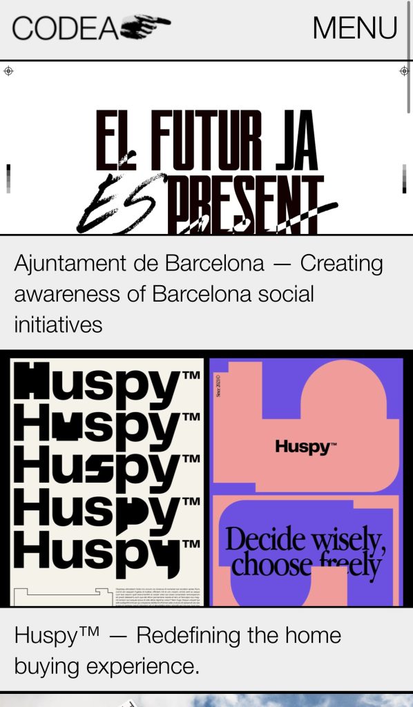

Desktop View
Mobile View
iPad View
Magic
The commission was quite exceptional: to design and develop a virtual platform where the different podcasts of MAGIC (First International Architecture Podcast Congress) would appear during the congress. We worked very literally with the idea of creating a space -like the outer space- where the podcasts would appear in the form of magical 3D objects of different types according to their category in the congress -transformations, totems, dreamworlds, rituals and mysteries – An ever changing website that is different every time you visit it and is full of magical mysteries for the visitor to discover.
Hyper Studio
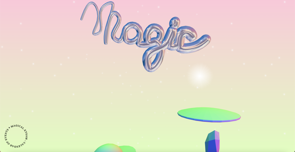
Magic is an incredibly interactive website designed to be an experimental radio platform. The website creates a virtual space with 3D spinning objects that you click to find different podcasts to listen to.
The virtual space makes use of clever JavaScript to create these 3D spinning objects, with the main title object following your cursor as you move around when viewed on a computer.
The website is very interesting when it comes to its responsiveness and use of grids and frames. This is because its layout is randomly generated each time, other than the main logo object that sits at the top centre of the page.
Every other object is randomly generated and placed each time the page loads. Once the objects are generated, they are fixed in their position, meaning if you shrink your viewing window, the site does not respond. However, if you refresh your window at a smaller size, the content is generated for this window size.
This must be because the script creating these objects fixes them to a certain point on your screen, so they do not move proportionately when your screen shrinks.
Desktop View
Mobile View
iPad View
Click here to save the world
The website was made in response to the refugee crisis in Europe, aiming to provoke the passiveness we felt by having it actually mistrust its user. That’s why we wanted a website that did the opposite of trying to wow you, begging you to stay with strong visuals.
Paul Botwid
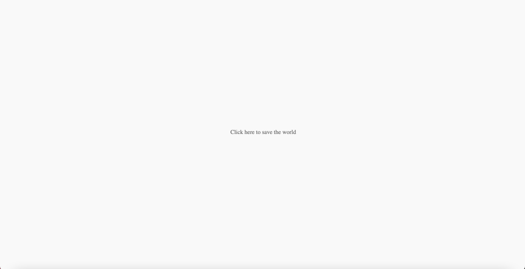
Click here to save the world is an interactive website which plays out like an old-fashioned game with different choices that will give you different text depending. The purpose of the site is to get donations towards UN refugees.
The website is very minimalistic with text only appearing in the centre of the screen. Each time you click the text changes and occasionally you are given options. These options can change the next type of text you get depending on what you click.
The website mimics a conversation with yourself and uses its storytelling to ask questions about how much you would typically spend on an alcoholic drink and how many would you usually buy. It then uses this information to prompt you to spend this much on a donation to UNHCR.
The website is clever as it often displays a blank screen like it’s turned off, but if you click again it might say something such as “Why are you still here” or “Go away”.
The website makes clever use of sound and images to make it believe it is infecting your computer, even going as far as to display your public IP address and location associated with your IP address.
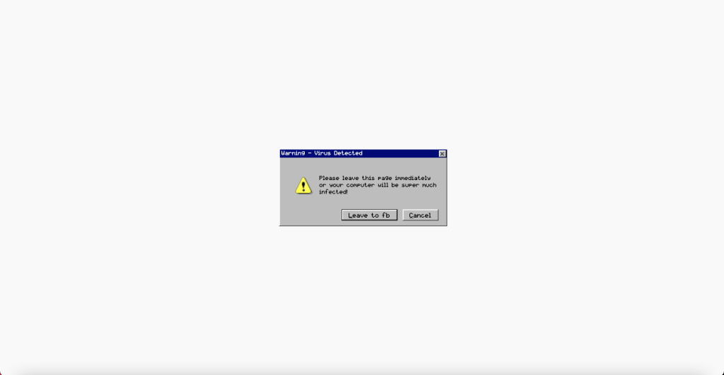

The website doesn’t make use of frames or grids as it is very minimalistic but it makes great use of storytelling and interactiveness. The website is responsive and will shrink down to a mobile screen as the content is always centred horizontally and vertically to the display. At some points, the user has to zoom out the website in order for the content to fit their screen.
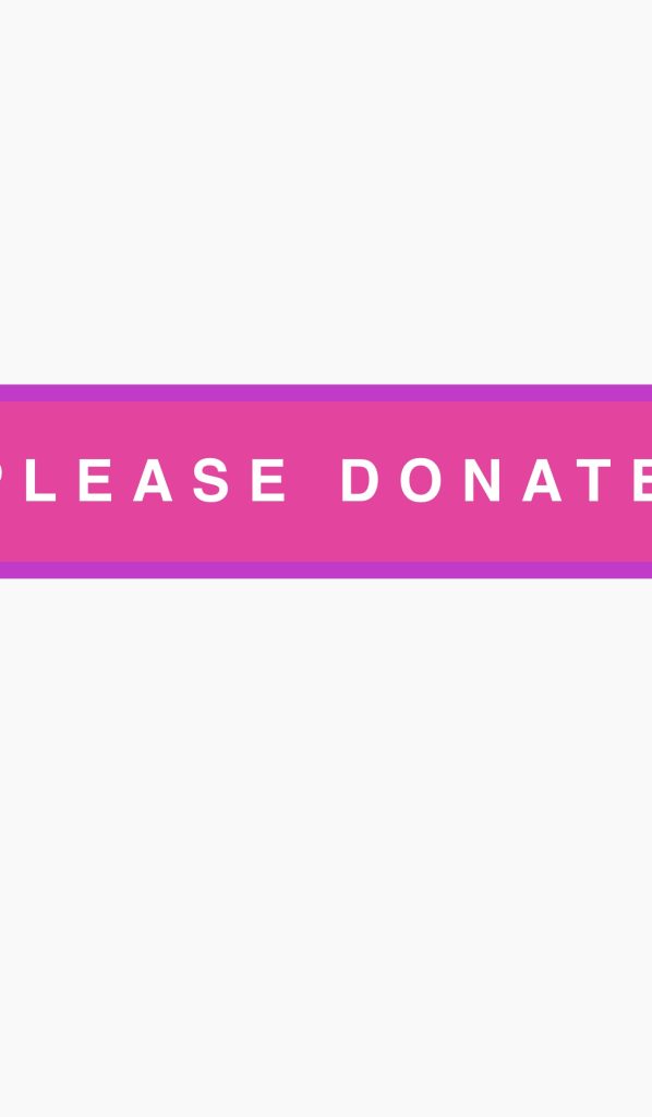
Desktop View
Mobile View
iPad View
References
- Adobe. 2018. The 12 Do’s and Don’ts of Web Design. [ONLINE] Available at: https://xd.adobe.com/ideas/principles/web-design/12-dos-donts-web-design-2/. [Accessed 1 November 2022].
- Brutalist Websites. Unknown. Click here to save the world. [ONLINE] Available at: https://brutalistwebsites.com/clickheretosavetheworld.com/. [Accessed 1 November 2022].
- Brutalist Websites. Unknown. Codeo Studio. [ONLINE] Available at: https://brutalistwebsites.com/codeastudio.com/. [Accessed 1 November 2022].
- Brutalist Websites. 2022. Magic. [ONLINE] Available at: https://brutalistwebsites.com/magic-magic.net/. [Accessed 1 November 2022].

