Dev Blog 9: Overview of advanced techniques
Exercise One
Step One
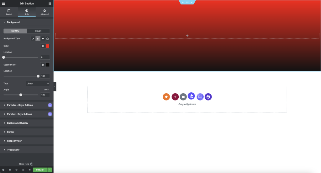
I started by inserting a single section onto the page. I made alterations to the structure by changing the default content width to full width, the default height to min-height, which is 400px and the background to a gradient with the colours #121212 to #FF0000.
Step Two
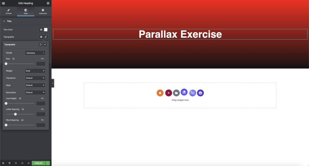
For the second step, I dragged the Title widget onto the structure and had “Parallax Exercise” as the text. I made alterations to the typography as I felt my existing font didn’t fit the theme of the task. I adjusted the colour of the text to be white, changing the alignment to the centre and making the text’s size XXL.
Step Three
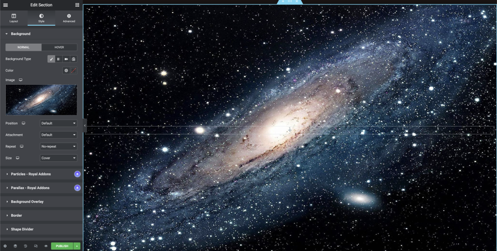
I then added another single section to the page and followed the process from step 1; instead of the gradient background, I inserted an image of space. I altered the image’s attachment to fixed, allowing the background image to act as a base layer, meaning everything else will sit on top.
Step Four
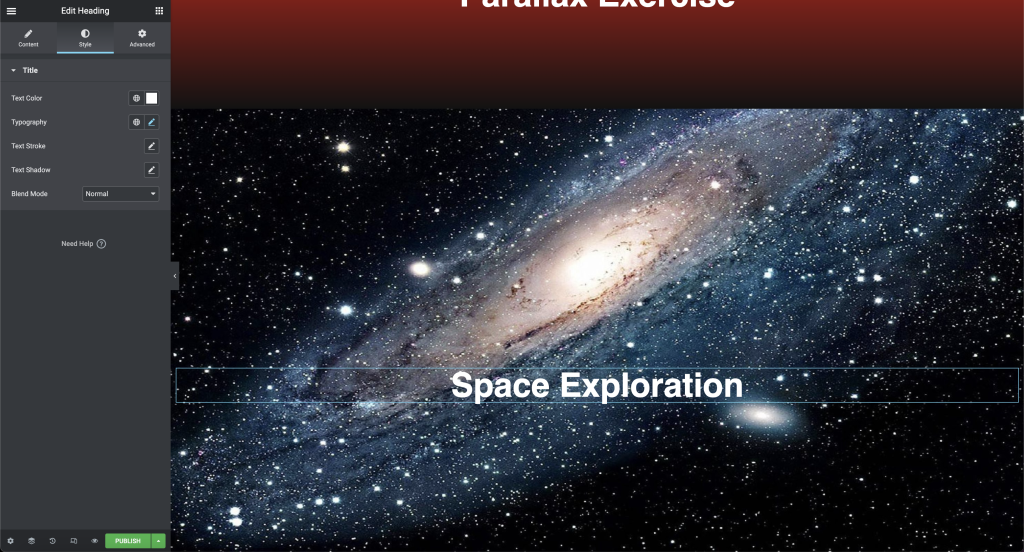
For the fourth step, I inserted text and followed the process and changes made in step 2. Additionally, I added a slight shadow and altered the position to absolute.
Step Five
I then revisited the section layer and inserted a background overlay with a mage of an astronaut. I adjusted the opacity to give the image more visibility and set the image’s attachment to fixed and the size to cover.
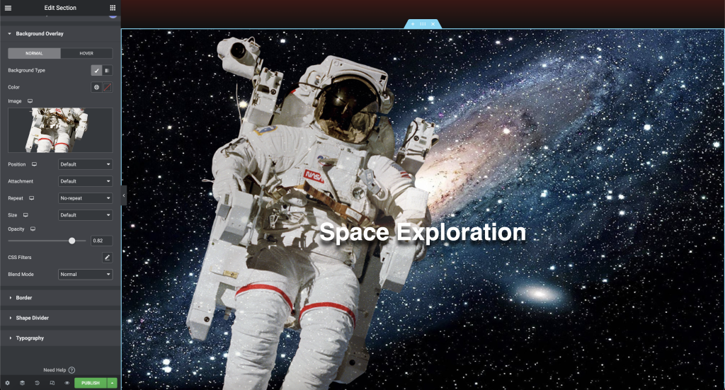
Step Six
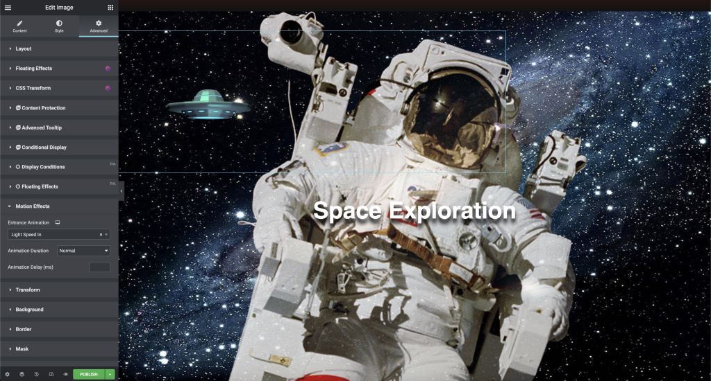
Here I added an image widget above the text in the same section changing the image position to absolute. Doing so allows me to move the image anywhere on the structure, giving more flexibility in the design. I placed the picture where I felt it fit and altered the size.
Following this, I headed to the advanced settings, where I added an animated motion to the spaceship to add an effect.
Step Seven
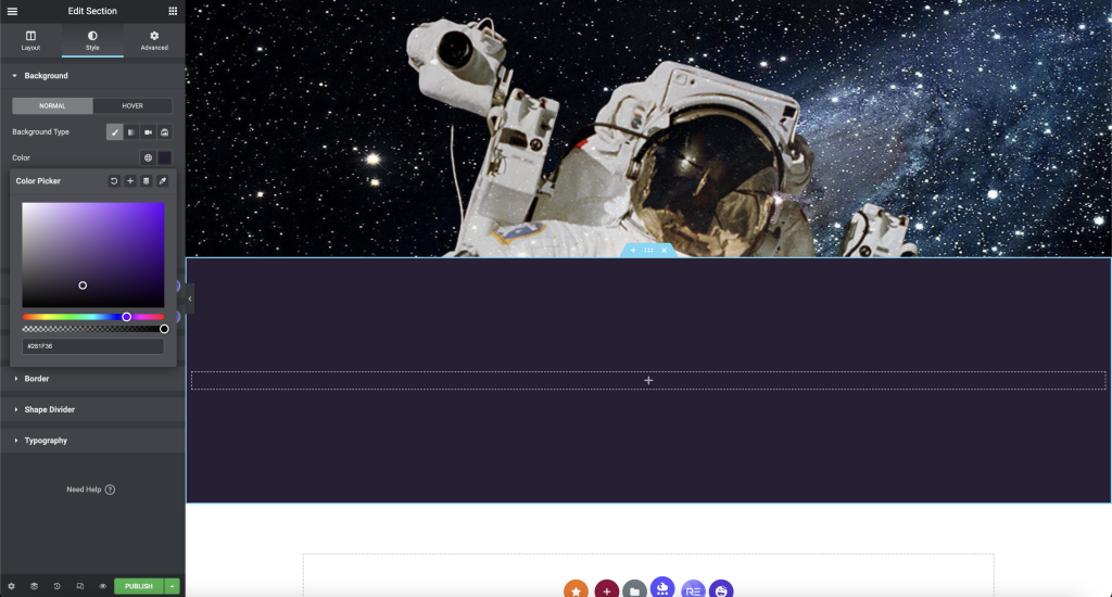
For step 7, I added another single column and altered the background colour to dark purple.
Step Eight
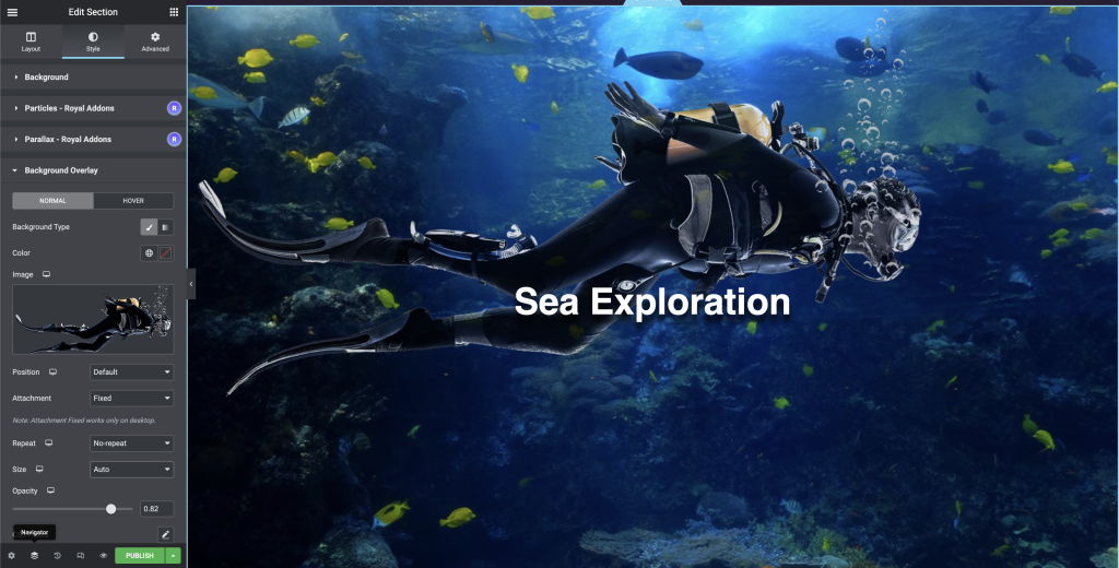
The final step of the task was a repeat of steps 3, 4 and 5. the only changes made were the text and images.
Exercise Two
Following on from exercise 1, I began to add the Mouse Move Parallax.
Step One
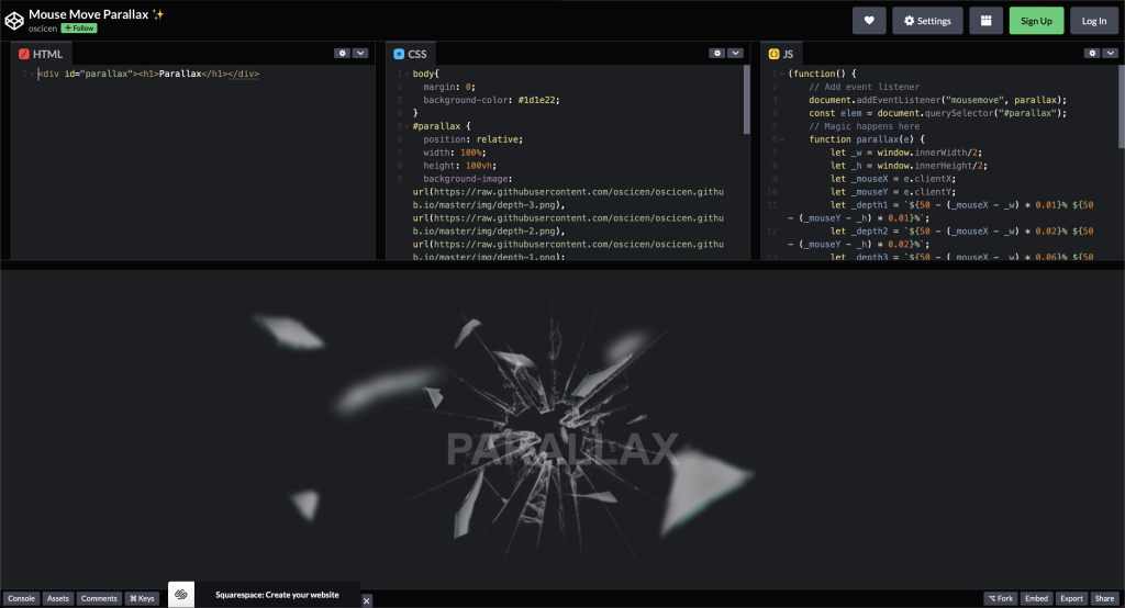
I started by accessing Codepen, where they provided me with the necessary code to complete the exercise.
Step Two
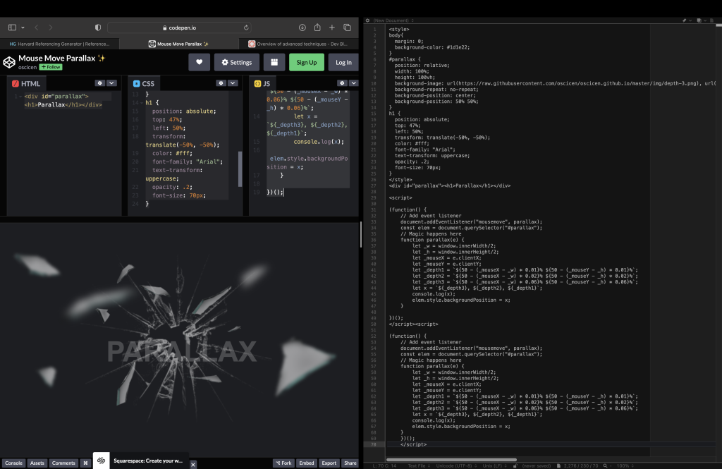
I used the same method in a previous post where I used BBEdit to add the HTML, CCS and Javascript together before posting it to my Elementor page. I inserted the correct open and close tags into the code to allow it to all come together.
Step Three
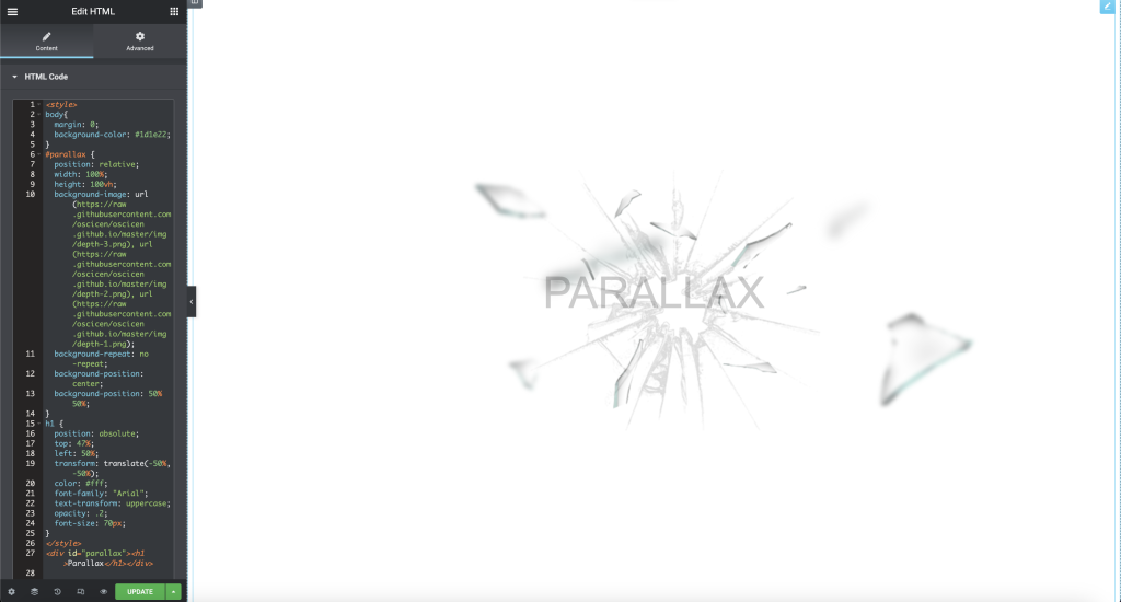
I then inserted the code from BBEdit onto Elementor using the HTML widget, which completed the task.
Exercise Three
The third and final exercise was to use the knowledge and skills learnt earlier in this task to design a website promoting a range of fair trade products.
