Research Proposal
Research Proposal Overview
My research project will explore the connection between digital art and the fashion industry. The ultimate goal is to craft a small collection of clothing inspired by the iconic work of a renowned fashion designer, Vera Wang, all using digital art mediums. This innovative approach adds a modern twist to the design process and opens up exciting possibilities for creating new, experimental, boundary-pushing fashion pieces. I’m eager to explore how VR tools can reshape the traditional fashion design landscape, from ideation to the final wearable creations.
Objective
In this project, I aim to develop a virtual lookbook that offers users an interactive experience resembling a virtual shopping encounter without actual purchases. Users can navigate around items, inspect them up close, from a distance, and explore every angle, providing a comprehensive and engaging virtual exploration of the showcased clothing items.
Idea Inspiration
The concept sparked when I discovered a viral video of a boundary-pushing moment in the fashion industry. The video is of Bella Hadid walking the catwalk during Paris Fashion Week, having her dress sprayed on; the video is in Figure 1. Coperni, a Parisian fashion brand, utilised Fabrican’s sprayable liquid fibre to create a dress in real-time, with a live audience witnessing the unconventional process. This innovative approach marked a unique and unprecedented moment in fashion, sparking my interest in exploring unconventional techniques and methods in fashion design.
software
Gravity Sketch
I find that Gravity Sketch is the software that would best suit my needs. Major fashion brands like Adidas, Puma, Reebok, and others utilise this software, and this endorsement from prominent clothing brands suggests that Gravity Sketch is a fitting choice for my purposes.
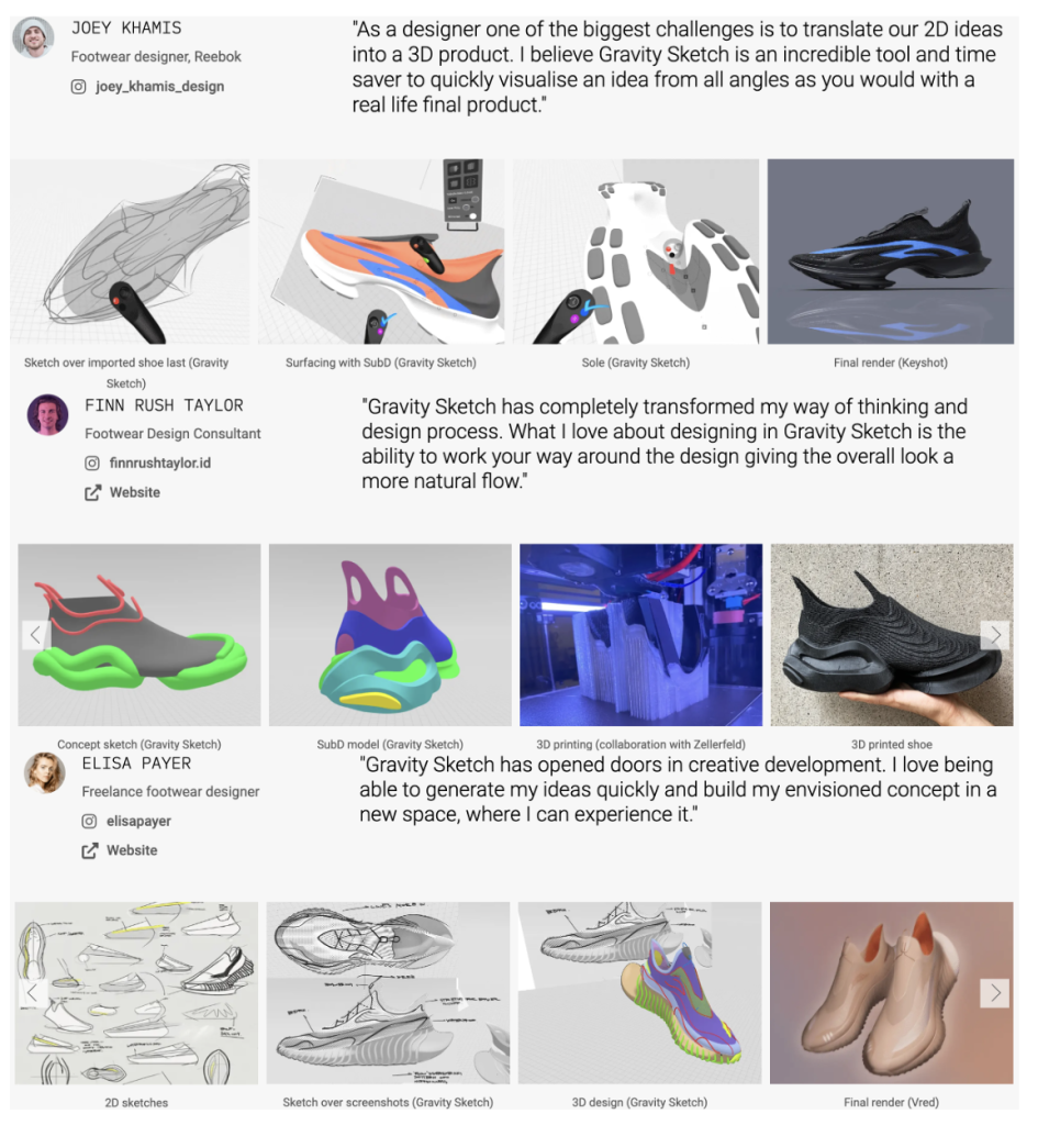
Numerous clothing designers have shared testimonials about their positive experiences with Gravity Sketch. These testimonials often include detailed examples of their workflows, demonstrating how they integrate the software into their creative processes. Interestingly, some designers showcase a combination of tools, using Gravity Sketch alongside other digital art software like Procreate. These insights highlight the versatility of Gravity Sketch and emphasise its compatibility with other popular tools, providing a comprehensive and flexible solution for designers in the fashion industry. Three examples of some testimonies can be seen in figure 2.
In addition to crafting the clothing pieces, I need to consider the presentation. The video below illustrates how someone used Gravity Sketch to construct their scene and design clothing within the same application. I appreciate how they integrated original sketches seamlessly into the final scene, presenting their final product and the process they had to go through to get to the final product.
Procreate
Procreate is the primary app in my plan for 2D sketching before transitioning to Gravity Sketch for the 3D rendering of clothing designs. Specifically designed for Apple’s iPad devices, Procreate is a comprehensive art studio that can be taken anywhere, offering unique features and user-friendly creative tools. The app has significantly improved over the past two years, introducing additional features to enhance the user experience.
Notably, Procreate Dreams, a recent addition, enables users to craft illustrated animations, breathing life into their 2D drawings. In 2022, the app also introduced a 3D feature, allowing users to create and edit 3D models directly within the platform. Despite this innovative addition, few artists have fully embraced or adapted to this 3D feature.
While Procreate isn’t commonly used in fashion design, I chose it for its extensive collection of downloadable brushes and stamps, allowing me to create a prototype closely resembling the final clothing designs. Having the ability to use existing stamps and brushes will give me more time to focus on using and exploring Gravity Sketch which is the main component of this project.
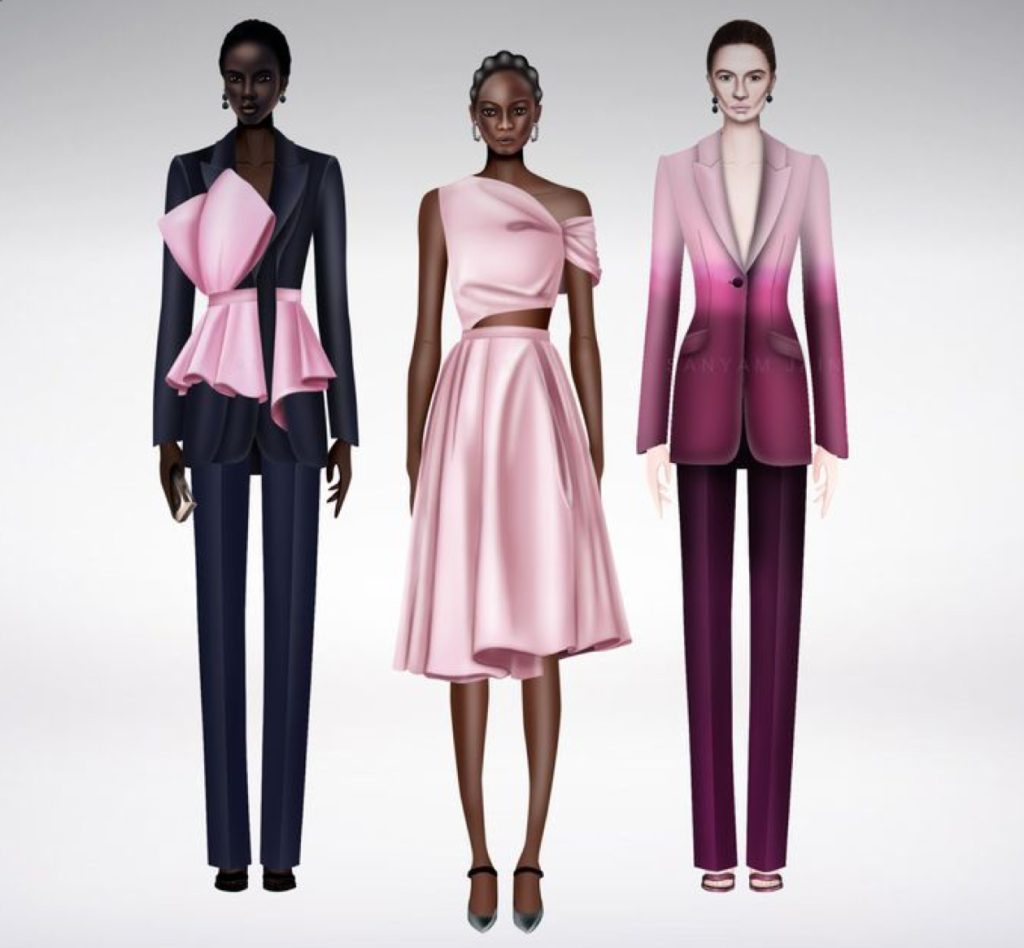
Here’s the work by Indian artist Sanyam Jain using Procreate, where she illustrated an Alexander McQueen collection, showcasing Procreate’s application in fashion. Her illustrations are remarkably realistic, employing various Procreate tools for that effect. However, it’s worth noting that various styles exist in fashion illustration on Procreate, some leaning towards a more low-fidelity approach. This example gives a general gist of the type of product that can be created.
Research
Target Audience
In today’s world, fashion is a widely embraced creative outlet, transcending specific target audiences. It serves as a means for individuals to express their identities openly. While the content I may create can resonate with a broad audience, it’s essential to acknowledge that specific designs may not appeal to more modest religious perspectives or younger age ranges, as people may view them as inappropriate. Recognising the diverse nature of fashion preferences is crucial in ensuring my creations are well received across different perspectives and demographics.
In creating content through digital art, I’ve opted for a versatile approach without narrowing down a specific target audience. I believe that individuals interested in art, digital art, and various facets of the fashion industry will naturally find this type of art more engaging. Rather than defining a demographic, the project’s audience will develop organically, drawing in those genuinely intrigued by the content and fostering a community around shared interests in digital art mediums and fashion.
AUROBOROS
The digital fashion brand Auroboros made history by being the first to showcase its entirely digital collection at London Fashion Week through its DiscoveryLAB platform for emerging brands. This breakthrough meant 3D fashion collections could coexist in physical spaces alongside traditional fashion. The digitally designed pieces were customised for customers who purchased on the website and submitted a photograph, and the outfit was tailored to fit their bodies. Auroboros drew inspiration for their pieces from nature and the sci-fi world, particularly movies like Ex Machina and Avatar. The brand embodies innovation, sustainability, and immersive design. Acknowledged by leading global media outlets such as Vogue, BBC, and Forbes. Auroboros is renowned for pioneering a revolutionary aesthetic and incorporating technological innovation in the fashion industry.
Auroboros serves as a real-world illustration of the application of VR art in the fashion industry. While numerous clothing brands leverage AR and VR technologies, Auroboros aligns closely with the concept I aspire to develop. Their distinctive and captivating work captures my interest, and I enjoy how they present their products.
Here is an image showcasing a selection of the styles featured in the London Fashion Week collection, accompanied by a PDF providing an overview of their digital collection.

Content Inspiration
While the initial spark for this research project came from Bella Hadid’s unique moment on the Paris Fashion Week catwalk, my design inspiration primarily draws from Vera Wang’s notable creations. The collections that resonate with me the most and fuel my creative inspiration are Vera Wang’s Iconic Bridal Lookbook and the Fall 2021 collection. These sources influence my vision and guide the artistic direction of my VR art-infused clothing collection.
Vera Wang

Vera Wang, born American in 1949, a globally celebrated fashion designer, has gained fame primarily through her iconic bridal collections, showcasing exceptional craftsmanship and sophisticated designs. With over 30 years in the industry, Wang is highly respected for revolutionising bridal fashion, offering modern and elegant alternatives. Beyond bridalwear, she has significantly contributed to various fashion realms, including footwear, accessories, fragrance, jewellery, and home decor. Wang’s influence extends across a diverse range of fashion categories, solidifying her status as a critical figure in the industry.
Iconic Bridal Look-book
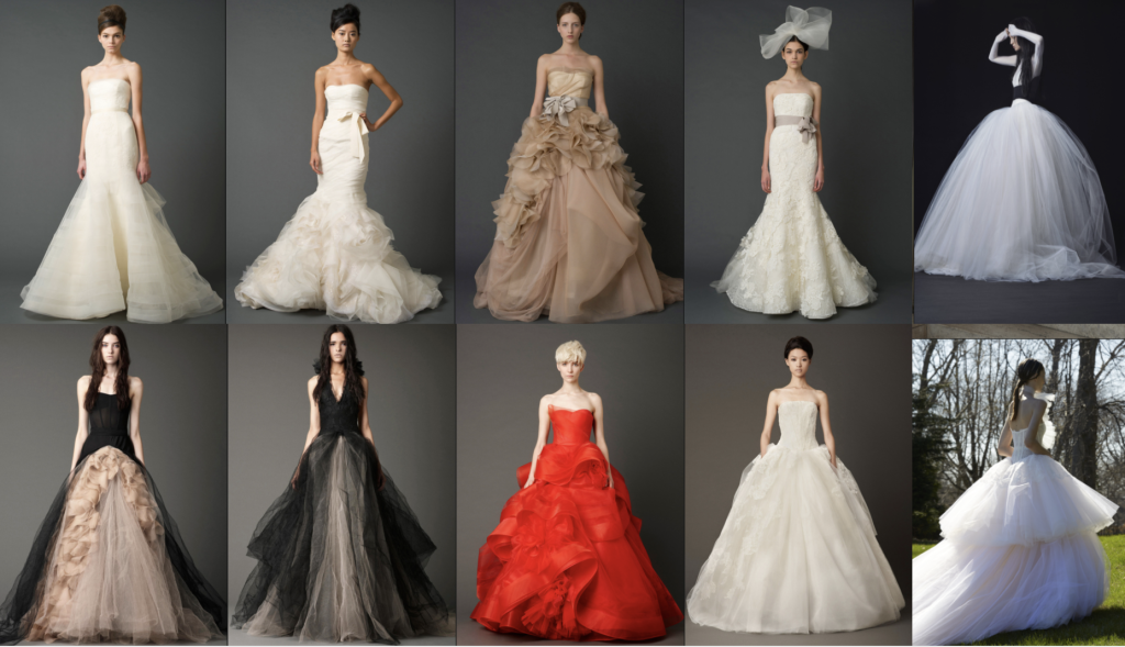
Below is a collection of images sourced from Vera Wang’s Iconic Bridal Lookbook on her website, showcasing the department she is renowned for. The gallery features a blend of both traditionally and socially accepted dresses, as well as more uniquely styled dresses which is a reflection of Wang’s signature approach to modernising wedding fashion. Notably, Wang incorporates light fabrics such as guipure lace, tulle, chiffon, and organza across the majority of her designs, adding to the elegance and charisma of her creations.
Fall 2021 Collection
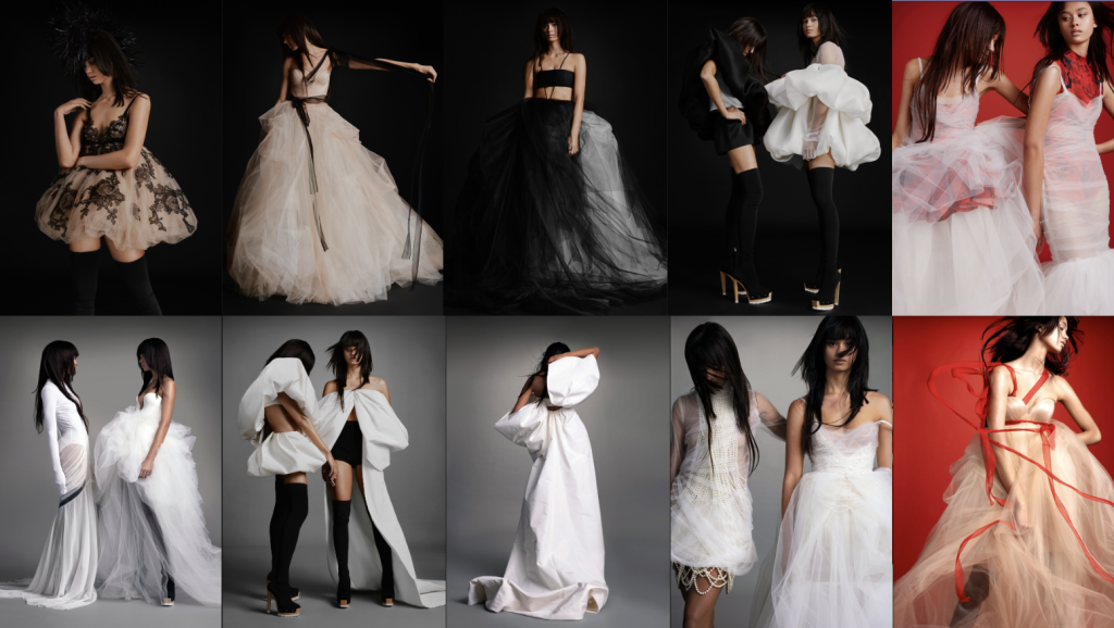
These images showcase Vera Wang’s Fall 2021 collection, featuring clothing items that share similarities with those in the Iconic Bridal Lookbook. Despite using the same materials consistently, each piece possesses distinct characteristics, which I find particularly enjoyable. Overall, I am a fan of the pieces she creates, finding them visually appealing which is why I aim to use her as my inspiration for what I create in this project.
Design Approach
Work Flow
With a specific software in mind and a clear vision of what I want to create, I’ve formulated a workflow that breaks the project into distinct stages. For each stage, I’ve identified the software I plan to use. This preliminary plan provides a structured approach to the design aspect, serving as a foundation for managing project timelines when constructing my Gantt chart.

UX
I aim to create a visually appealing, comfortable, intuitive, and immersive environment. Balancing these elements is vital to ensuring a positive and enjoyable user experience within the virtual space. To help me achieve this, I will explore the principles and ethics of virtual reality.
I’ve explored common UX design principles to enhance my final product. Specifically, Jakob’s Law, Hick’s Law, and Fitts’ Law align closely with my project.

VR Guidelines
As the primary device for my project is a virtual reality headset, understanding and adhering to VR guidelines is essential. Below is a list generated by ChatGPT (Referenced below with link to the chat), encompassing the majority of VR guidelines, along with brief descriptions for each.
- Comfort: Minimise motion sickness by maintaining a stable frame rate, reducing latency, and avoiding sudden movements.
- User Interface (UI): Design intuitive and accessible UI elements, considering the 3D space. Keep important information within the user’s field of view.
- Navigation: Implement smooth and natural movement controls to enhance user experience. Consider teleportation, walking, or a combination based on the VR context.
- Scale and Proportion: Ensure realistic scale and proportion of objects within the virtual environment to enhance immersion.
- Interaction: Provide responsive and realistic interactions, such as hand tracking or controller-based actions. Enable users to interact with objects in a way that mimics real-world behaviour.
- Accessibility: Design for users with varying levels of VR experience. Provide options for comfort settings and accommodate different physical abilities.
- Graphics and Performance: Optimise graphics to maintain a high frame rate and visual fidelity. Consider the capabilities of the target VR hardware.
- Audio: Utilise 3D spatial audio to enhance the sense of presence and directionality within the virtual environment.
- Testing: Regularly test your VR application with real users to gather feedback and identify areas for improvement.
- User Comfort: Include features like a fixed reference point to reduce motion sickness and avoid prolonged VR sessions to prevent fatigue.
While some principles on this list may not align with my project, aspects such as comfort, navigation, and accessibility are relevant. The product I aim to create has minimal user movement, which relates to the three principles I have noted. There won’t be overwhelming graphics or movements to prevent motion sickness, which I struggle with and will test throughout the process. No running or teleporting is required; users can steadily walk around clothing items at their own pace. This design also caters to accessibility, ensuring wheelchair users can navigate the experience easily by moving comfortably within an open and spacious area.
Ethics
Ethics is another aspect to be mindful of in the project. ChatGPT has compiled a list of all the ethical considerations related explicitly to virtual reality below (Referenced below with link to the chat).
- Privacy Protection: Safeguard user data responsibly.
- Informed Consent: Inform users and seek consent for data collection.
- Content Appropriateness: Ensure content aligns with ethical standards.
- User Safety: Prioritise physical and psychological well-being.
- Accessibility: Design inclusively for diverse user needs.
- Security Measures: Implement robust measures to protect user accounts.
- Data Ownership: Clearly define and respect user data ownership.
- Community Standards: Enforce respectful and inclusive user interactions.
- Fair and Inclusive Design: Avoid unintentional biases in design.
- Regulatory Compliance: Adhere to legal and regulatory frameworks.
- Children’s Privacy: Comply with child privacy protection laws.
- Transparency: Communicate app functionality and data usage.
- Regular Audits and Updates: Conduct ethical audits and keep the app updated.
- Environmental Impact: Consider sustainability in development.
- User Feedback and Improvement: Encourage user feedback and address concerns promptly.
These ethical considerations may not directly relate to my project and some overlap with the VR guidelines mentioned earlier. Two points particularly relevant to my project are user feedback and accessibility. User feedback is crucial for product improvement, addressing safety, comfort, and potential issues like cybersickness. Accessibility is crucial as the application/software should be suitable for everyone. My project aims to prioritise accessibility by considering various disabilities—for instance, avoiding flashing lights and ensuring the design accommodates wheelchair users.
Project Plan
I’ve created a project plan detailing the milestones I aim to accomplish during my research project. I utilised techniques like Scrum’s User Stories and task management boards to articulate user-centric goals. This plan outlines the sequence of activities, expected timeframes, and key deliverables at each milestone. It serves as a structured timeline, clearly illustrating the progression of my research project. These milestones will be pivotal for tracking progress during the second half of this module.
Scrum User-Story
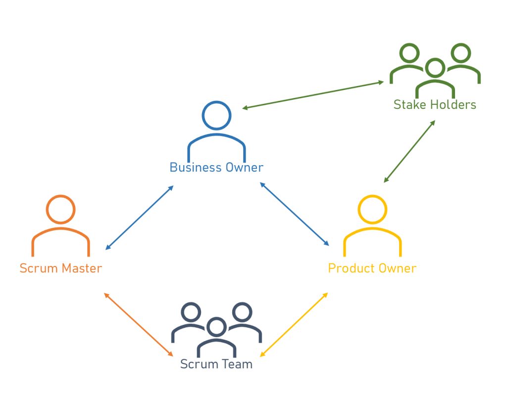
Scrum is a framework teams employ to organise and collaborate towards a shared objective. It outlines a series of meetings, tools, and roles to enhance project delivery efficiency. Many roles make up a scrum; the diagram below shows who is included and an idea of the hierarchy of a scrum.
In agile software development, a user story keeps end users in focus. It uses plain language to help the team understand why, what, and the value of what they’re building, boosts collaboration and creativity and improves the overall product.
A simple way to think about user stories is who, what and why. By describing who is using the product, what they want to achieve with it and why, you keep can design features that are centred around the user.
Thinking of the experience being developed, the following user story was created.
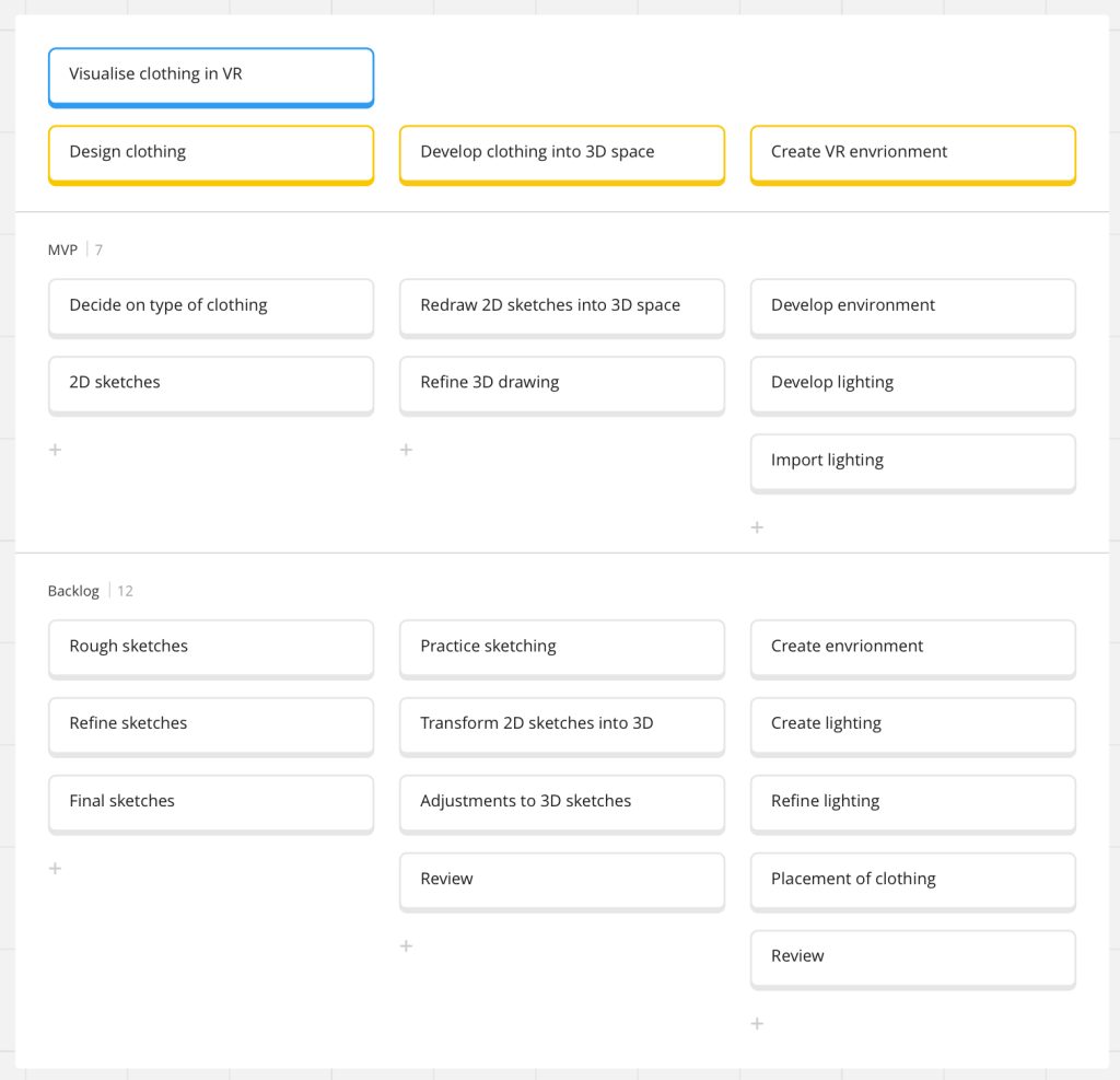
“As a mum, I prefer to shop online as I don’t have the time to go shopping in person but I want to see the shape of the clothes which I can’t fully gage from just photos before purchasing.”
By using this user story, a user story map can be created linking the user story to the development and features of the experience being developed.
Project Management
I’ve crafted a Gantt chart using Team Gantt, meticulously outlining how to distribute my time and specify tasks. I must adhere to this chart to ensure the project reaches its highest standard. I’ve also factored in that I have tasks from my major project that will run alongside this assignment project, allowing for a comprehensive time management approach.
Within the limited timeframe, I’ve allocated significant time to crafting the clothing pieces. This phase seems time-intensive, and I aim to give myself ample time for refinement, corrections, and achieving the desired quality or close to it.

Concept Storyboard
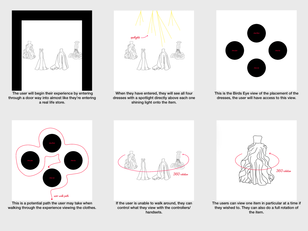
In visualising my project’s concept, I’ve developed a preliminary storyboard, providing a somewhat sequential representation of the user’s journey and interaction with the project’s contents. I aim to allow users the freedom to navigate without a predefined path. The storyboard serves as a rough guide, offering insights into how users might move through their experience, providing a bird’s-eye view of potential paths they may take and showing what the user can do if they’re unable to move around.
References
- AWS Amazon. Unknown. What is Scrum?. [ONLINE] Available at: https://aws.amazon.com/what-is/scrum/#:~:text=Scrum%20is%20a%20management%20framework,experience%2C%20and%20adapt%20to%20change.. [Accessed 22 November 2023].
- Analytic Steps. 2022. Virtual Reality in Fashion: Examples, Benefits and Uses. [ONLINE] Available at: https://www.analyticssteps.com/blogs/virtual-reality-fashion-examples-benefits-and-uses. [Accessed 23 November 2023].
- Atlassian. Unknown. User stories with examples and a template. [ONLINE] Available at: https://www.atlassian.com/agile/project-management/user-stories. [Accessed 10 November 2023].
- Cannibals. 2023. 7 Different Types of Target Examples for Fashion. [ONLINE] Available at: https://cannibals.digital/target-examples-for-fashion/?utm_content=cmp-true. [Accessed 9 November 2023].
- Dazed. 2021. AUROBOROS is the tech fashion house creating celestial cyber couture. [ONLINE] Available at: https://www.dazeddigital.com/fashion/article/51913/1/auroboros-celestial-couture-alexander-mcqueen-vr-technology-digital-fashion. [Accessed 10 November 2023].
- Design By Michel. (2023). Designing a Fashion Scene in Gravity Sketch VR. [Online Video]. 3 February 2023. Available from: https://youtu.be/y-CSTHxbShA?si=eaKAU5Nb0mpz7kaL. [Accessed: 22 November 2023].
- Dezeen. 2022. Dress sprayed onto model on Coperni catwalk at Paris Fashion Week. [ONLINE] Available at: https://www.dezeen.com/2022/10/04/spray-on-dress-paris-fashion-coperni-bella-hadid/. [Accessed 9 November 2023].
- Emperia VR. 2021. 5 FASHION BRANDS MAKING WAVES IN VR. [ONLINE] Available at: https://emperiavr.com/2021/07/01/5-fashion-brands-making-waves-in-vr-emperia/. [Accessed 9 November 2023].
- Fashion Innovation Agency. Unknown. The Fabric of Reality – An Immersive VR Fashion Show. [ONLINE] Available at: https://www.fialondon.com/projects/ryot-studios-the-fabric-of-reality/. [Accessed 23 November 2023].
- Fashion United. 2022. LFW’s DiscoveryLab designers bring social commentary to fashion. [ONLINE] Available at: https://fashionunited.uk/news/fashion/lfw-s-discoverylab-designers-bring-social-commentary-to-fashion/2022022261514. [Accessed 9 November 2023].
- Gravity Sketch. Unknown. Products. [ONLINE] Available at: https://www.gravitysketch.com/products/. [Accessed 10 November 2023].
- Gravity Sketch. Unknown. Workflows. [ONLINE] Available at: https://www.gravitysketch.com/workflows/. [Accessed 10 November 2023].
- Jain, S., (2023) Alexander McQueen – Couture Fashion Illustration and Sketches by Indian illustrator Sanyam Jain. [ONLINE]. Available at: https://pin.it/4vYuELw [Accessed 22 November 2023].
- London Fashion Week. Unknown. AUROBOROS. [ONLINE] Available at: https://londonfashionweek.co.uk/designers/auroboros. [Accessed 9 November 2023].
- Medium. 2022. Using Procreate 3D for Augmented Reality design. [ONLINE] Available at: https://medium.com/popul-ar/procreate-3d-for-augmented-reality-452925127f8d#:~:text=Procreate%20is%20an%20iPad%2Donly,new%20sets%20of%20useful%20features.. [Accessed 10 November 2023].
- OPENAI CHATGPT (2023) VR Design Guidelines [AI Generated Chat]. Prompted by Ellie Ward. 26 November 2023, 19:49. https://chat.openai.com/share/44a769ab-54fa-4fe7-82c3-2266c128ba13
- OPENAI CHATGPT (2023) VR Ethical Considerations [AI Generated Chat]. Prompted by Ellie Ward. 26 November 2023, 18:36. https://chat.openai.com/share/a75f51da-8791-4109-9009-9de984c85e40
- Procreate. Unknown. Procreate for iPad. [ONLINE] Available at: https://procreate.com/ipad. [Accessed 10 November 2023].
- Wedding Dresses I Love. Unknown. What makes a wedding dress a ‘Vera Wang’?. [ONLINE] Available at: https://www.weddingdressesilove.com/vera-wang-wedding-dresses.html. [Accessed 22 November 2023].
- Ward, E .(2022). ‘UI principles to be applied to your design’ UI & UX Design. University of Hull. Published Essay.
- Vera Wang. Unknown. Bridal/Iconic. [ONLINE] Available at: https://www.verawang.com/bridal-collection/iconic-wedding-dresses/?country=Global%20Site&id=20272. [Accessed 19 November 2023].
- Vera Wang. 2021. FASHION/FALL 2021. [ONLINE] Available at: https://www.verawang.com/fashion-collection/spring-2021/. [Accessed 19 November 2023].
- Vera Wang. Unknown. THE WORLD OF VERA WANG. [ONLINE] Available at: https://www.verawangbride.com/vera-wang-world. [Accessed 9 November 2023].

One thought on “Research Proposal”
Comments are closed.