Post Five: Website
This post will outline the process of designing the Wardell Homes website. Since the website is not a significant component of this project, the designs and prototypes are not extensive. Instead, they provide a general idea of the website’s appearance and included features. I wanted to show how the website would run alongside the companion app which was a big component of the project. I again wanted to showcase the skill set I had gained throughout the course.
Functionality
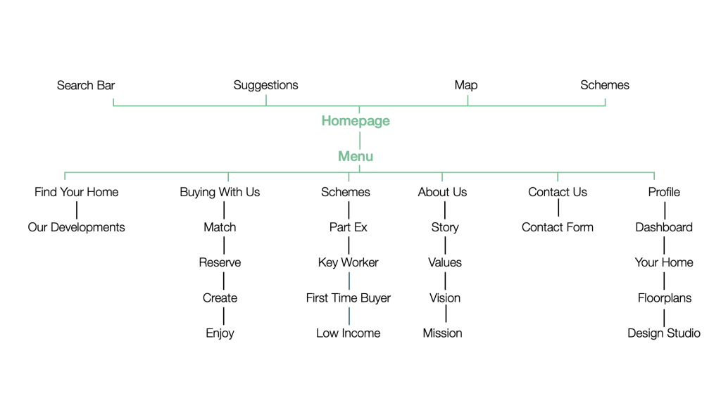
Before starting the design process, I developed a basic flowchart to map out my website’s structure and determine which design screens to include. This initial step ensured a smooth and coherent design flow. By defining the functionality early on, I was able to strategically place each feature within the app’s layout, enhancing the overall user experience.
Design
Software
For the website design, we chose Figma as our software tool. Although Adobe XD shares many features with Figma, we found Figma to have a significant edge due to its superior collaborative capabilities and accessibility on various devices. Figma’s real-time collaboration allows multiple team members to work on the same project simultaneously, fostering seamless teamwork. Moreover, its cloud-based platform enables access from any device with internet connectivity, offering greater flexibility and convenience.
I developed a comprehensive component library to ensure a consistent design across the website and the app. This library included all the elements needed for the website, eliminating the need to recreate designs from scratch. This ensured uniformity and facilitated the easy transfer of these components to the app design, maintaining a cohesive and consistent user experience across both platforms.
Design Process
The website is not a major component of the project, so I did not design a fully functional website. However, I still wanted to provide a preview of how it would look if it were fully designed.
As previously mentioned, I started the process by creating a component library to incorporate directly into the design. While designing these components, I ensured adherence to the brand guidelines and style guide.
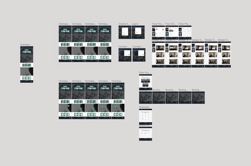
Typically, a web designer would employ wireframes to outline all the components and the overall design. However, I chose a different path. I find that I work more efficiently and swiftly by diving straight into high-fidelity designs. This approach not only allows for quick iterations but also demonstrates my adaptability and productivity. I can easily make alterations once the designs are complete if I am unsatisfied with them. Wireframing, on the other hand, doesn’t provide a comprehensive view of how all components work together or if the composition is correct, hence my preference for high-fidelity design.
Before beginning the design process, I used a flowchart to map out each website page to create a structured approach. From there, I started adding each component to construct the design. Once I felt the design was complete, I reviewed each frame and made necessary adjustments until I was completely satisfied.
Prototyping
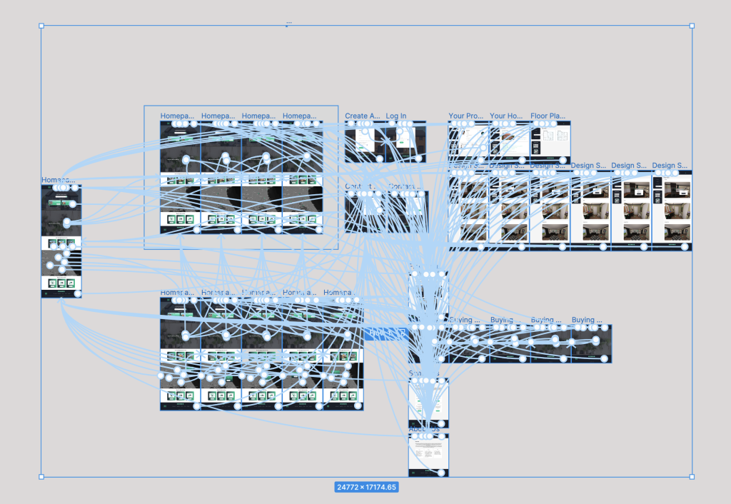
The prototyping process was smooth and efficient due to the strategic layout of frames and Figma’s powerful features. Figma’s ability to select and transfer multiple components simultaneously streamlined the workflow. I added animations for hover actions on specific parts, particularly on the homepage and the “Buy with Us” page. My prior experience with Figma made the design process straightforward.
Completed Design
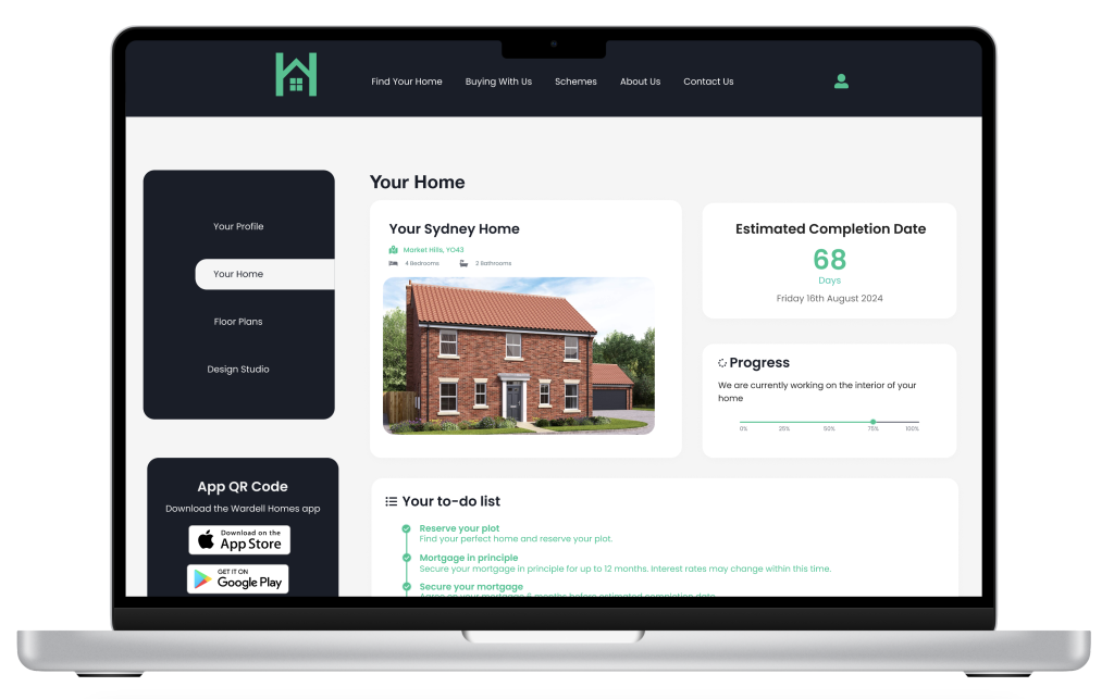
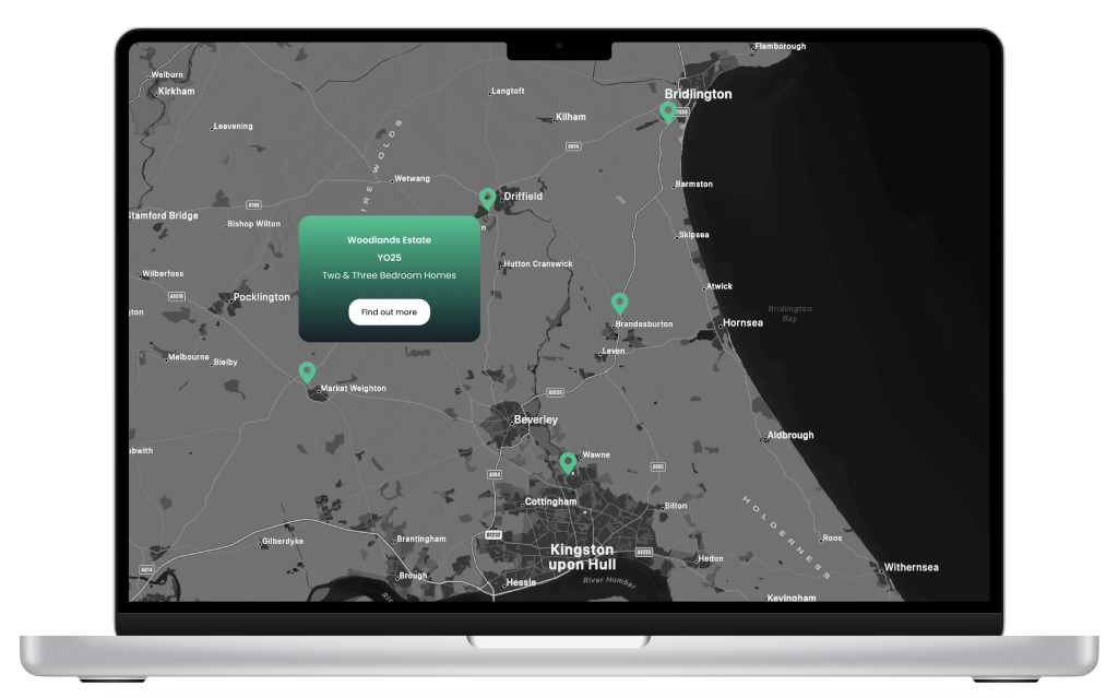
The website design maintained a simple aesthetic, with a restrained use of animations and animated call-to-action elements. The overall design adhered closely to the brand guidelines and style guide, ensuring consistency across all assets associated with and created for Wardell Homes. This commitment to brand consistency helped strengthen the website’s overall identity and connection to Wardell Homes.
Below is a preview of the website design and the Figma link, which provides direct access to the file. The link allows you to explore the prototype and examine the designs closely.
Website Breakdown
The video of the website breakdown will be included as part of the practical work assignment, so you may choose to skip it. However, it provides a general overview of the website’s design and functionality.
How the post contributes to the project’s objective
The website supported the app with user profiles and showcased potential design and functionality, illustrating a seamless digital experience. Whilst it wasn’t a major component, I felt as though it contributed towards how the website can run alongside the companion app. I felt it was necessary to produce this work since the app was a companion, not a stand alone app.
Time Management Reflection
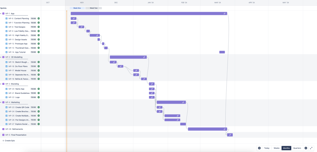
I didn’t originally plan on designing a website since it wasn’t a major project component. However, I had extra time left from other tasks, so I created a brief design. This took me a few days to complete. As I have stated on other posts throughout my development of the project, I wanted to showcase the skills I learnt and put them into practice on my own project; This is the reason it didn’t take me too long to complete since I was familiar with the software.
References
Images Used
- Graven Hill. (n.d.). 3 Bedroom Houses For Sale In Bicester, Oxfordshire. [online] Available at: https://www.gravenhill.co.uk/3-bedroom-homes-for-sale/ [Accessed 19 March 2024].
- Graven Hill. (n.d.). 4 Bedroom Houses for Sale In Bicester, Oxfordshire. [online] Available at: https://www.gravenhill.co.uk/4-bedroom-homes-for-sale/ [Accessed 19 May 2024].
- Graven Hill. (n.d.). 5 Bedroom New Homes for Sale in Bicester, Oxfordshire. [online] Available at: https://www.gravenhill.co.uk/5-bedroom-homes-for-sale/ [Accessed 19 March 2024].
- published, J.P. (2023). The only 5 tips you need to know about hanging plants indoors – simple steps to successful suspension. [online] livingetc.com. Available at: https://www.livingetc.com/advice/the-only-5-tips-you-need-to-know-about-hanging-plants-indoors-simple-steps-to-successful-suspension [Accessed 19 March 2024].
- Welham.(Unknown).Peter Ward. Available at: https://peterwardhomes.co.uk/ward-hills-bridlington/welham/. [Accessed 19 March 2024].
