Conceptual Design/Community Projects
The Big Issue UK
Good Example

Who Are The Big Issue UK?
It is a form of print media that is sold on the high street to accumulate money that goes towards charities. The charities help to generate opportunities and pathways that benefit people on low income or no income. The proceeds are used to reduce the percentage of homelessness by contributing towards housing for those in need.
The Logo
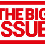
Red creates a sense of urgency; it is proven to be more attractive to the human eye making people instantly drawn to the colour. It is symbolic to life and health which relates to those in need because they require assistance.
The thick rectangular border highlights the text of the logo clearly. The use of capital letters attracts the viewer’s attention. Subtly the word “issue” is in a larger font size which could highlight how big of an issue poverty is.
Breast Friends
Bad Example

Who Are Breast Friends?
It is a foundation that was created to help, support, and connect people with, previously been diagnosed or have been effect by breast cancer. It was created to help see the positives of the disease. The foundation educates and empowers those effected.
The Logo
The butterfly is non conceptual, it does not have a relation to breast cancer. The butterfly however could have a link to nature and happiness. There is too much information displayed for a logo leading to people thinking this might not be a logo.
The logo uses too much letter spacing which makes the logo feel separated, the opposite of the brand. The logo highlights the letters H E R in pink, creating an acronym of her, however breast cancer can be in both females and males. The use of pink highlights does at least link to the breast cancer ribbon.
Breast Friends Redesign

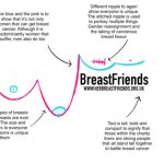
Figure 3 shows the redesign of the logo. There is a change in colours, composition and typography compared to the original logo. The pink colour in the original logo has been kept and carried through to the redesign. However, the blue within the logo has been added to the redesign. This is to promote the fact that is not just women who suffer with breast cancer but men also do.
The typography in the redesign has been completely changed to help signify more of what the charity is about. The text spacing has been decreased to portray togetherness, it is bold to show that the people within the charity are strong and stand together.
The imagery of the breasts may be seen as explicit, it is important to show what the charity is about. There is no symmetry with the breasts as it shows that everybody is different.
References
American Cancer Society. n.d. Breast Cancer Information and Overview. [ONLINE] Available at: https://www.cancer.org/cancer/breast-cancer.html. [Accessed 1 November 2021].
The Big Issue UK. (2021) About Us. [Online]. Available online: https://www.bigissue.com/about-the-big-issue-group/ [Accessed 29/10/2021].
HER Breast Friends. (2021) About Us. [Online]. Available online: https://herbreastfriends.org.uk/about-us/ [Accessed 29/10/2021].
MVOrganizing. 2021. What do bold words indicate?. [ONLINE] Available at: https://www.mvorganizing.org/what-do-bold-words-indicate/. [Accessed 1 November 2021].
Sensational Color. n.d. Color Symbolism and Meaning of Blue. [ONLINE] Available at: https://www.sensationalcolor.com/meaning-of-blue/. [Accessed 1 November 2021].
Sensational Color. n.d. Color Symbolism and Meaning of Pink. [ONLINE] Available at: https://www.sensationalcolor.com/meaning-of-pink/. [Accessed 1 November 2021].
Sensational Color. n.d. Color Symbolism and Meaning of Red. [ONLINE] Available at: https://www.sensationalcolor.com/meaning-of-red/. [Accessed 1 November 2021].
UMKC. 2018. Sexism in Colors. [ONLINE] Available at: https://info.umkc.edu/womenc/2018/06/25/8369/. [Accessed 1 November 2021].
