
Extended Research
Colour Research
“Color is a power which directly influences the soul.”
Wassily Kandinsky
Colour Psychology
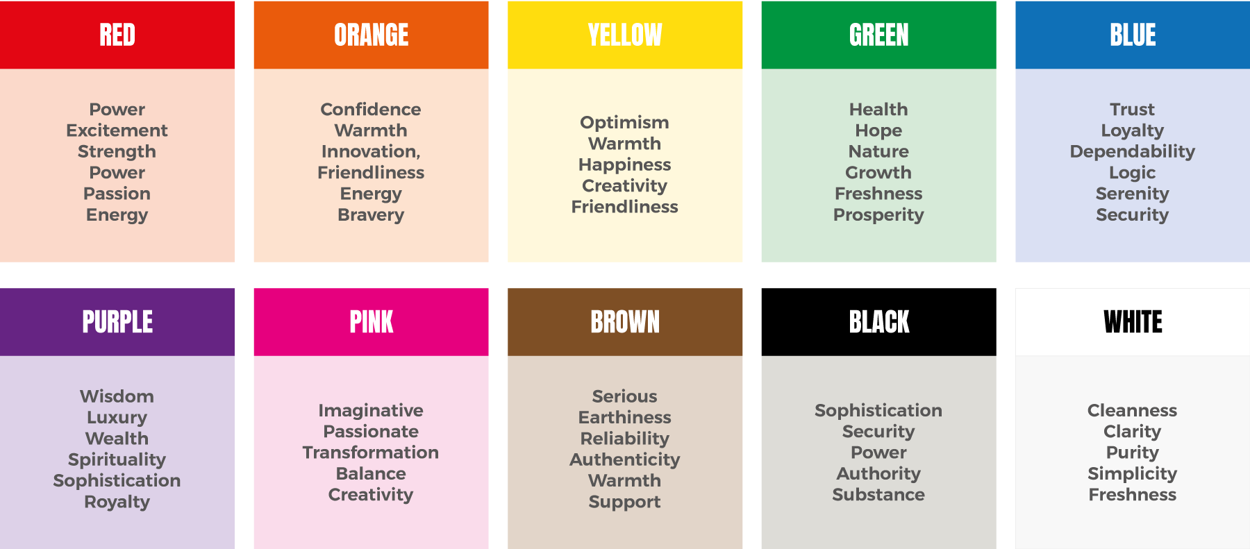
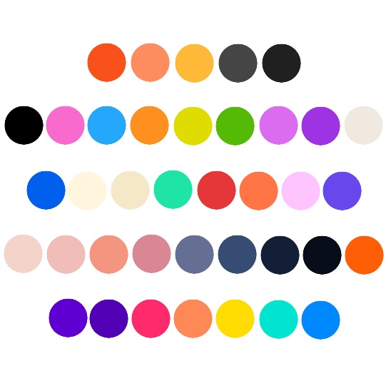
Colour psychology is the study of how colours can effect the emotions and behaviour of a person. In graphic design colour psychology is essential as it helps to chose a colour that will evoke the appropriate emotions by the user. Figure 1 displays a chart of 10 colours, each with the feelings behind those colours. At first glance, an ideal colour palette would consist of Orange, Blue, Pink and Red.
Colour in gender
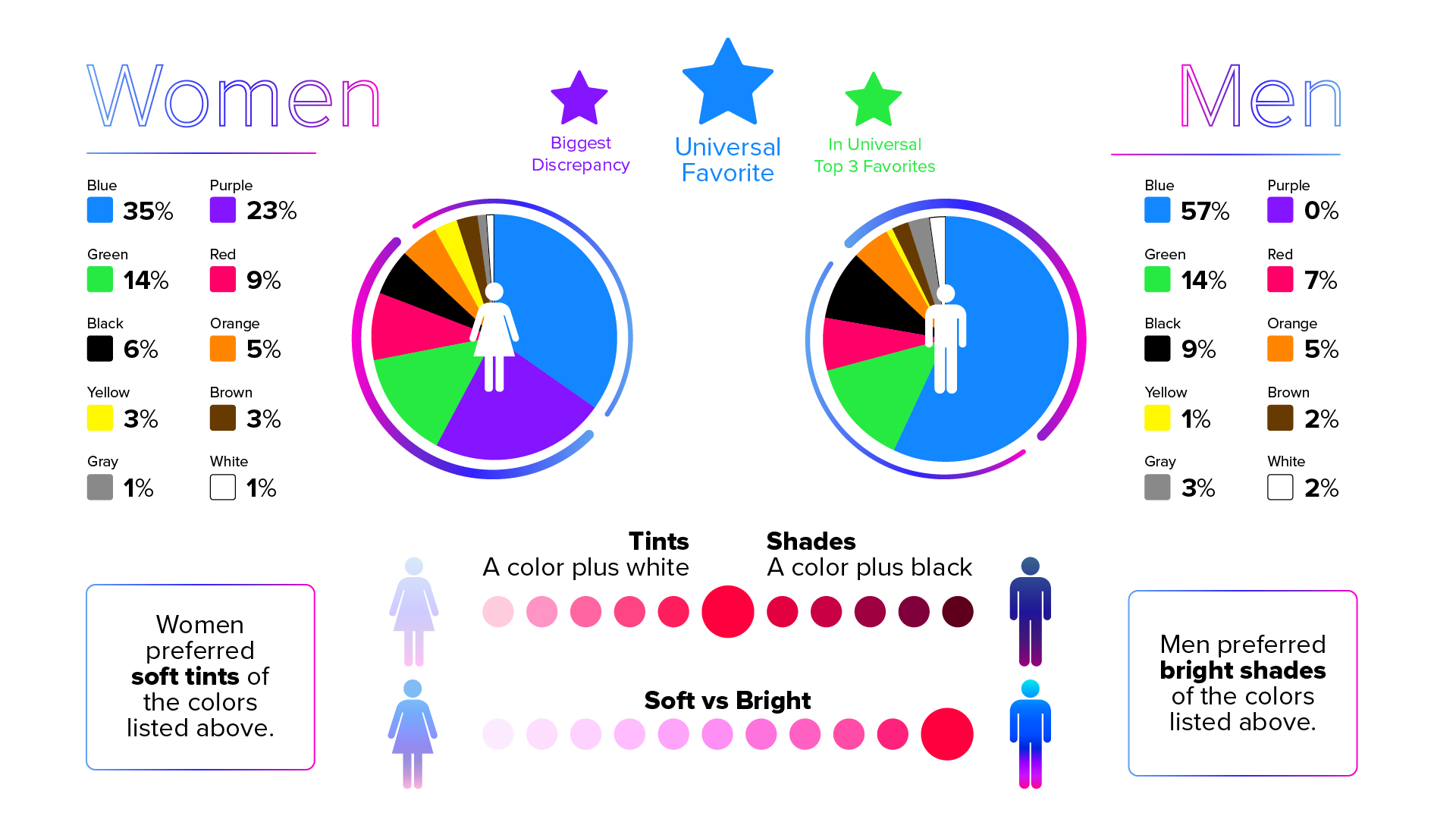
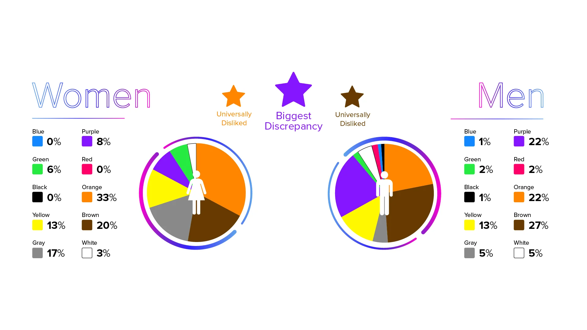
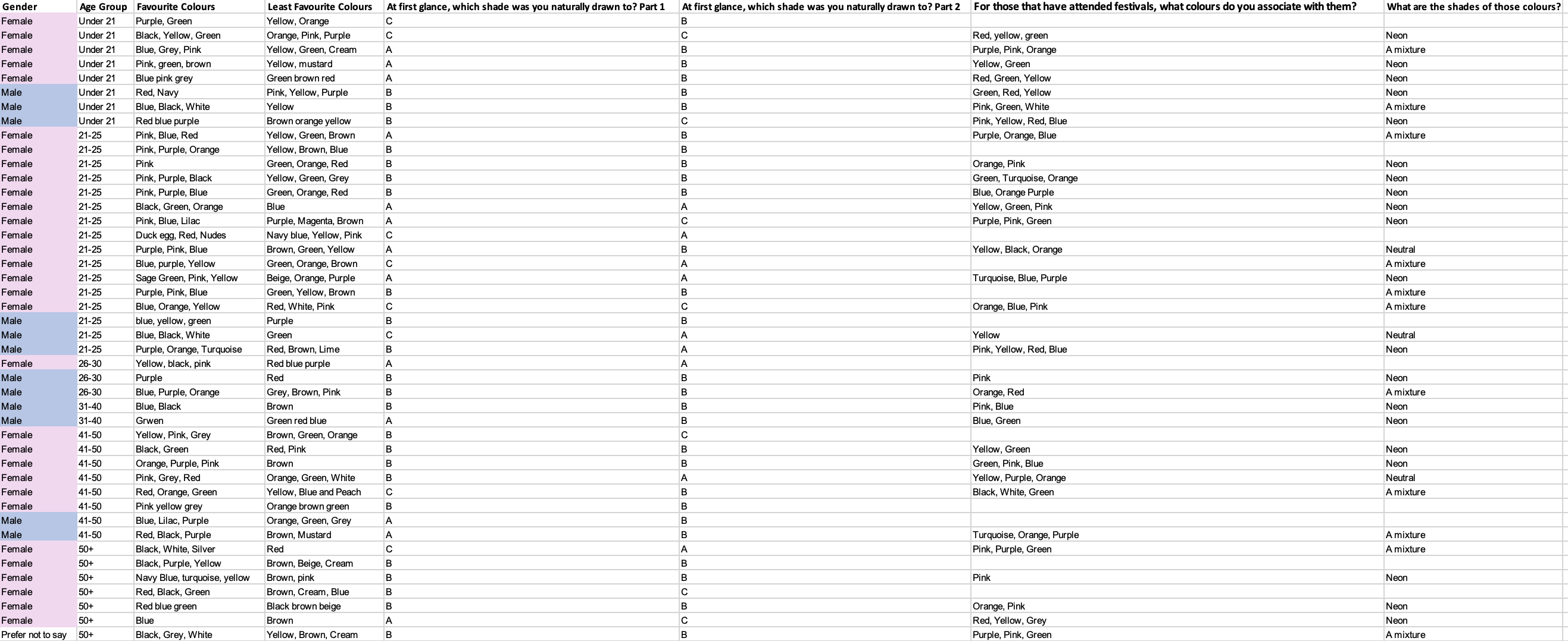
It is important that the colours have to appeal to all genders. Figure 2 and 3 show research conducted between males and female on their favourite and least favourite colours. It becomes easier to see what colours and shades are most preferable between the genders and what their common denominators are to avoid using colours that are heavily disliked. These colours can also differ within age groups which would lead on to conducting firsthand research to distinguish the differences. Knowing these differences will help tailor the designs towards the target audience.
Research on other colour palettes
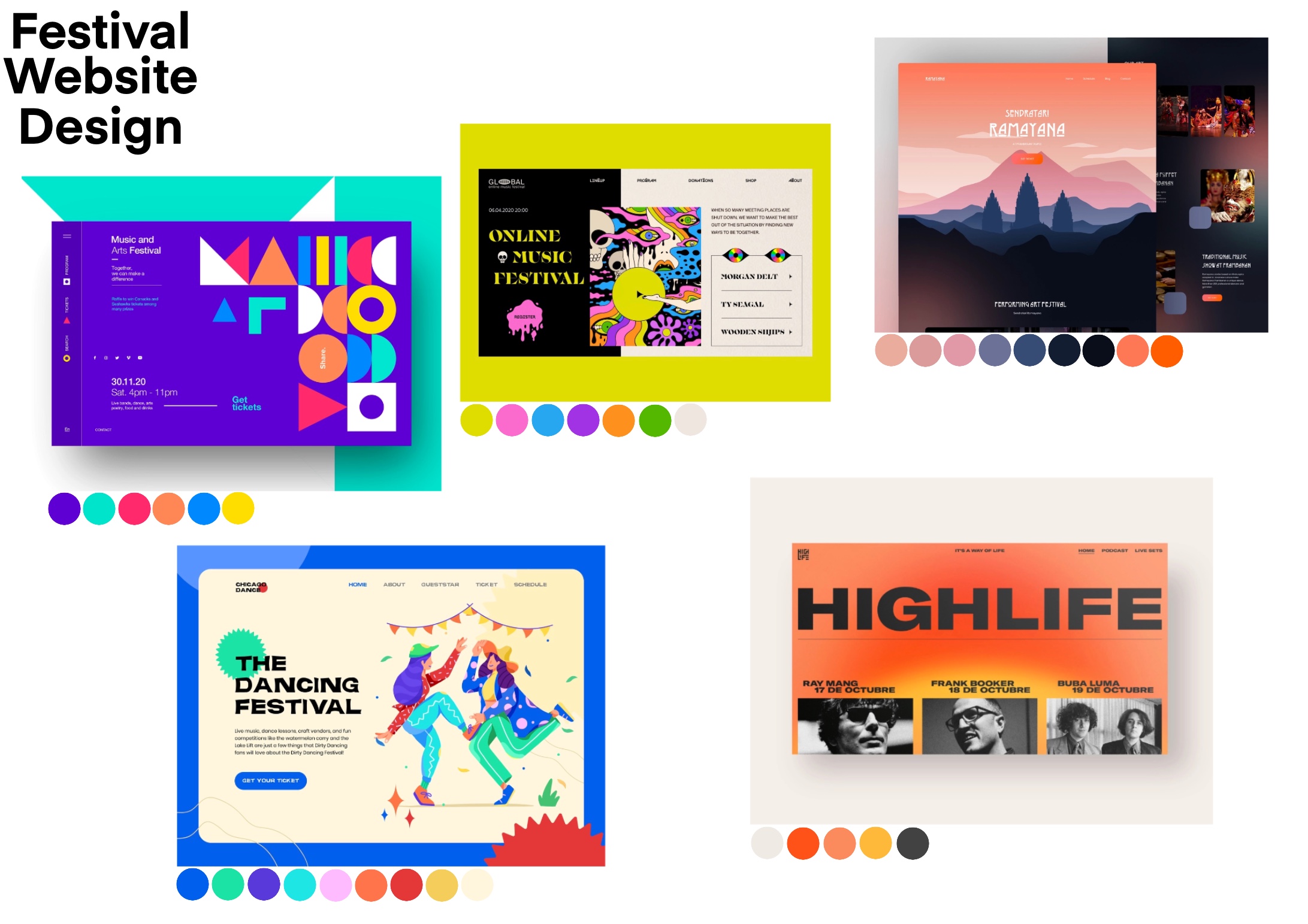
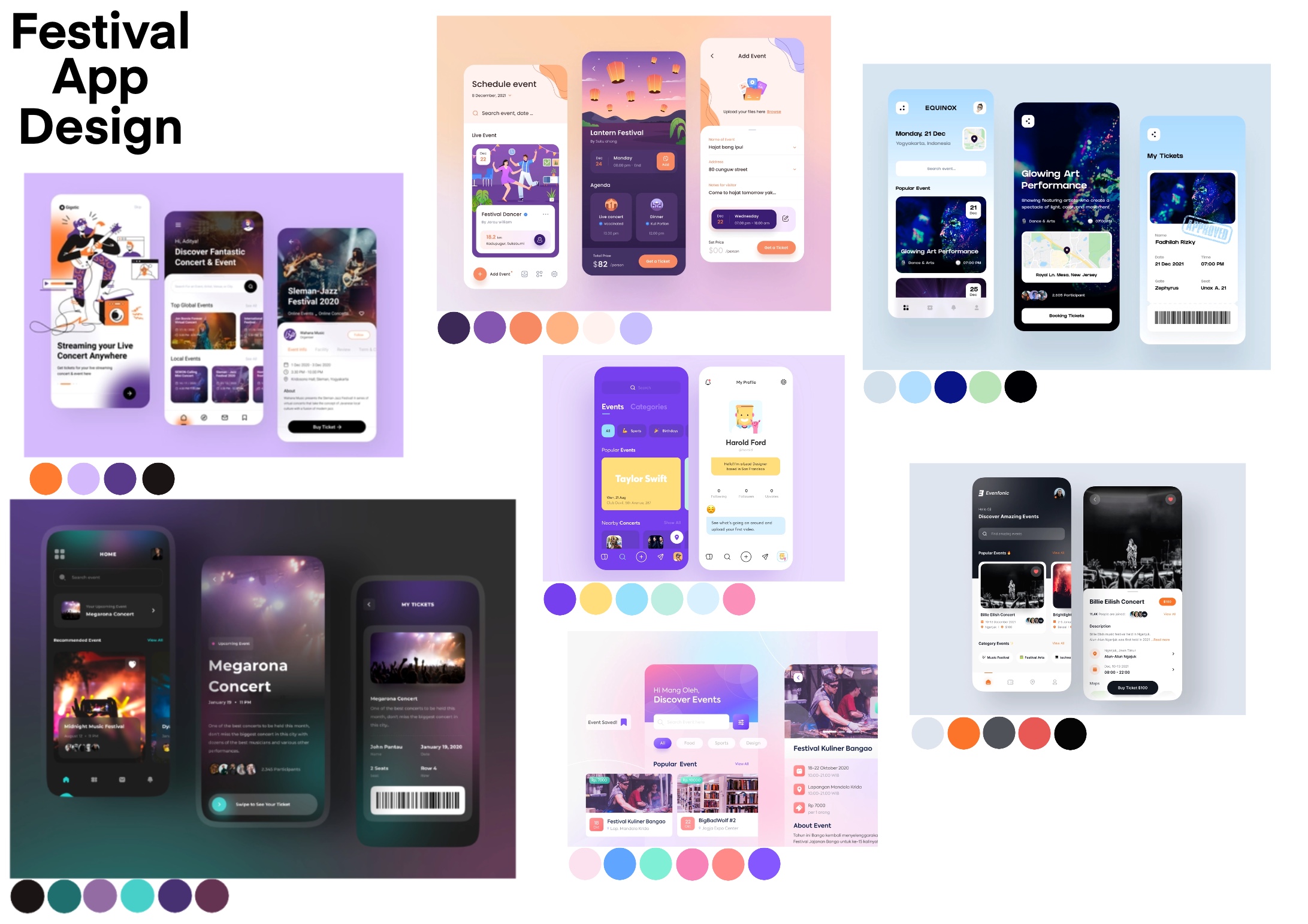
Moodboards on existing app and web designs were created and can be found further into this post. Aside from generalised research on colour, it is useful to obtain information from festival websites and apps of a similar setting. From these designs, a colour pallete was created in order to distinguish what appeared to be the most popular colours. This will help in the decision making of the colours that will be used for the Childish Festival website and companion app. Figure 4 and 5 display a set of colour palettes picked from the mood boards.
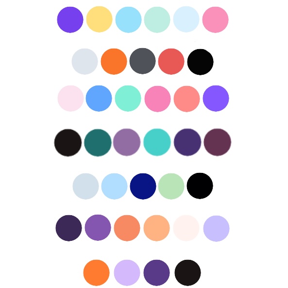
The most common colour that appears thoughout the website and app designs is purple , followed by blue and orange.
In the research of colour in genders, purple had the biggest discrepancy as it was the most popular disliked colour whilst also sitting in the top 3 favourite colours.
Orange was in the top 3 disliked colours between genders, however, in colour psychology this colour portrays energy and friendliness which is what the designer wanted the users to feel. In this instance the designer has prioritised the emotions of the user rather than what colours the user may not like.
Blue on the other hand was the universal favourite colour. Blue represents a sense of freedom and imagination which directly relates to the meaning of a festival. The attendees what to feel free and they often use festivals as a stress reliever and to feel positive energy.
Primary Research
After doing research on popular colours and what colours people find most attractive, generalised information was gained. In addition to online research, more specific research was required which lead to obtaining data firsthand.
A questionnaire was created with a series of questions that would assist in the decision of the colour palette of the designs. This questionnaire was shared across Facebook and Instagram for a variety of people to take part in. The form can be found at https://forms.gle/iA8kzYqBCdyGrzDS8.
Figure 6 displays those results.
Typography
Referring to Jakobs law for the website and app to be successful, the user would benefit from familiarity in the design. Text is a major component so this would be a great way to show the user some familiarity. The typeface also has to fit with the theme of the festival otherwise it would make the user feel out of place. The top 5 fonts that are regularly used by publishers and marketers are as follows:
- Helvetica
- Calibri
- Futura
- Garamond
- Times New Roman
Fonts 1 and 2 appear to be the most used fonts across the world. They are primarily seen to be business related, often used on forms and invoices. Helvetica doesn’t hold much character which therefore leaves a neutral impression which isn’t the desired effect wanted for the design. Calibri was a font created by Microsoft and was set as default across their software applications which makes it the most noticeable font. Due to both fonts being associated with businesses an in a more formal setting, it wouldn’t be appropriate to use either of them in this instance.
Font 3, Futura, is a post modern typeface which is based on geometric shape meaning each character is drawn from either a circle, square or triangle. Futura holds the characteristics of futurism and has a modern feel to it. This typeface is popular in the creative media industry, used in film making and graphics in general. It would be a plausible font to use as it assists in making the website and app feel modern and look more futuristic.
Fonts 4 and 5 are seen as elegant typefaces that are generally used in books and journalism. They are pre-modern fonts which don’t fit with a modern day music festival, like the Childish festival. For that reason, it would be inappropriate to use these.
Existing music festival typography
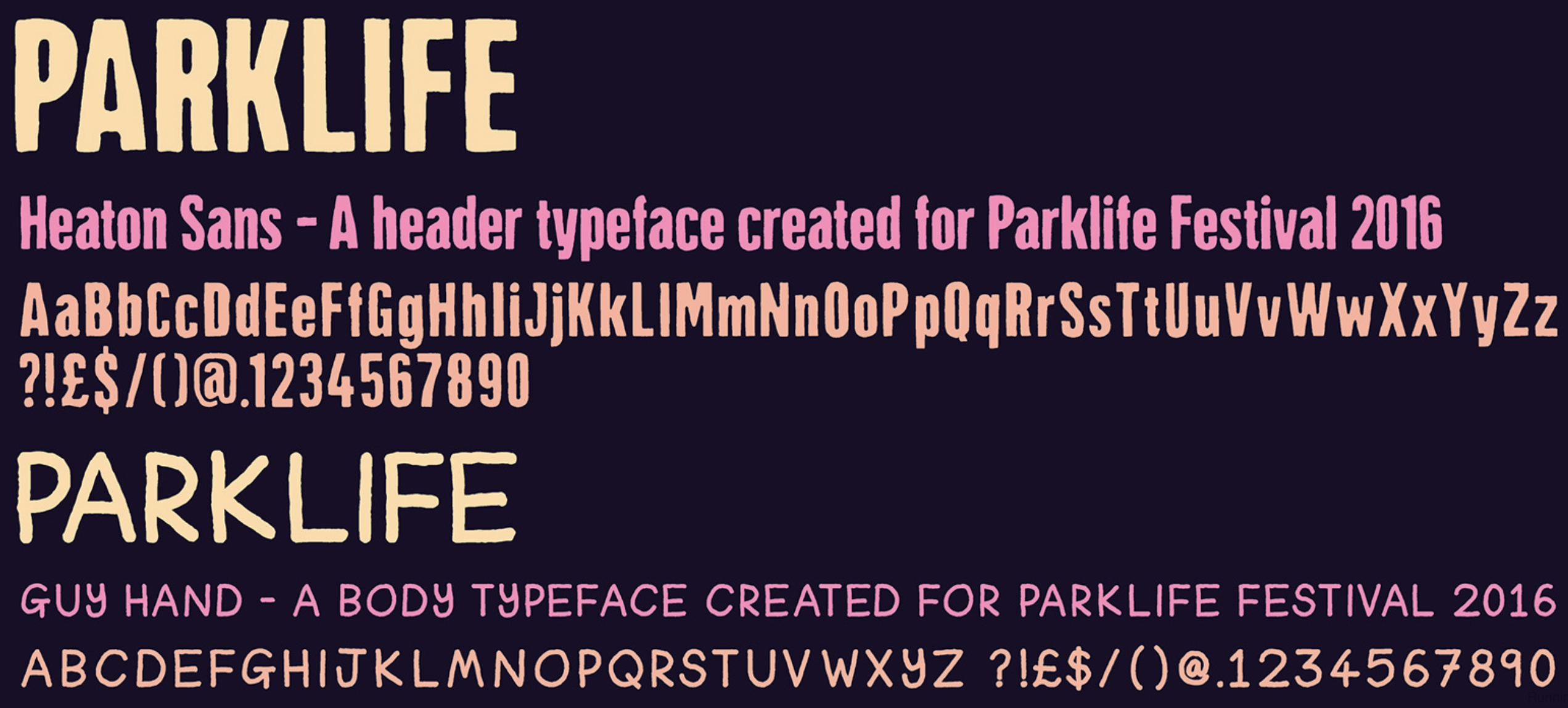
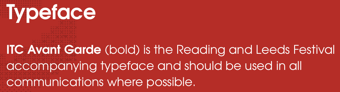
Below is a series of images that show the typefaces used on other popular festival websites and companion apps that were taken directly from their style guides.
Composition
Composition is essential when it comes to the success of an application. Each individual element must come together for the design to be appealing to the user. Composition is also important if you want a particular element to stand out to the user, such as a call to action button.
Below are figures 9 and 10, these are moodboards of existing designs created on XD. The colour scheme are included below each design to assist in colour research.
Festival Website Artboards
Festival App Artboards
References
- Formation Media. 2015. Colour psychology – using colour to appeal to your target market. [ONLINE] Available at: https://formationmedia.co.uk/blog/colour-psychology-using-colour-to-appeal-to-your-target-market/. [Accessed 30 March 2022].
- Resene. Unknown. Colours for teenagers. [ONLINE] Available at: https://www.resene.co.nz/homeown/use_colr/colours-for-teenagers.htm. [Accessed 30 March 2022].
- Business 2 Community. 2013. 10 Colors That Increase Sales, and Why. [ONLINE] Available at: https://www.business2community.com/marketing/10-colors-that-increase-sales-and-why-0366997. [Accessed 30 March 2022].
- Stack exchange. 2015. How to select colors for target audience based on age?. [ONLINE] Available at: https://graphicdesign.stackexchange.com/questions/60330/how-to-select-colors-for-target-audience-based-on-age. [Accessed 30 March 2022].
- Crazy Egg. 2020. 6 Colors That Are Proven to Boost Sales. [ONLINE] Available at: https://www.crazyegg.com/blog/colors-proven-to-boost-sales/. [Accessed 30 March 2022].
- Crazy Egg. 2021. The Best Website Color Palettes to Increase Engagement in 2022. [ONLINE] Available at: https://www.crazyegg.com/blog/website-color-palettes/. [Accessed 31 March 2022].
- Design Mantic Blog. 2016. Age And Gender Based Color Preferences. [ONLINE] Available at: https://www.designmantic.com/blog/infographics/age-and-gender-based-color-preferences/. [Accessed 31 March 2022].
- ResearchGate. N/A. Blog Posts. [ONLINE] Available at: https://www.researchgate.net/figure/The-color-preference-order-for-different-age-groups_fig1_267857549. [Accessed 31 March 2022].
- Amy Wax. 2019. Generational Colors: How to Attract Various Demographics Via Color. [ONLINE] Available at: https://amywax.com/generational-colors-how-to-attract-various-demographics-via-color/. [Accessed 31 March 2022].
- Elementor. 2021. 7 Rules for Choosing A Website Color Scheme. [ONLINE] Available at: https://elementor.com/blog/website-color-schemes/. [Accessed 31 March 2022].
- House Beautiful. 2020. 30 Quotes About Color All Maximalists Will Love. [ONLINE] Available at: https://www.housebeautiful.com/room-decorating/colors/g15954761/color-quotes/?slide=3. [Accessed 31 March 2022].
- fifteendesign. 2022. Colour Psychology. [ONLINE] Available at: https://s3.eu-west-2.amazonaws.com/fifteen-uploads/uploads/2018/07/ColourPsychology3.png. [Accessed 3 April 2022].
- Insider. 2022. Millennial pink and Gen Z yellow captured their generation’s economic struggles. Now it’s purple’s turn.. [ONLINE] Available at: https://www.businessinsider.com/millennial-pink-gen-z-yellow-very-peri-orchid-flower-generational-colors-2022-1?r=US&IR=T. [Accessed 3 April 2022].
- Creative Boom. 2019. Top 20 fonts that will be popular with designers in 2020. [ONLINE] Available at: https://www.creativeboom.com/resources/top-20-fonts-that-will-be-popular-with-designers/. [Accessed 2 April 2022].
- Lifehack. Unknown. Top 20 Most Popular Fonts Of All Time. [ONLINE] Available at: https://www.lifehack.org/428846/top-20-most-popular-fonts-of-all-time. [Accessed 2 April 2022].
- Engadget. 2016. 8 Reasons Why Typography Is Important. [ONLINE] Available at: https://www.engadget.com/2016-07-17-8-reasons-why-typography-is-important.html?guce_referrer=aHR0cHM6Ly93d3cuZ29vZ2xlLmNvLnVrLw&guce_referrer_sig=AQAAAMx11SB-nQwP145cOccndkFLLo5OaXodpD5nxnPlGTmvy8sLwQVXdVh4jt4RmcAt9WEt4rkxFFUMapAo4xmru5PlZ4qJVED4TsTJDDgtRuAFXuz93–R2_xLQMnv3u9TLj6Jty54u7BK2Nzmjmu6pM5Dz0R41ukRIA2vhDwdQoh1&guccounter=2. [Accessed 2 April 2022].
- Vital.. Unknown. The Importance of Typography, Part 1: Fonts Speak Louder Than Words. [ONLINE] Available at: https://vtldesign.com/brand-development/graphic-design/importance-typography-part-1-fonts-speak-louder-words/. [Accessed 2 April 2022].
- Smashing Magazine. 2010. What Font Should I Use? 5 Principles for Choosing and Using Typefaces. [ONLINE] Available at: https://www.smashingmagazine.com/2010/12/what-font-should-i-use-five-principles-for-choosing-and-using-typefaces/. [Accessed 2 April 2022].
- Specky Boy. 2012. Captivate your Audience with Web Typography. [ONLINE] Available at: https://speckyboy.com/captivate-your-audience-with-typography/. [Accessed 2 April 2022].
- Dribbble. Unknown. Festival Typography. [ONLINE] Available at: https://dribbble.com/tags/festival_typography. [Accessed 2 April 2022].
- MyFonts. 2022. festival fonts. [ONLINE] Available at: https://www.myfonts.com/tags/festival. [Accessed 4 April 2022].
- copiprintsupport. 2020. Top Ten Fonts for 2020 and When to Use Them. [ONLINE] Available at: https://www.copiprintsupport.com/2020-top-ten-fonts. [Accessed 14 April 2022].copiprintsupport. Unknow. Top Ten Fonts for 2020 and When to Use Them. [ONLINE] Available at: https://www.copiprintsupport.com/2020-top-ten-fonts. [Accessed 14 April 2022].