Low fidelity UI prototype
After extensive research into other festivals and analysing their designs, the final design was made along prototypes for both the website and companion app. The UI principles and laws along with the personas needs were all accounted for when designing the website and companion app. The issues that were present within the rejected designs have been resolved, elements that were missing have also been included in the final prototype. All these elements have come together in an attempt to design an effective festival website and companion app.
Website prototype
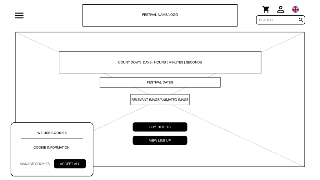
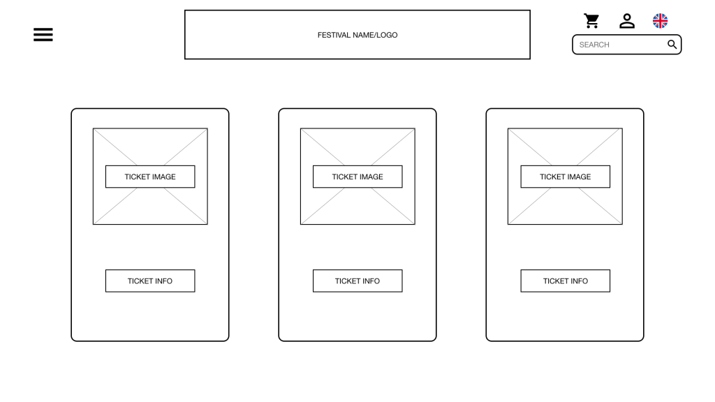
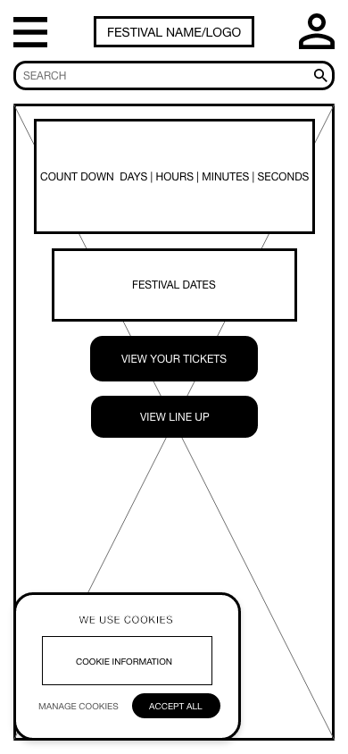
Looking at the design of the website, careful consideration has been made for certain aspects to ensure that the design fulfils the needs of the internal and external customers along with the investors and owners of the website. Figure 1 shows the home page of the website and gives an example of a pop up which gives the user the option to accept or decline, allowing the user to chose what information they want to share. The homepage also contains a count down to encourage excitement around the festival. A call to action has been placed on the homepage to go straight into buying tickets.
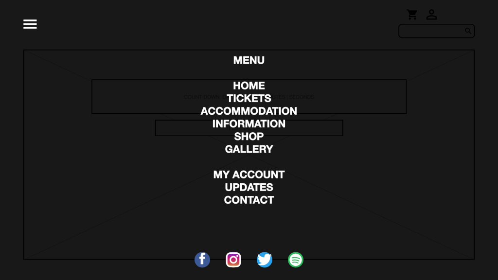
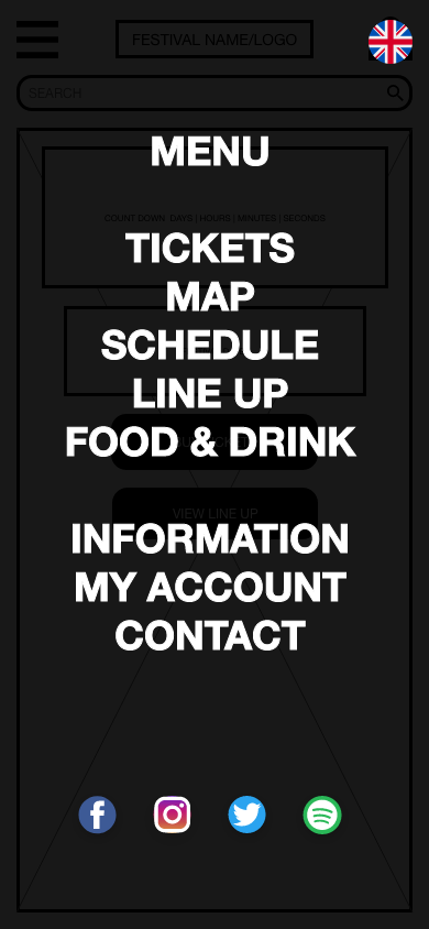
Figure 2 shows the full menu system which includes links to social media that is available to follow and a link to Spotify for a festival playlist which contains artists that will be performing.
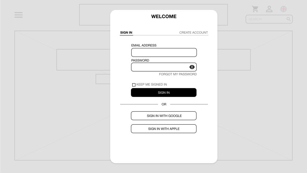
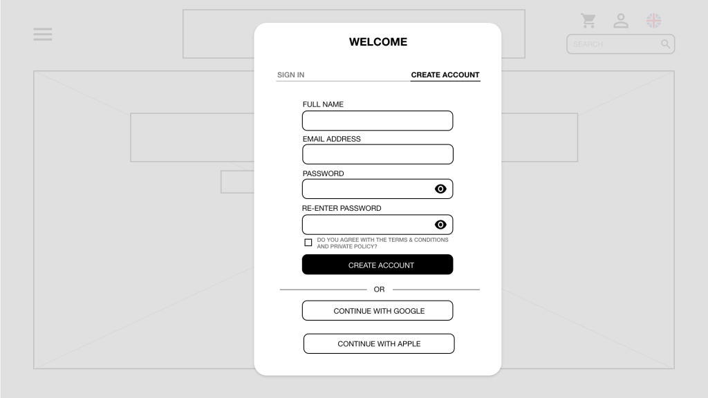
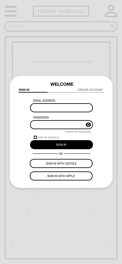
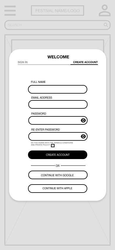
Figure 3 and 4 show the sign in and create account modal. The forms hide the password by default but has an option to show the password which meets the W3C guidelines on input forms. When creating an account, the user is made to re-enter their password to reduce user error on incorrect inputted password. The forms make use of newer web technology such as Sign In with Apple and Google, which makes it easier for the user. When signing in, there is a tick box to be kept signed in, along with a tick box to accept the terms and conditions on the create account form.
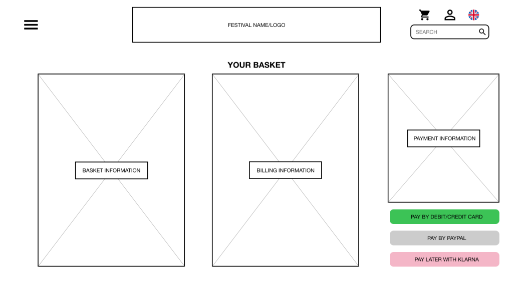
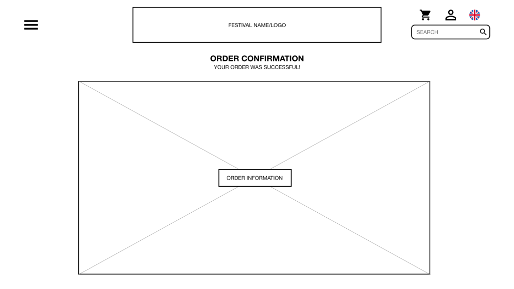
Figure 6 shows the basket, which again makes use of newer web technologies such as pay with PayPal and Klarna. This gives the user more options on payment of tickets, which will help to drive sales. Figure 7 shows the designed order confirmation page, this notifies the user that their order has been confirmed and the user can double check they have ordered the correct items and how much they paid.
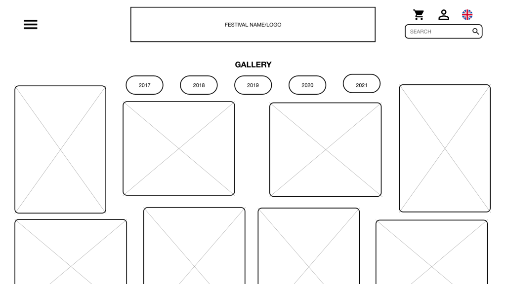
Figure 9 shows the designed photo gallery which will help to generate more excitement for the festival along with give users an understanding of what to expect from the festival.
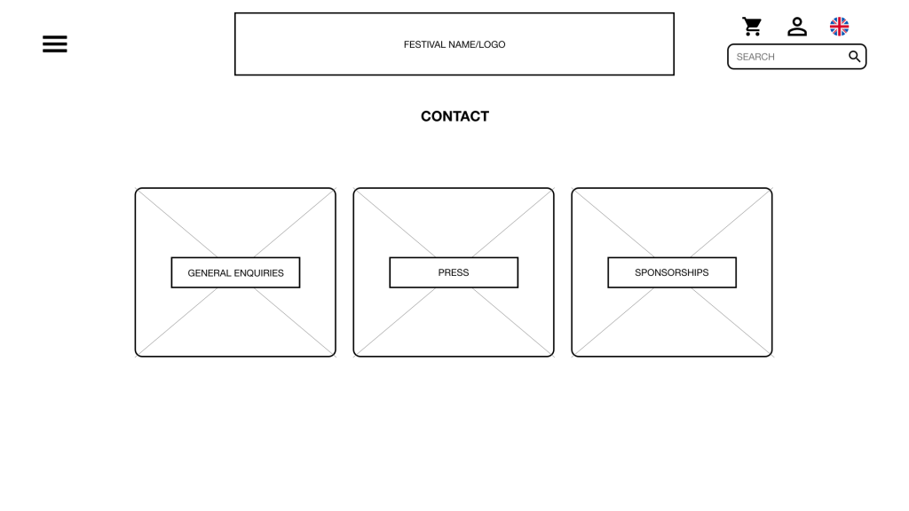
Figure 10 shows the contact page which gives an option for contacting the owners about potential jobs for users who may wish to work for the festival. This is a good option to have for the owners and investors and it could help drive talented works to work for them.
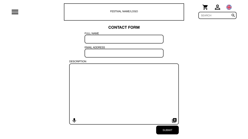
Figure 11 shows the contact form of the website, this is useful to users who may wish to make a quick enquiry. The contact form includes an option of text to speech which helps to meet accessibility guidelines, anyone wishing to make an enquiry on the website but may struggle to type messages out can use the text to speech.
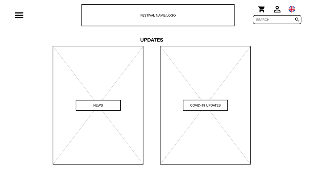
Figure 13 shows the updates page, this is useful to users of the website, it gives them a one stop page to check for updates regarding the festivals. It’s also useful for employees, owners and investors as it gives a method of pushing updates to all customers easily.
The navigation bar includes the option to change the websites language, this accessibility option allows the website to reach a wider audience. The search bar of the website will help to narrow down what users may be looking for without having to trawl through lots of different pages and the menu system.
Possible website constraints
Although the symbols used across the designs are universal, there may be users that haven’t seen these before. Because of this, the user may struggle to navigate the website and app if they lack knowledge in this area.
Another possible constraint which could directly affect users with motor or physical disabilities as desktops typically have screen sizes starting from 11″+. Due to the website design being more spread out, the user may struggle with the distances between functions, especially if they have larger screens on their desktops/laptops.
App prototype
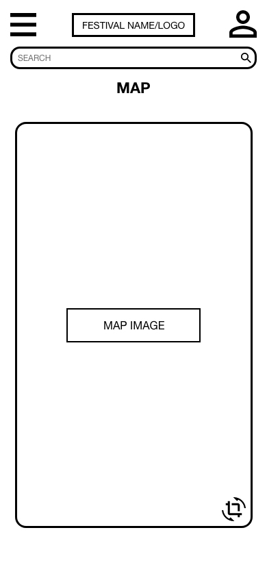
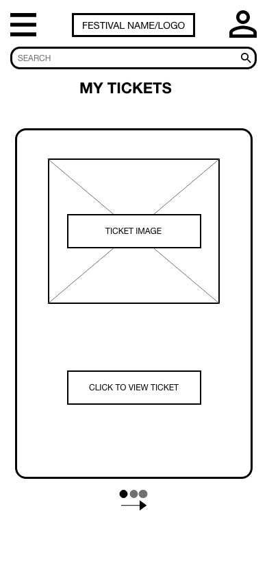
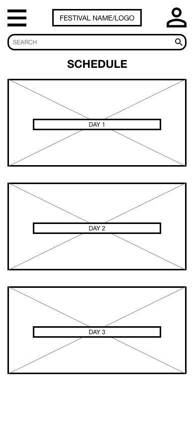
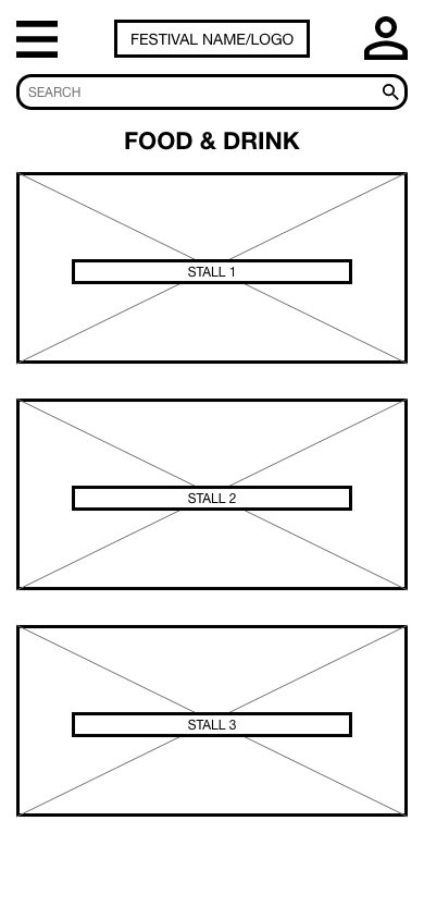
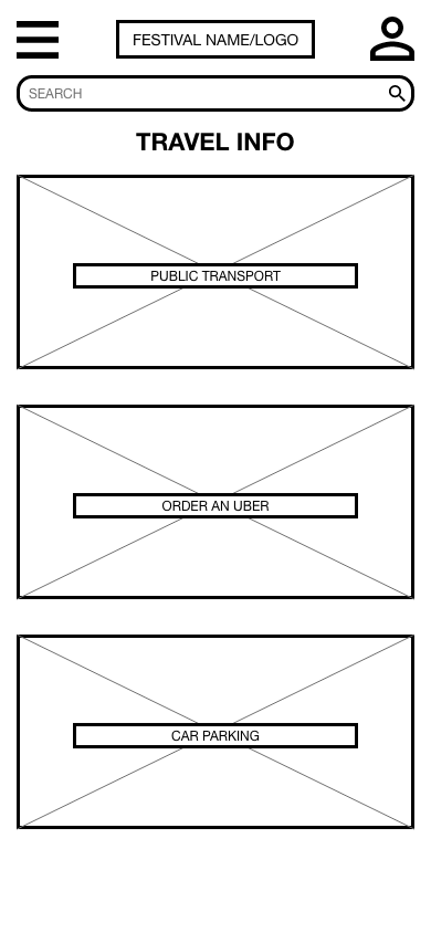
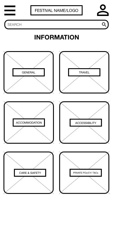
The companion app has been designed and tailored towards being used during the festival whereas the website is tailored towards use prior to attendance. Additional information is available through the app such as food and drink, schedule and map which is not available on the website, see figures 20, 23, 24. Certain features on the app can be used without internet connection, the only features that can’t are those that redirect the users to an external website.
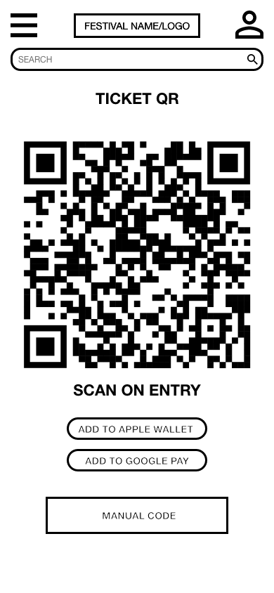
Figure 22 shows the E-Ticket QR code that is available through the app, the makes signing into the festival much easier for both customers and employees. There is also a QR code number available on this page incase the QR code won’t scan. Through this page, there is also the option to add the ticket to a digital wallet such as Apple or Google, this is inline with using newer technology that is available.
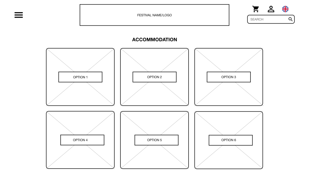
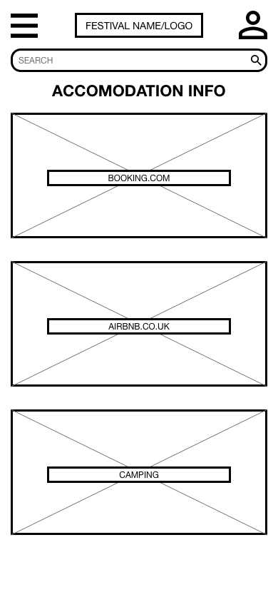
Figure 25 shows a range of different accommodation that is available for the festival, helping users able to plan their trip. Features like this will help to increase ticket sales, in return boosting revenue and profit.
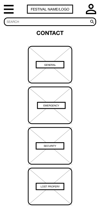
Figure 28 shows the contact page that’s available within the app, this includes a range of different support numbers which is particularly useful to users, such as personas 2 (attendee) and 3 (PO).
Possible app constraints
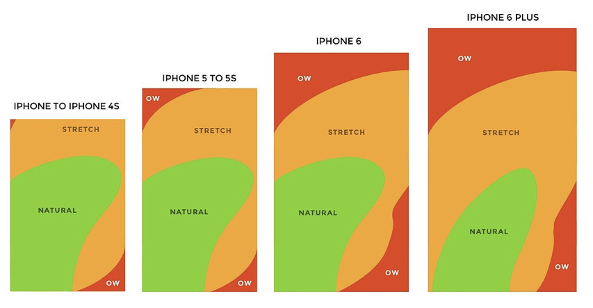
Some app constraints are specific to the user. A common constraint is dependent on the device the user is interacting with the app from. Typically with smaller screen smartphones, the buttons/functions may appear bigger or chunkier, thus taking up more screen space making the information look overwhelming. The larger screen smart devices have the problem of the buttons/functions potentially being too small to click. Due to the screen being bigger, the information is more spread out meaning more movement is required by the user. Figure 29 has a series of 4 images that show the users movement when using an app on different devices. They each display the physical constraints in the movement of the user by using thumb zone maps. The app needs to re-size the information to fit the device to avoid potential un-useability caused to the users. Those with motor disabilities may struggle with the apps architecture if it is not tailored towards their device.
Another app constraint which relies on the user. The users smart device may be limited to the storage of the software. Even if the user has the capacity available to download the app, app updates can take up storage they may have. This would result in the user either deleting other apps to be able to update the festival app, or the user running an outdated version of the app.
References
- Appcues. Unknown. The 5 UX constraints of mobile apps (& how you can work around them). [ONLINE] Available at: https://www.appcues.com/blog/the-5-ux-constraints-of-mobile-apps-how-you-can-work-around-them. [Accessed 11 March 2022].
- Figure 29 – https://assets-global.website-files.com/5c7fdbdd4e3feeee8dd96dd2/5c915cda50b21f214ff4fe1a_optimal-user-experience-area-iphones-over-time.jpeg
