App Design Development
https://xd.adobe.com/view/5e942f51-6213-4aa7-9acb-89f48a4182f0-0bc7/
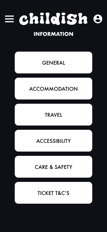
The primary focus of the companion app is for the user to use it during the festival. The app offers many options that will be useful to the user during the festival, it will include content that the website didn’t.
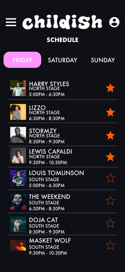
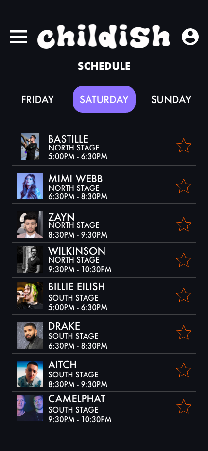
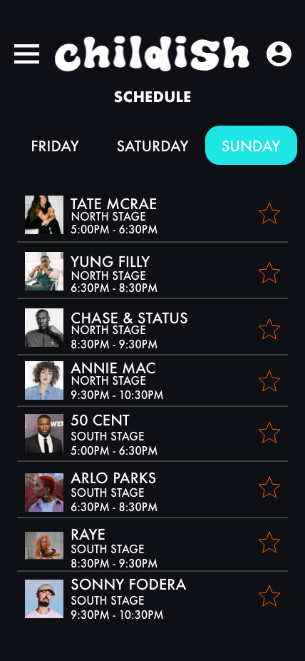
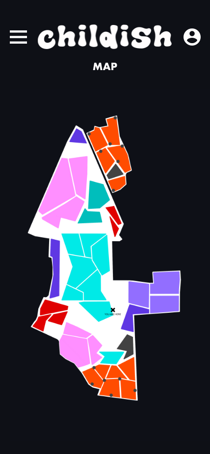
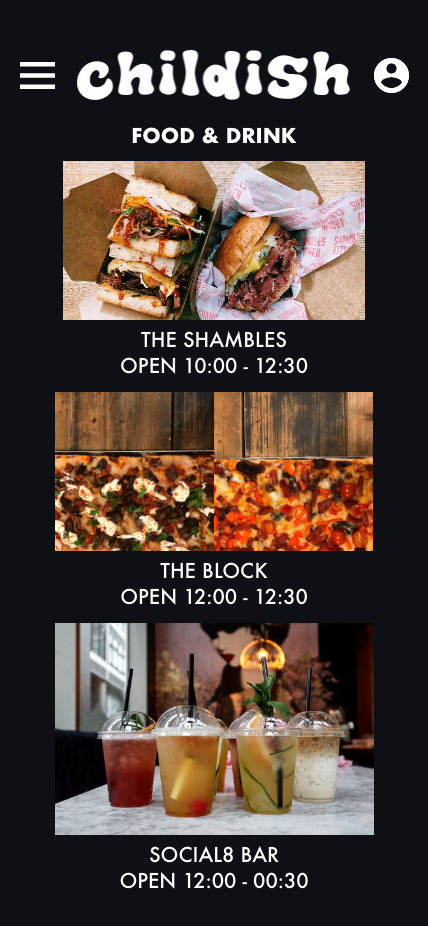
The main goal for the user in this instance is for them to be able to use their tickets through their phone, see the daily schedules, a map of the festival and what food and drink is provided.
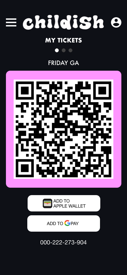
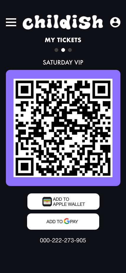
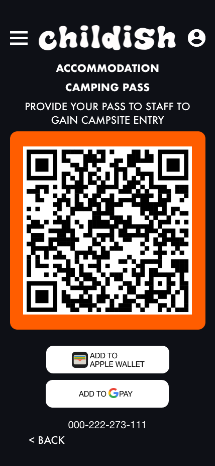
The tickets the user will need to enter the venue grounds is displayed as a QR code. QR codes have become a popular way to store and provide information. For the target audience, this should be something they are familiar with. Having an e-ticked provides security and a piece of mind for the attendees, as the risk of losing their ticket is slim. They also have the ability to add their tickets to either Google pay or Apple wallet. This will impact the users massively as they won’t have to open up the app to find their tickets, they can just double click their power button and the ticket will be displayed. Due to how quick this process is, it can help to reduce waiting times when entering the grounds which gives the user a better experience.
The buttons on the app were designed so that they are big enough for the user to click. The design is relatively compact so the user shouldn’t have far to travel to select the button they need to which relates to Fitt’s law. Most interactive buttons can be found towards the bottom of the phone screen in an attempt to avoid a common app constraint, thumb zones.
A “back” button was added so that the user can go back to appropriate page without having to go through the menu again to find what they were looking for. This increases the efficiency as the user won’t have to spent the time going back through the information.
The app design is near on identical to the website design. It increases the learnability as the user will have previously used the website to purchase the tickets so having the same design will be beneficial to them.
Screen Breakdown
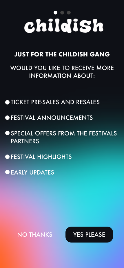
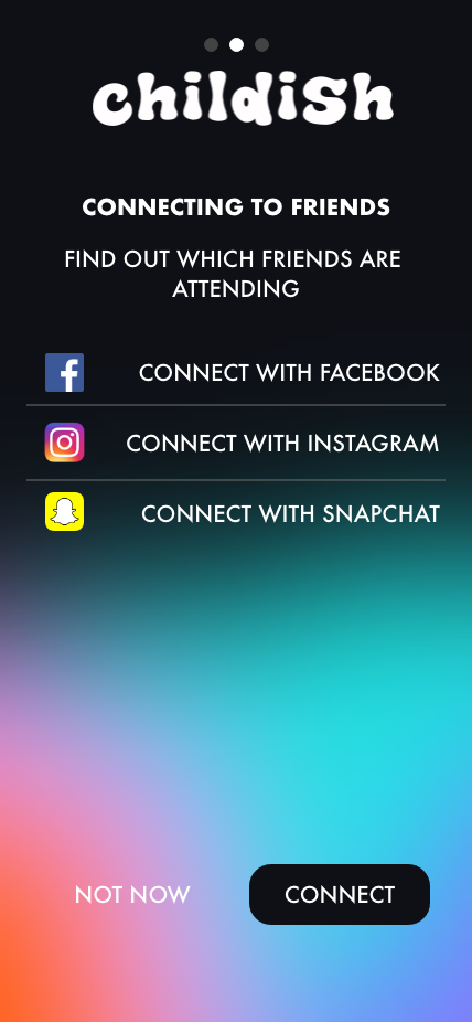
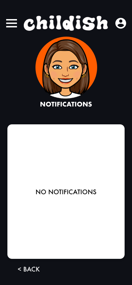
Opening of the app consists on 3 screens, the first one being the opportunity for the customer to opt in on marketing, second is the ability for the user to connect to friends and to see who else they may know that is attending. Third is notification settings, this allow the user to control the information they receive and how they receive it.
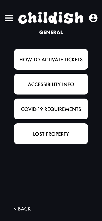
Just like the website, the menu on the app is kept simple, it makes it easier for the user to navigate. All pages are grouped appropriately which makes what the user is looking for easy.
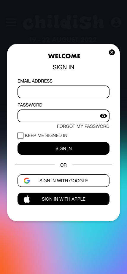
The sign in page is the same as the website, however the app doesn’t offer the user to create an account as this is something they do on the website to be able to checkout. It means all their information for the festival can be all kept in one place and is transferable to the app.
There are limited options on the account, like most festival apps, there isn’t an option to edit details as this should be done via the website. Due to the app being primarily used during the festival, the user shouldn’t have to change their details at that time.
The travel page offers the shuttle bus times, where on the map the collection point is, the ability to purchase tickets and live updates. The live updates gives the user knowledge on the bus times, whether they are delayed or arriving early.
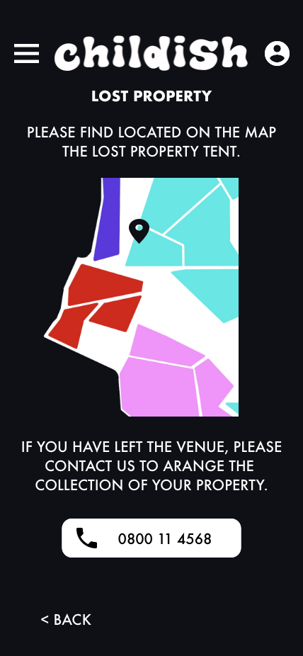
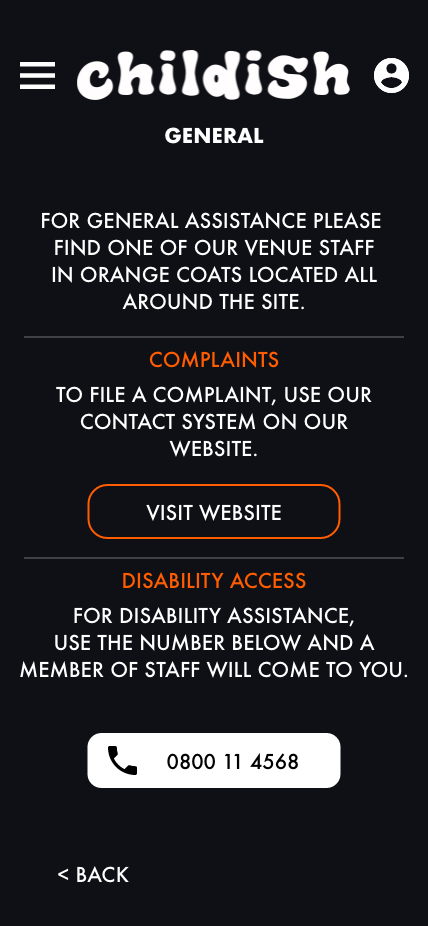
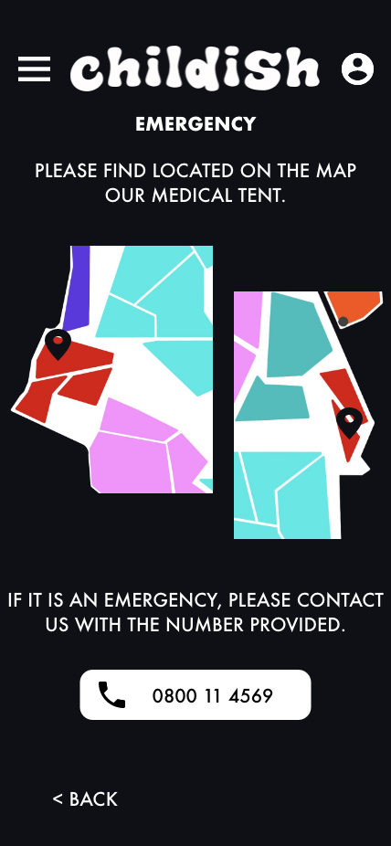
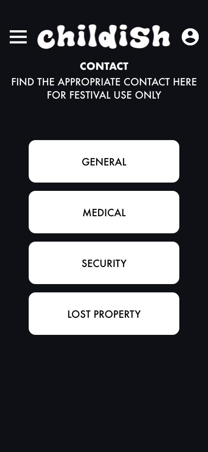
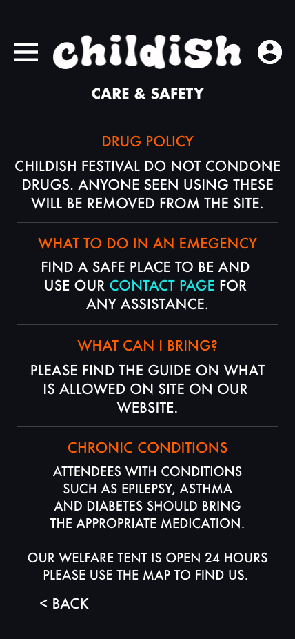
The contact pages offer phone numbers that the attendees can call if they need too. Supporting that is a map, the maps show the locations of the appropriate contact point so that the users don’t have to use their phone, this is also good if there happens to be limited signal at the venue.
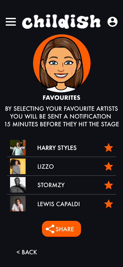
There is a favourites option, this gives the user a chance to get notifications when their favourite artists are performing as well as giving them live updates incase they are delayed.