
Website Design Artwork Development
https://xd.adobe.com/view/919745f3-1f15-461c-b504-b54f5f753760-c4c4/
The primary use case of the Childish festival website is for users to have the ability to purchase tickets and gather relevant information that they may require. The navigation of the website allows the user to be able to complete their tasks seamlessly and efficiently. Design laws were considered during the design process of the website to ensure that the user finds each step simple to follow.
The childish website follows a similar structure to other existing festival websites. This makes it easier for the users to understand the website, as they may have already experienced a similar one. Universal icons are used through out which were provided by Google therefore, the user should be familiar with those symbols.
Screen breakdown
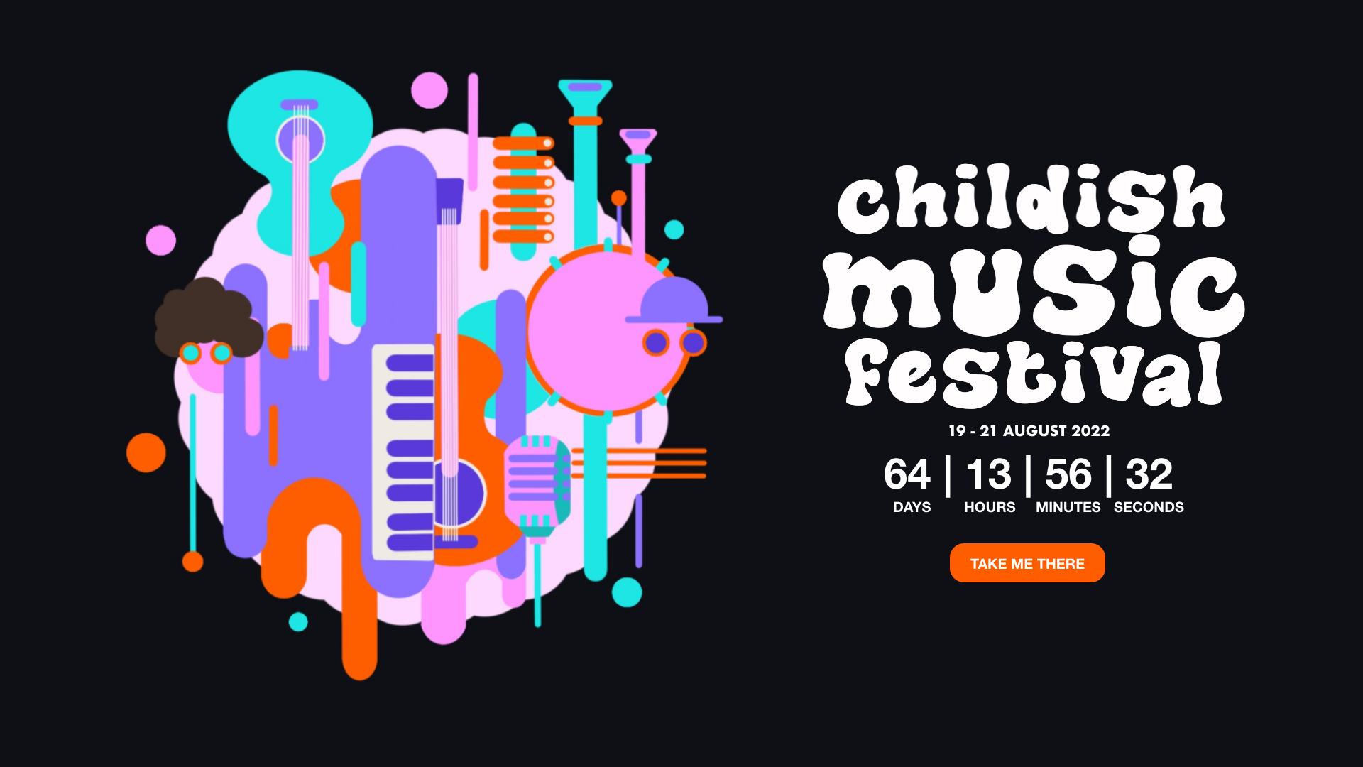
The homepage image is a fisheye lense and as reported in the feedback, it makes the user feel as though they are there. the image is used to provoke excitement.
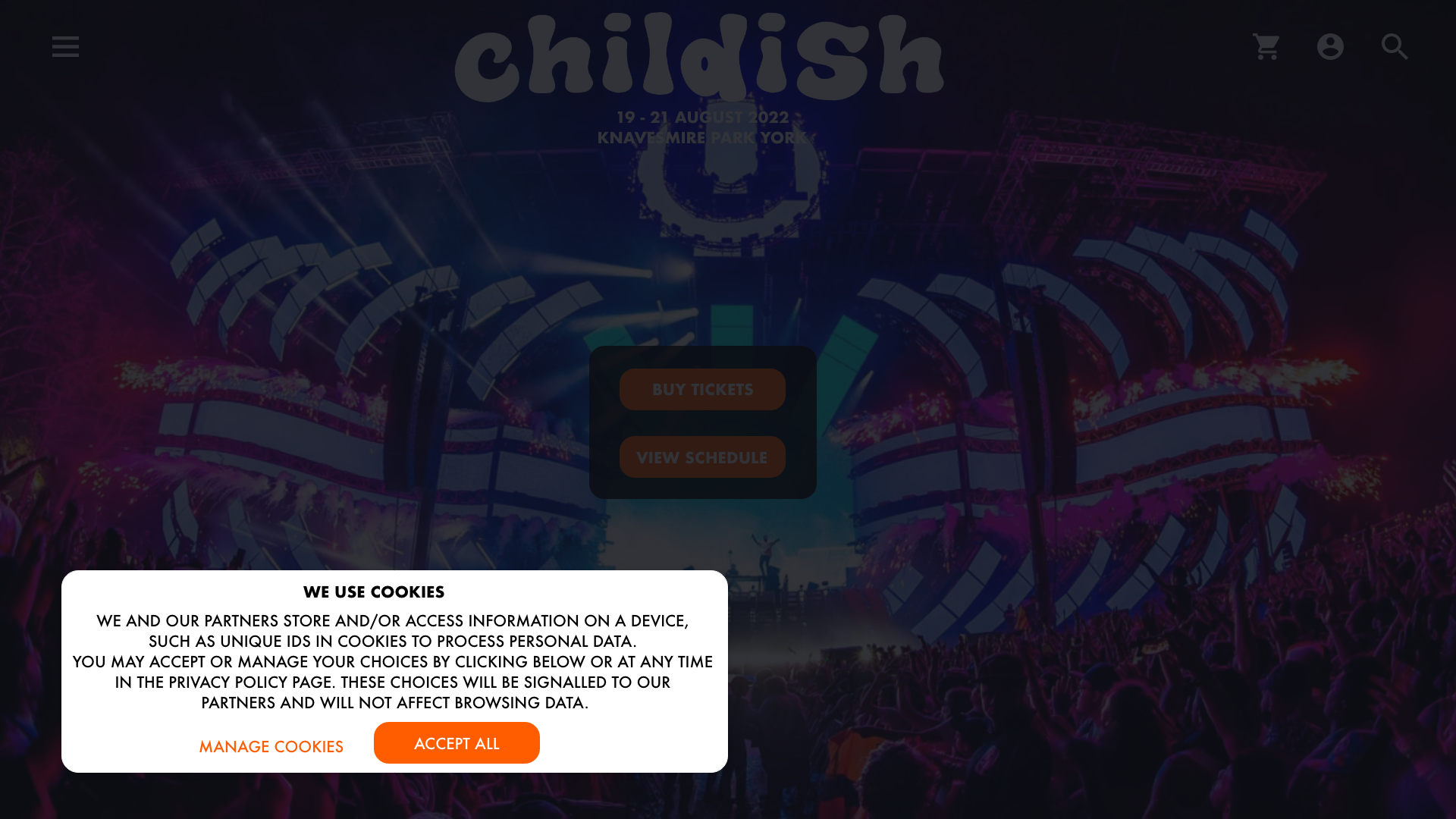
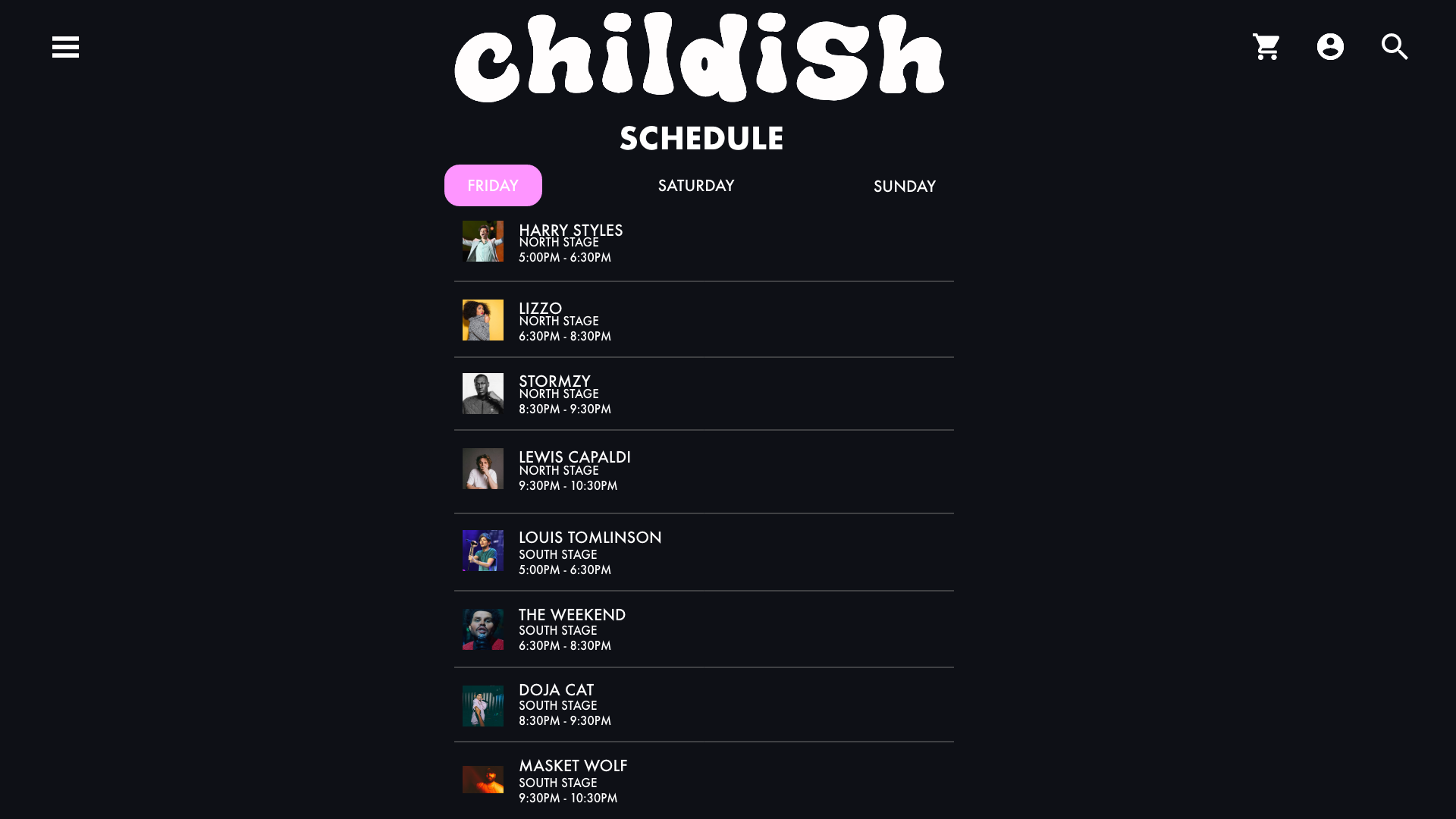
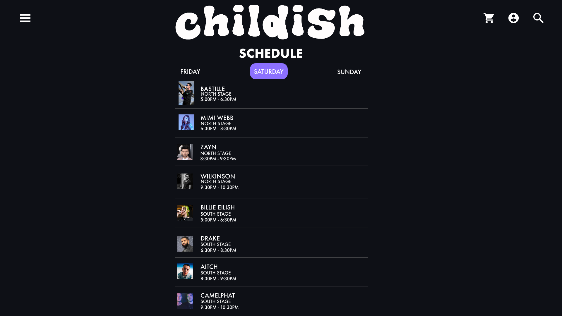
Hicks law states that the more options you give to the user, the less efficient they will be. With this in mind, the navigation menu is kept simple. Using law of proximity, the options on the menu increase once you click on them so that each piece of information is grouped correctly.
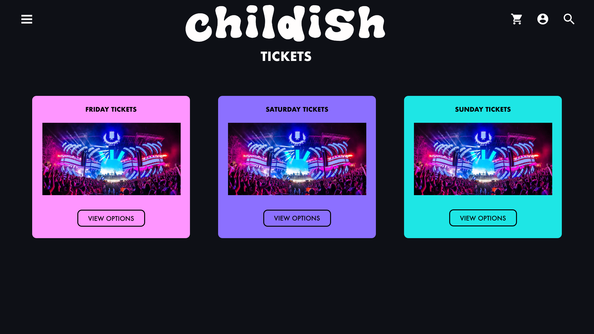
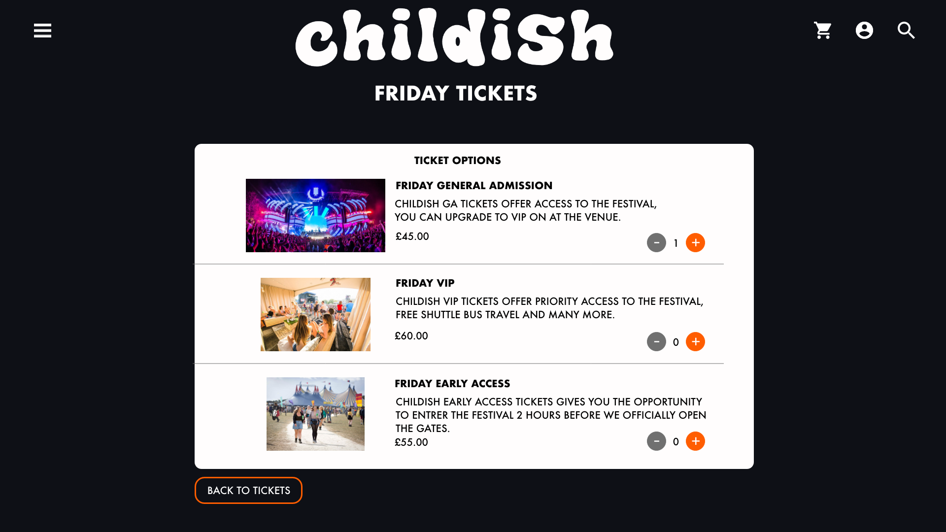
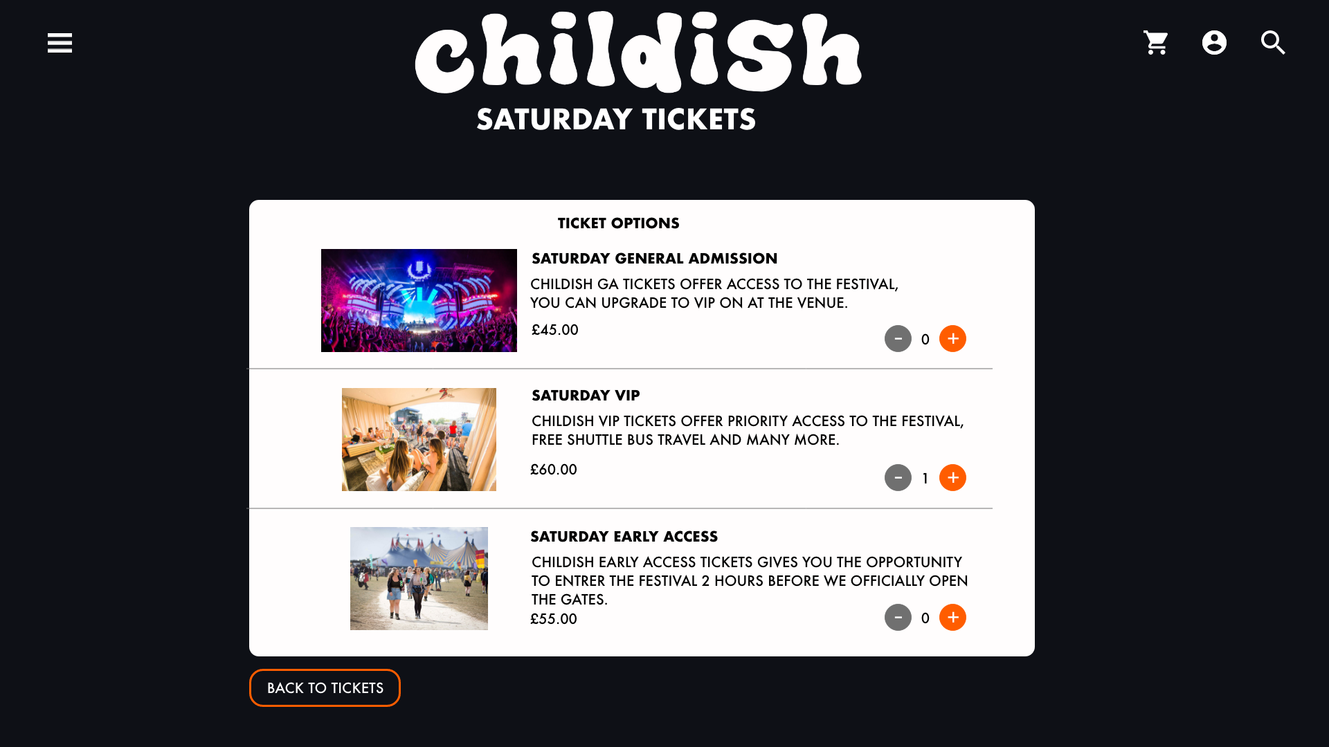
The tickets menu provides 3 different options, each option holds 3 additional choices. On each ticket page, there is a list of 3 different tickets that the user can purchase. In order to increase efficiency, they can select the quantity of the tickets which adds them instantly to the basket without having to go onto separate pages.
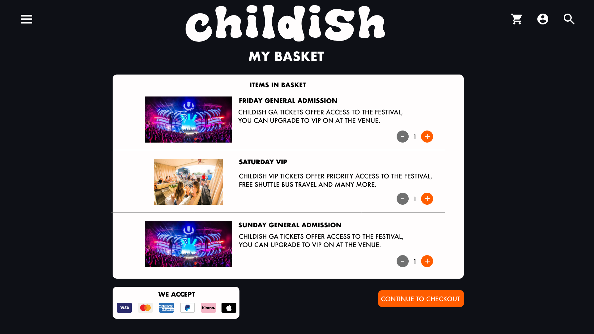
Following from that is the basket. The basket page has the same layout as the ticket pages except it includes the different tickets the user has chosen. They can change the quantity of tickets on this page too so that they don’t have to go back through to the tickets page if they wan to add an extra one. Towards the bottom of the screen shows the payment methods that are accepted on the website, these types of payment are commonly used on every e-commerce site. An advantage for the user is the ability to pay by third party such as Klarna which is a credit company, with additional payment methods available, users are less likely to abandon their basket (Baymard Institue, 2021).
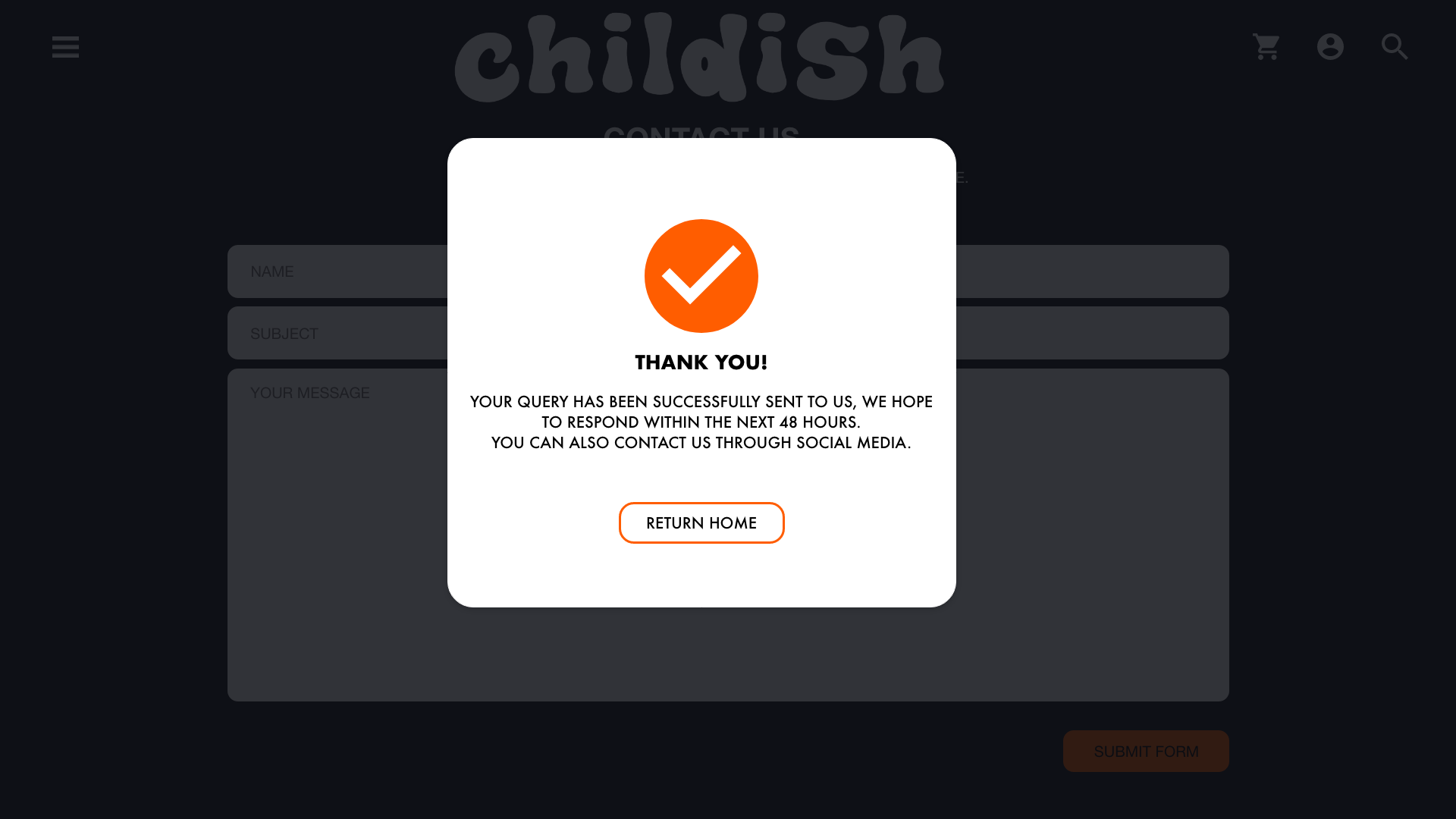
On the checkout screen, the users billing details are automated which saves them time trying to type in all their details. There is also a summary to the side so that the user knows what they are buying. Once the user has checked out, a confirmation pops up to tell them the payment has gone through.
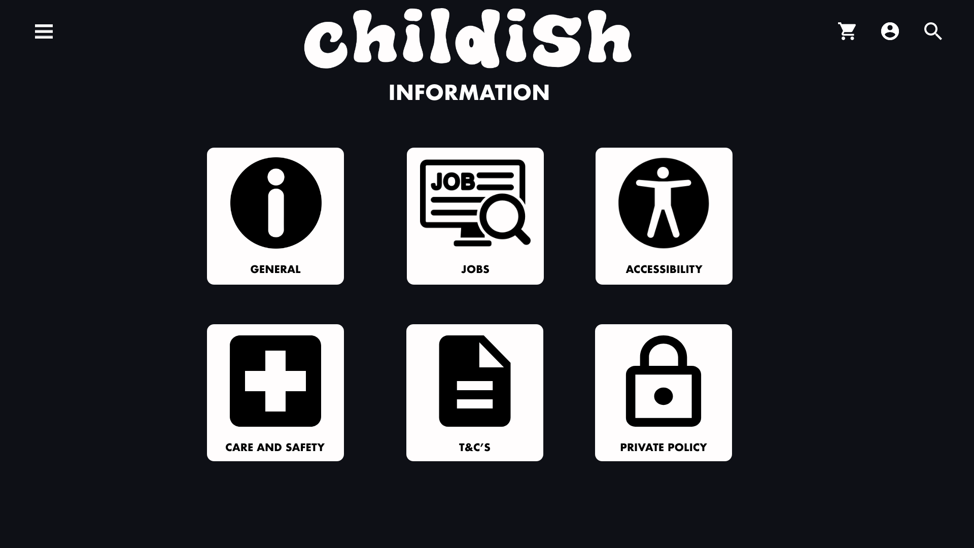
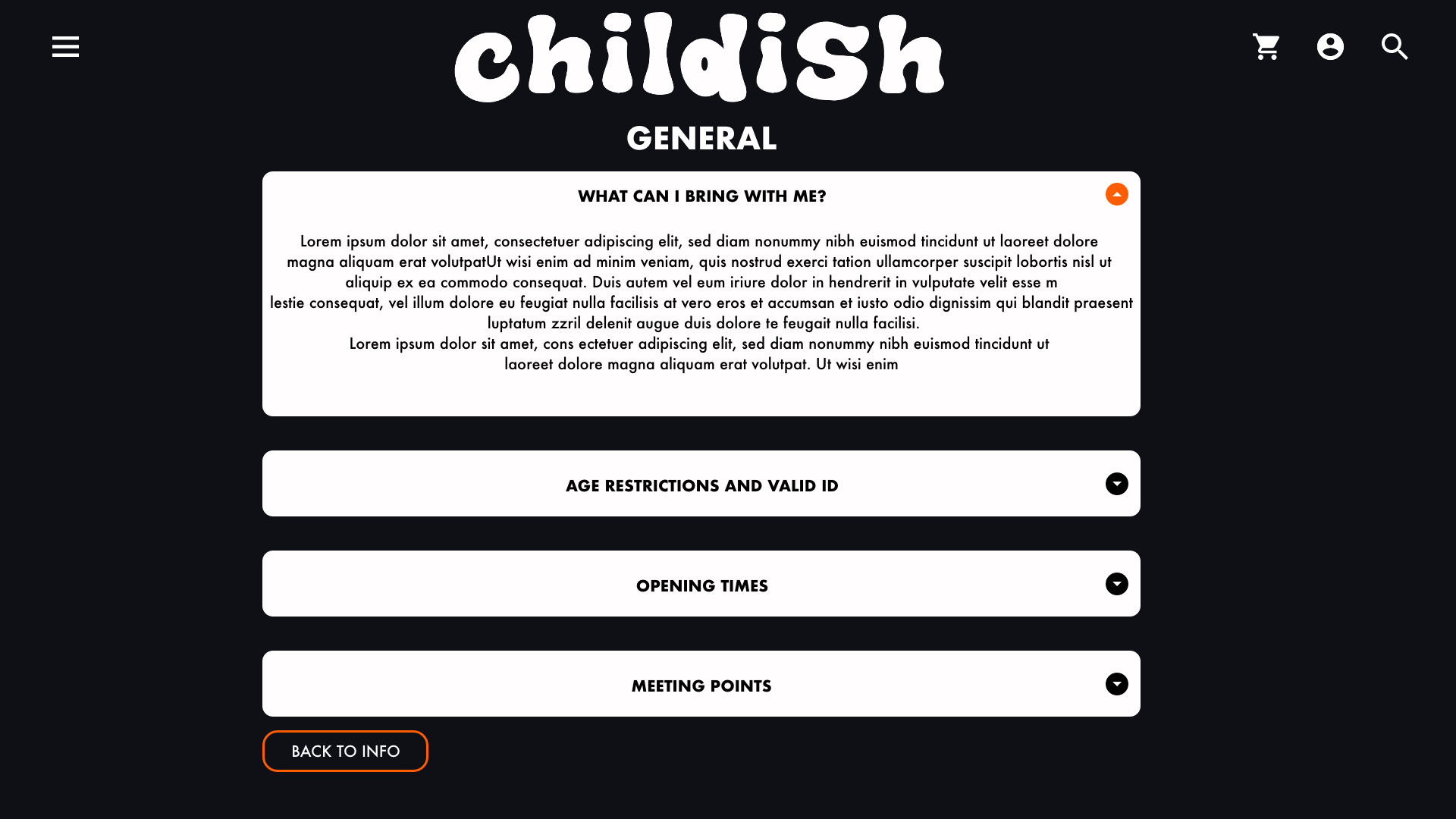
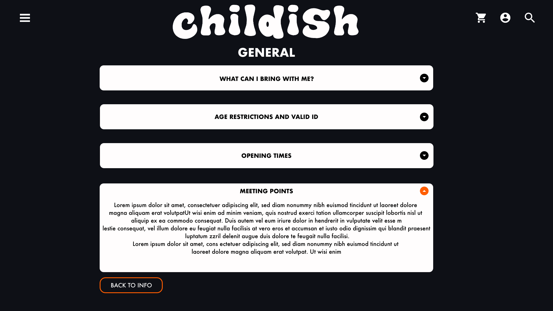
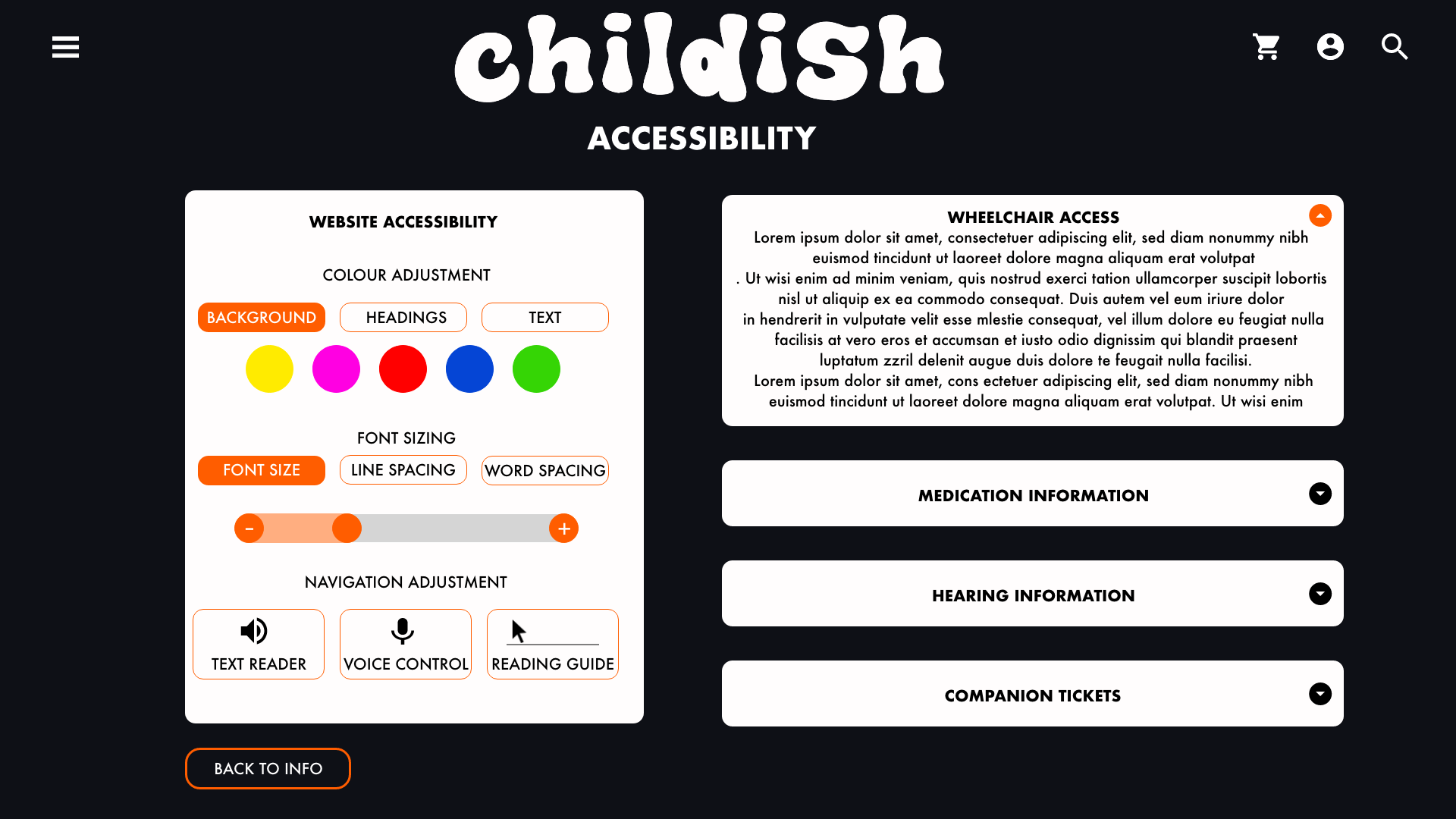
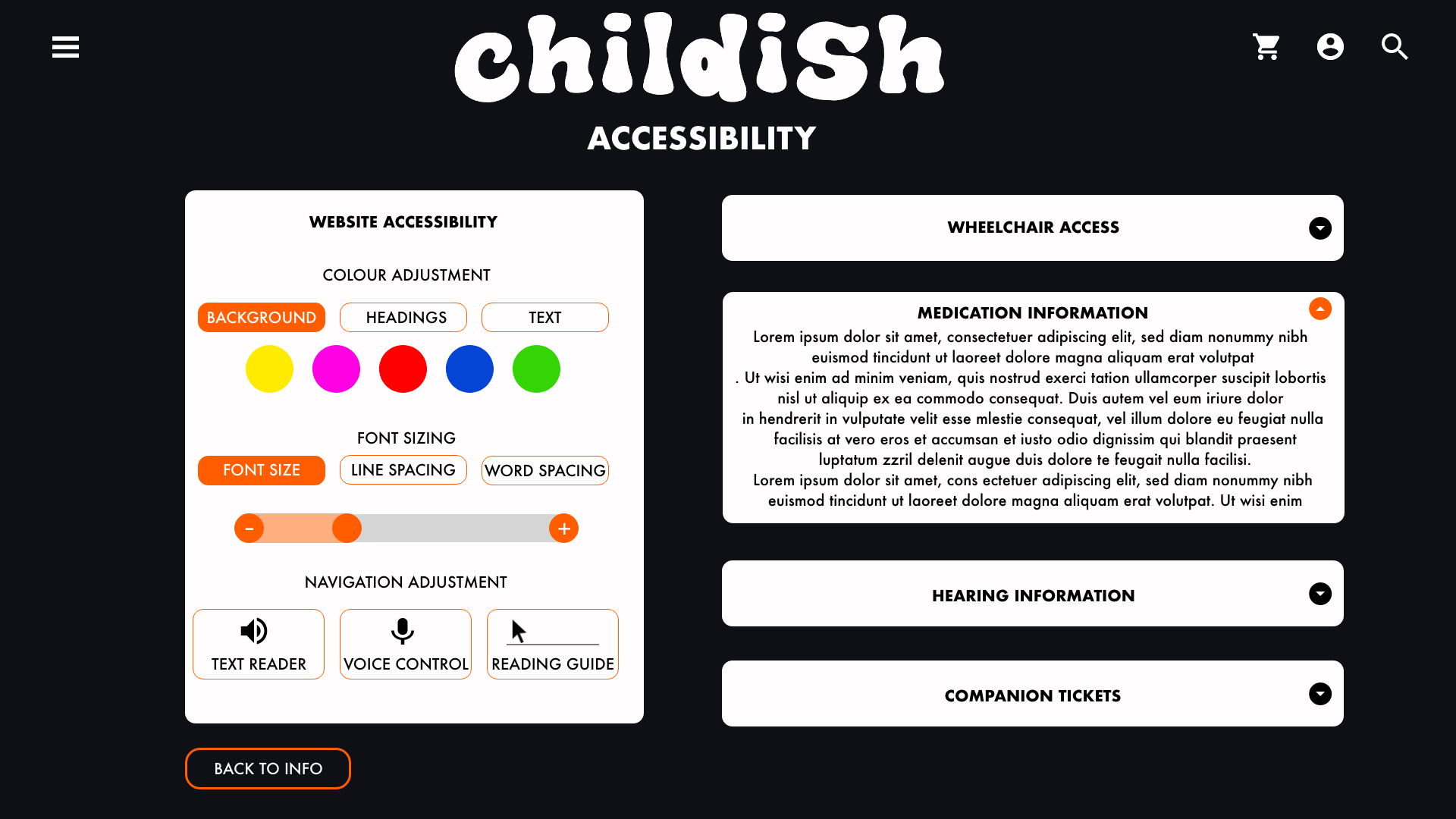
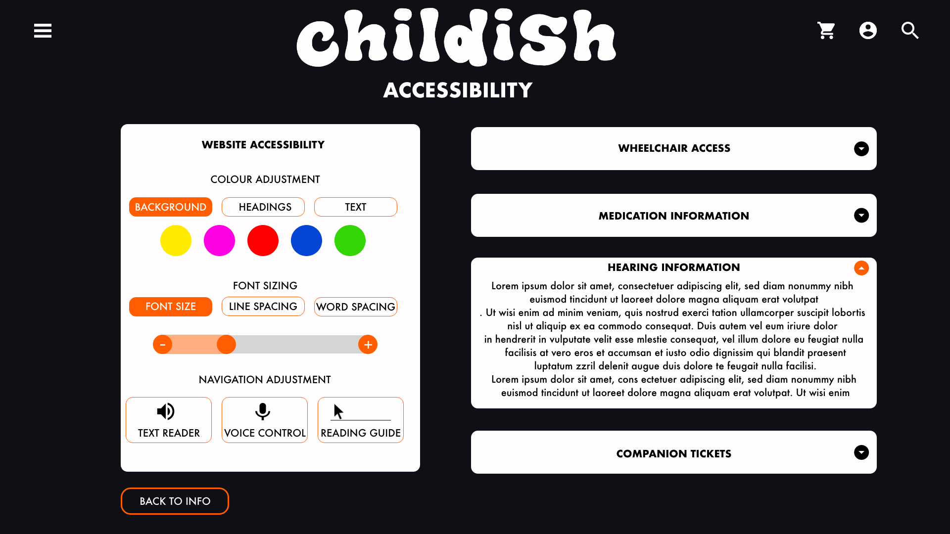
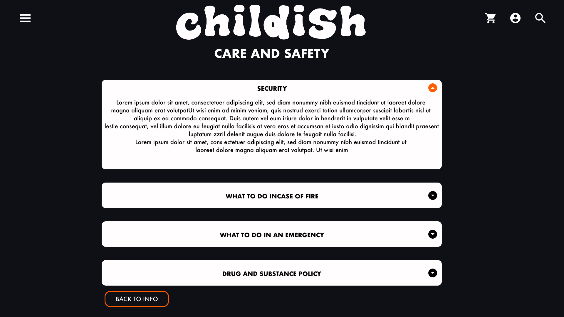
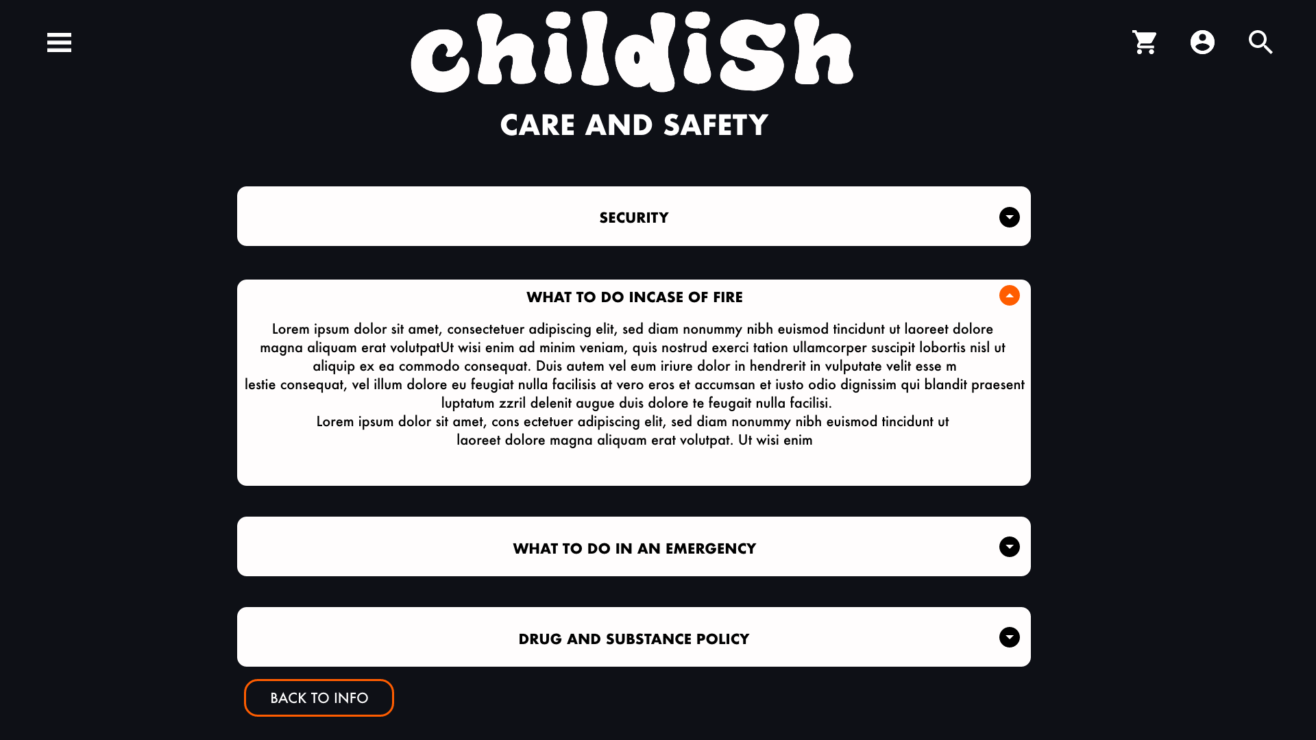
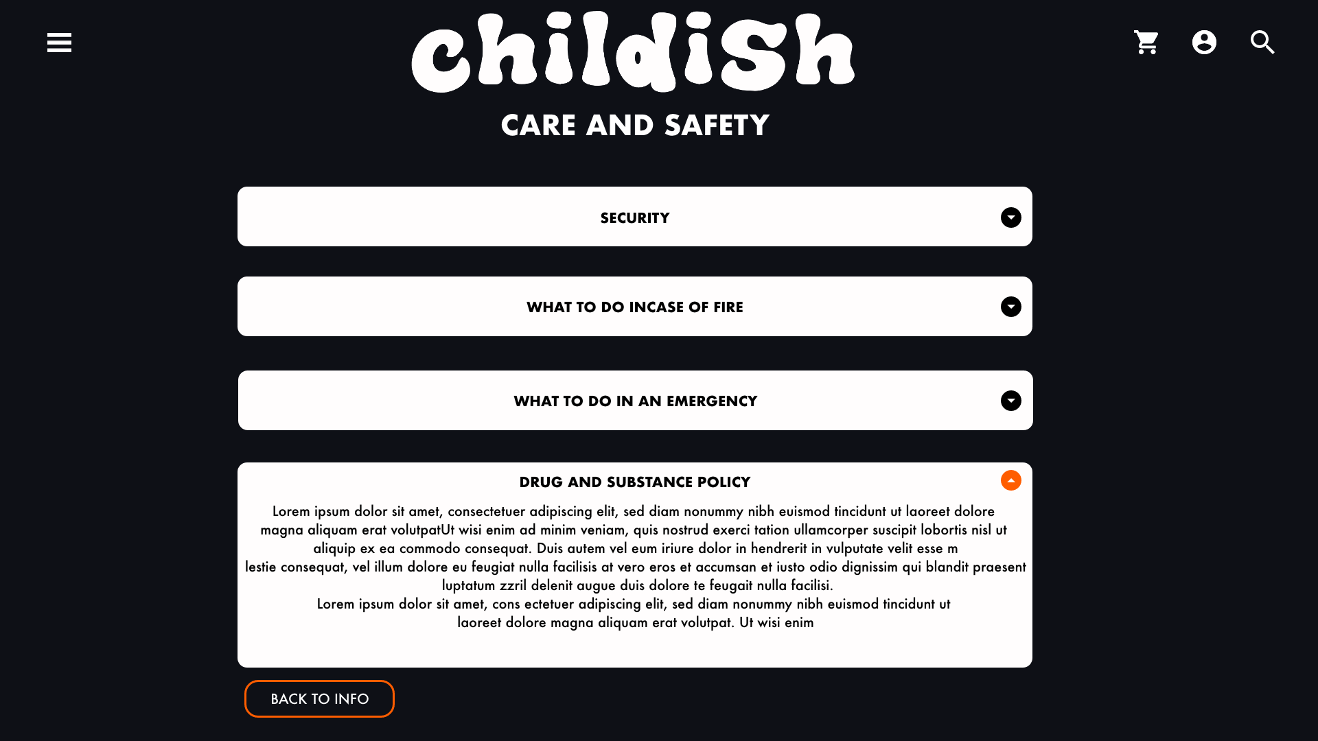
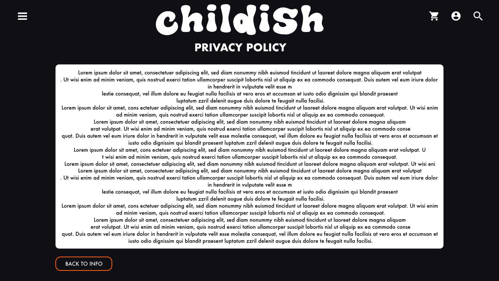
The information screen provides the user 6 different options to chose from, the accessibility screen allows the user to make changes to the website as well as finding out information about accessibility at the festival. The general page along with the care and safety page both use collapsed paragraphs, which can be expanded using the arrows to the right hand side. Also provided on every information screen is the option to return back to the initial information screen.
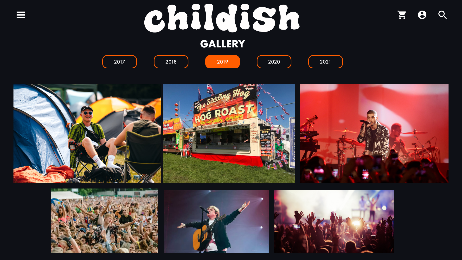
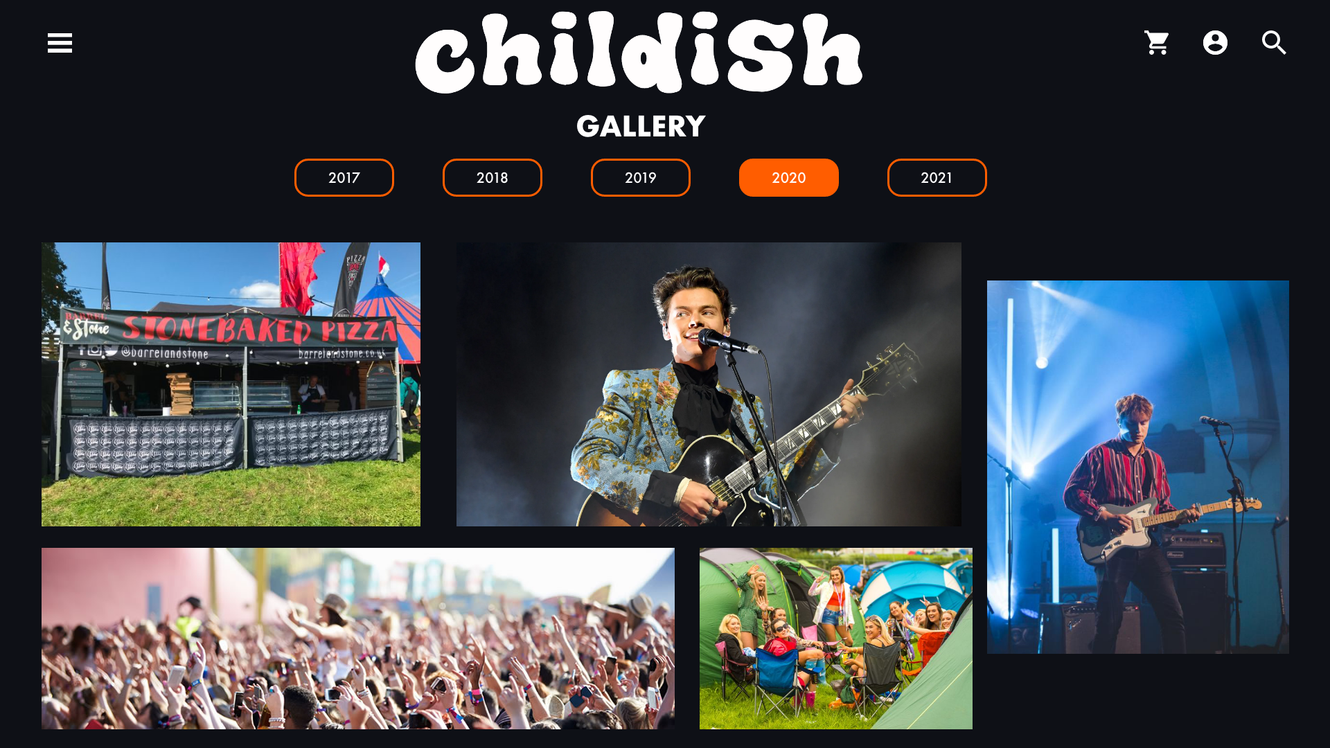
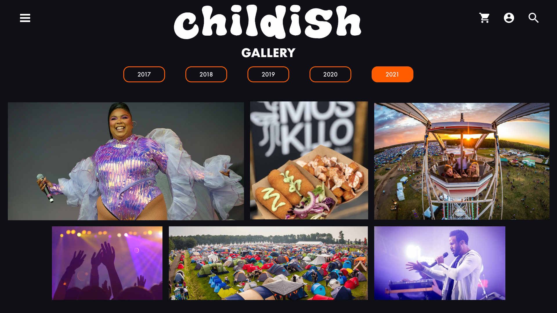
The gallery shows the user what the previous years of the festival have been like, they can get a sense of the atmosphere through the pictures, which will hopefully invoke excitement in them.
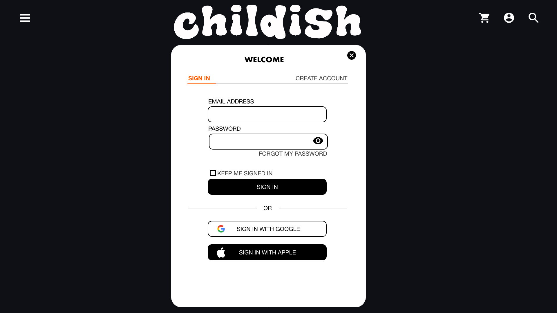
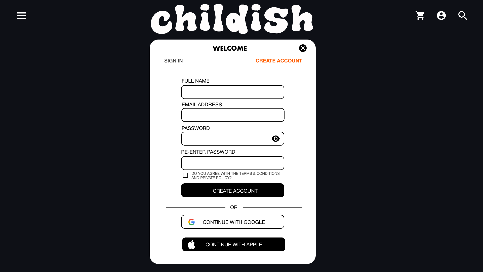
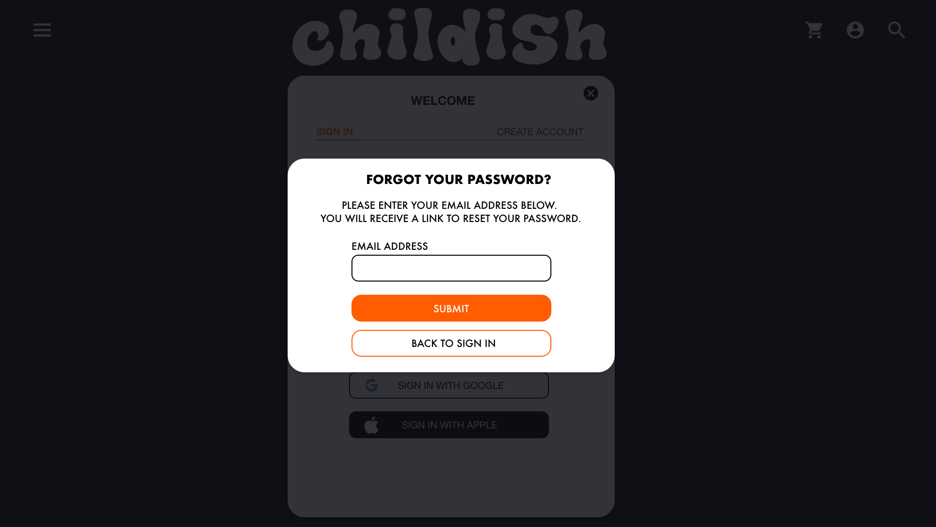
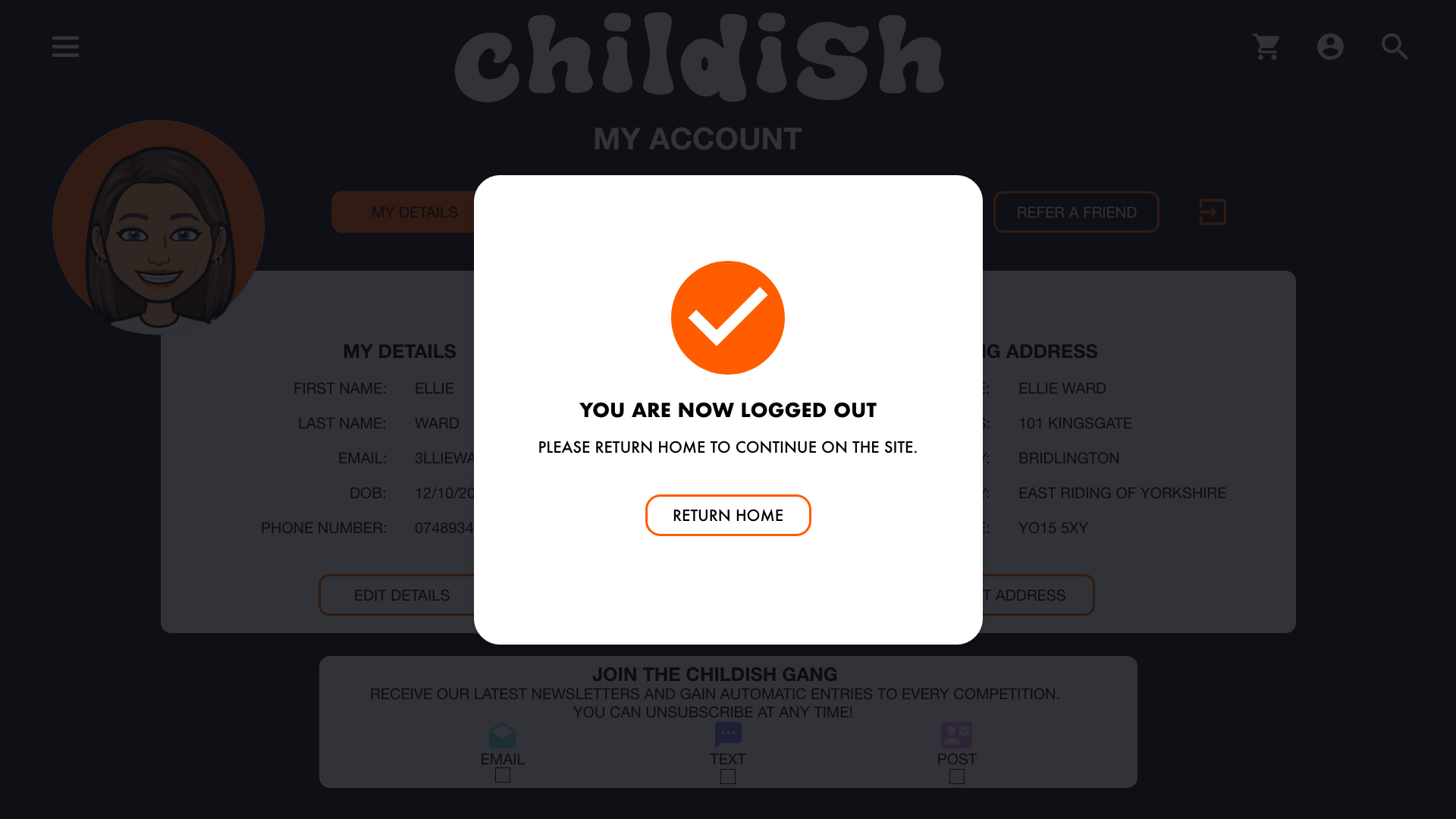
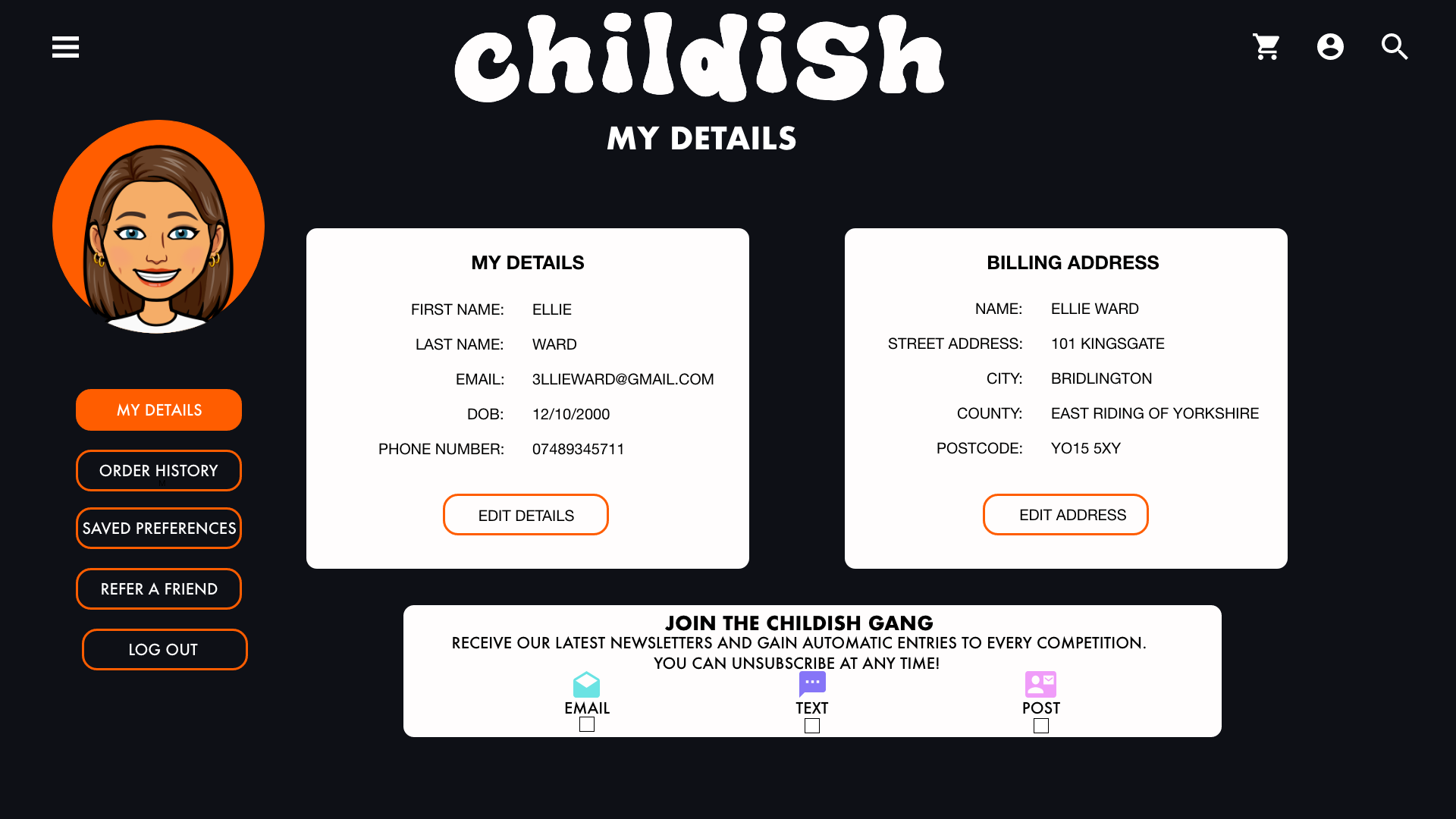
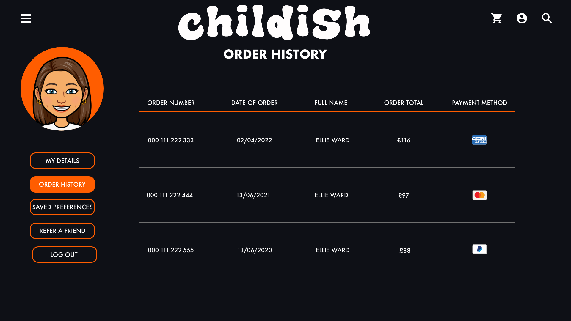
The sign in and sign up is simple, it follows the design and layout of most websites. It also gives the user an option to use their Apple or Google account to sign in, which can save the user time typing in their details. The account options are kept simple, it allows the user to change their details, alter their saved preferences, view their order history and the ability to refer a friend that will earn them a discount code.


References
- Baymard Institute. 2021. Payment Method UX: How to Design the Payment Selector. [ONLINE] Available at: https://baymard.com/blog/payment-method-selection. [Accessed 5 May 2022].