
Requirements gathering and analysis
Defining the audience
Given the extensive research in the previous post, the set audience of the Childish Festival is the age range of 18-30. This age range was chosen due to the nature of the festival along with the genre of music that will be played that the festival. An assumption the people aged 30+ may have is that they can’t attend the festival. This is not the case, but the UI/UX of the website will be tailored to the specific age group selected.
Understanding the stakeholders
Stakeholders hold a vital part in the decision making process. knowing this, it is important to understand who these stakeholders are. Figure 1 displays research into the potential festival stakeholders, this will become helpful in the designing of the website and companion app process and how successful it can be.
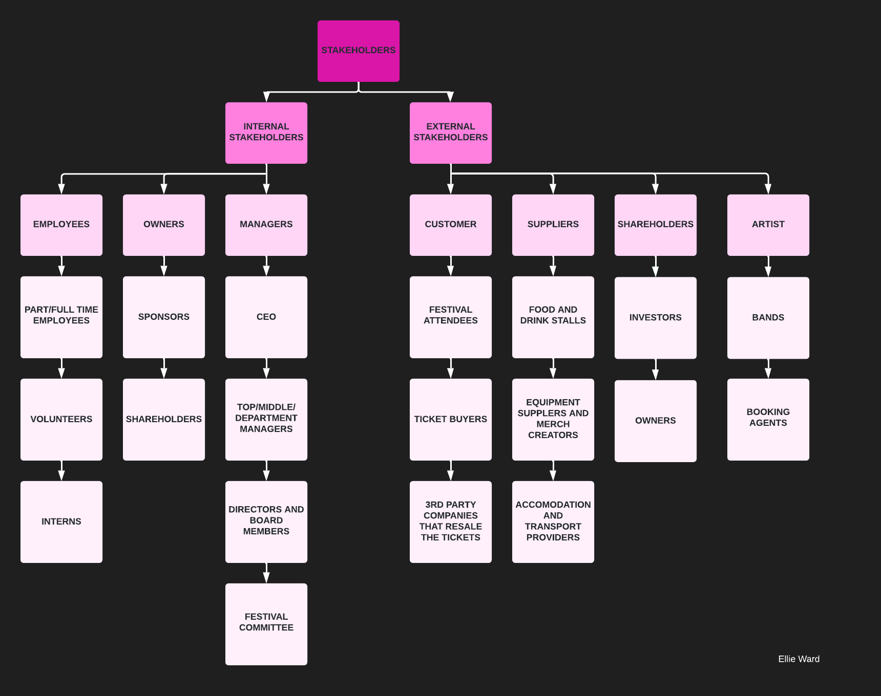
In order for the stakeholders to consider the design a success, it is important that their interests and ideas are taken into account and are kept informed of the designs and some changes that may occur. There will be a rank within these stakeholders, some of which will hold a greater power in the project and others not so much. The CEO and directors may have a design in mind or would like to contribute personal ideas. It is vital that their thoughts and ideas are imputed in the design as this could potentially hinder the success of the product.
The products users
Whilst it is important to keep the stakeholders satisfied, the users of the product are also deserving of that. The primary purpose of the website is for the users to be able to purchase the festival tickets, along with having easy access to information they may require. A feature that many festivals don’t have is an account option, this is based on previous research. It would be beneficial to the user to have a set place where all their information including tickets, transport and accommodation is kept. It would improve the users experience as this would be easier for them to handle and with personal experience, it would give them a peace of mind knowing everything is organised and kept together.
Personas
Below are three personas which are used to help bring the Festival to life.
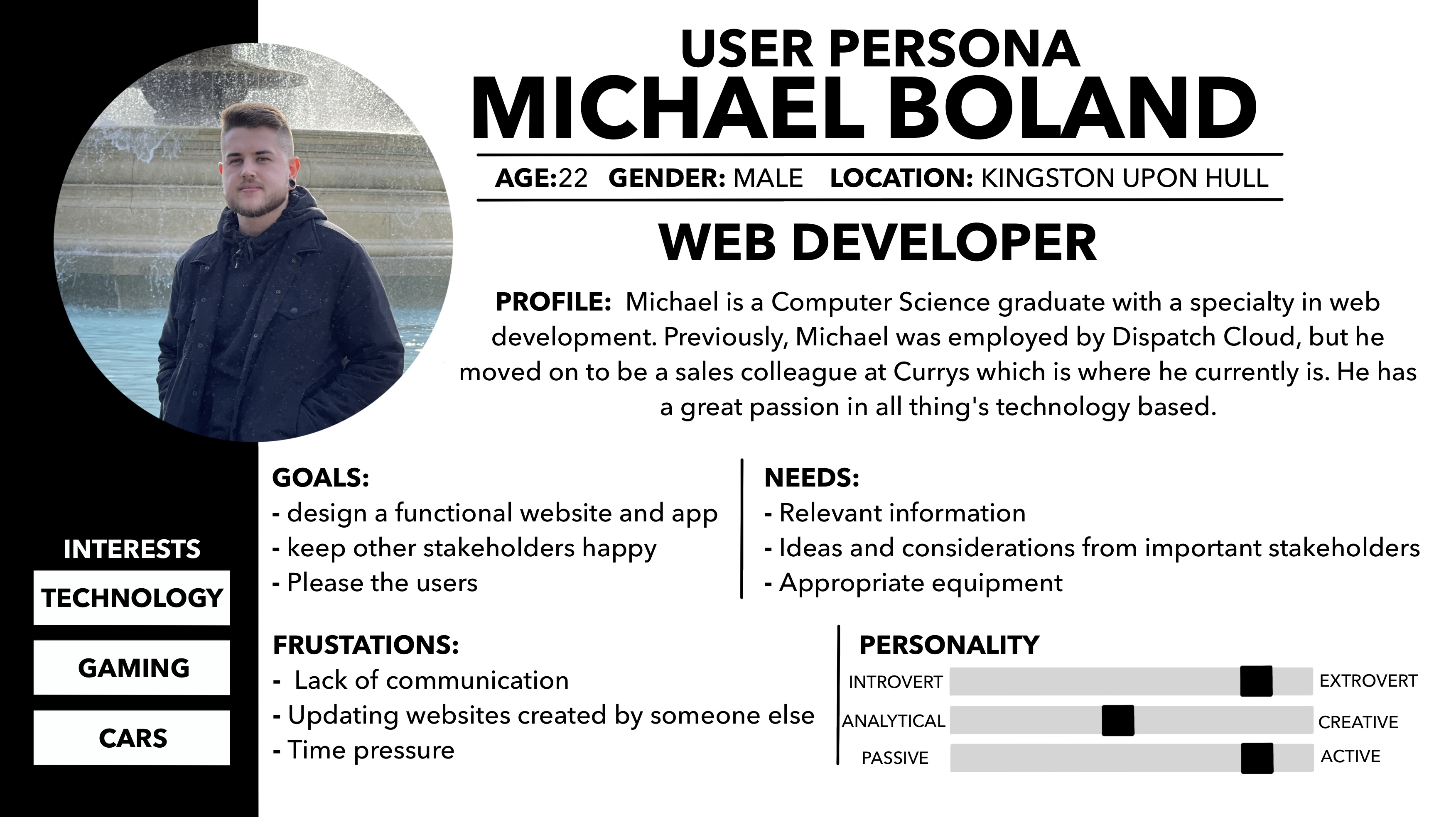
Persona 1
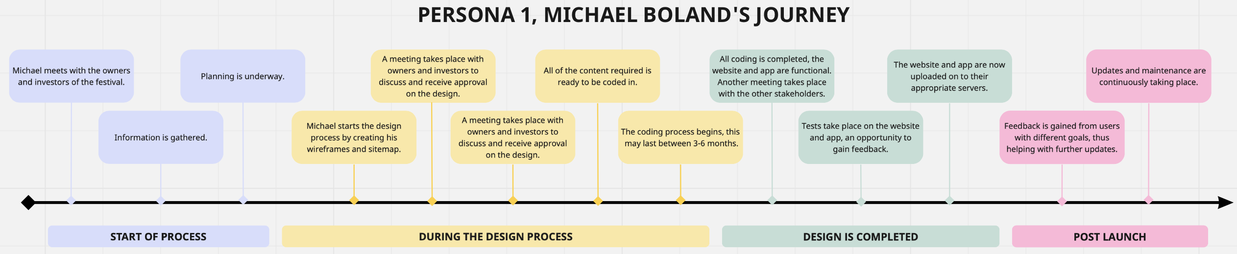
Figure 2 displays the details of the first persona. Michael Boland is a Web developer who is working with the festivals stakeholders in order to bring the website and app to life. His goal is to create a website and app for users of all kind to successful carry out their goals in relation the the app and website. Figure 2a demonstrates the journey which he may take to complete his goal.
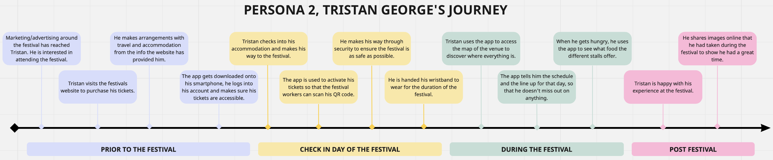
Persona 2
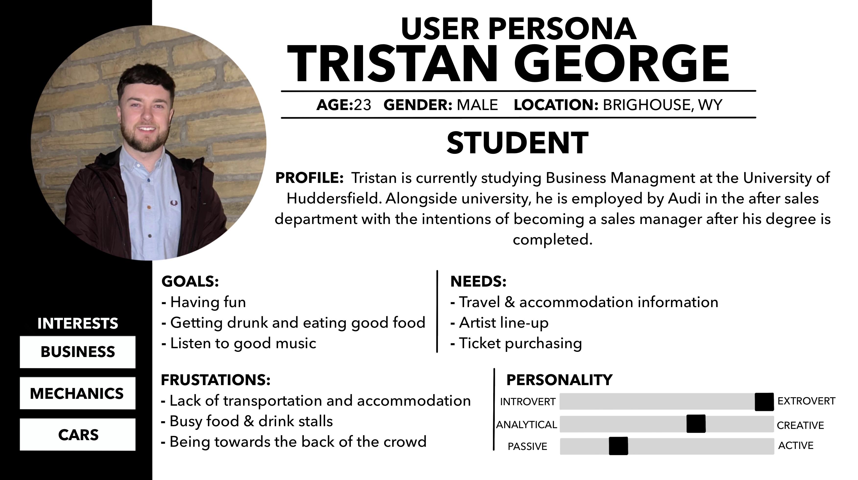
Figure 3 displays the details of a festival attendee, Tristan George. Tristan is a student that will be attending the festival as a customer. He will require the ability to purchase festival tickets on the website and to access festival info through the app. Figure 3a is the potential journey he may take starting from before the festival, to after the festival.
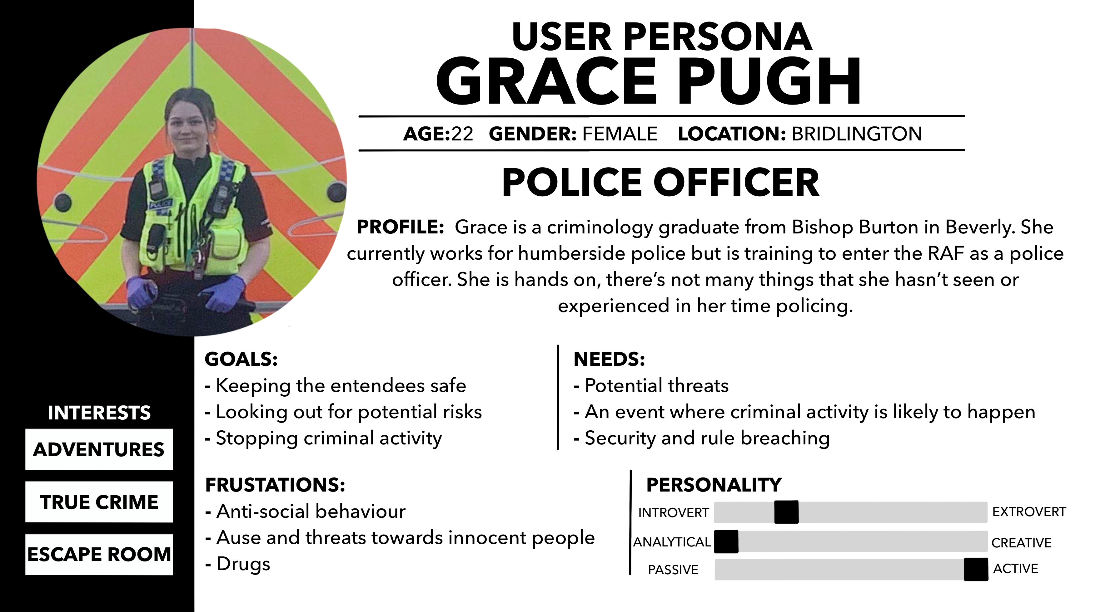
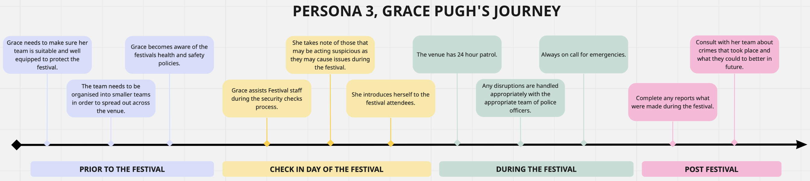
Persona 3
Figure 4 presents the details of Grace Pugh who is a police officer that will be attending the festival. She has the duty to keep all of the worker, artists and attendees safe through out the duration of the festival. Figure 4a is an example of the journey she may take in order to successfully complete her goals.
Similar festival website and app
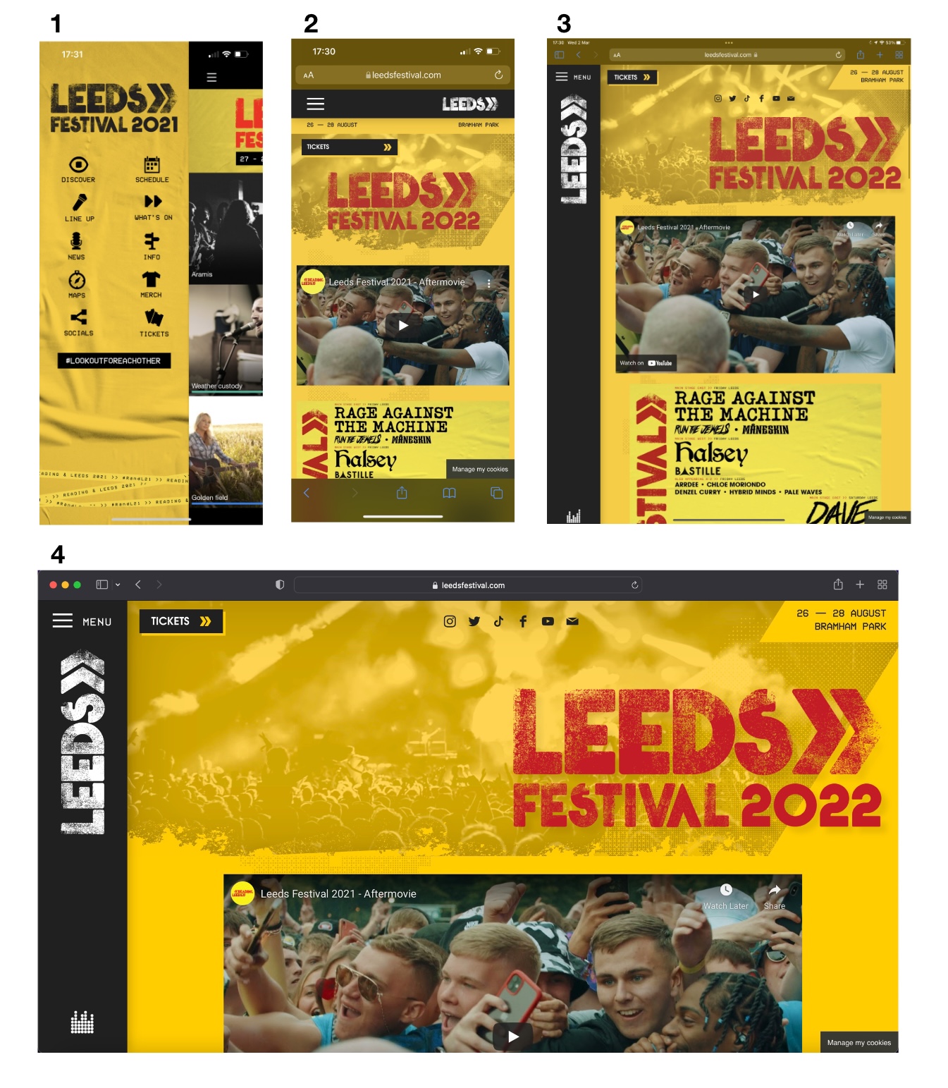
- Image 1 – Companion app
- Image 2 – iPhone view
- Image 3 – iPad view
- Image 4 – Desktop view
Above are 4 images of different perspectives of the Leeds Fest website and app. There is a clear consistency across all 4 images the design, each of their designs and placements of functions seem to be near on exactly the same. From personal experience, the website is east to navigate. The primary goal of the website is for the user to purchase tickets, the developers have made this easy with the tickets CTA readily accessible on the homepage.
The app offers features that the users will find more useful during the event that isn’t available on the website. One feature that stands out is on the app there is a map of the venue available which is not accessible on the website. The app can also run without internet connection which is beneficial as the area the festival is hosted in could have weak signal. Not only that, there is often a congestion in mobile service with the amount of the attendees meaning that the user might be unable to access the website.
Similar festival websites and apps analysis
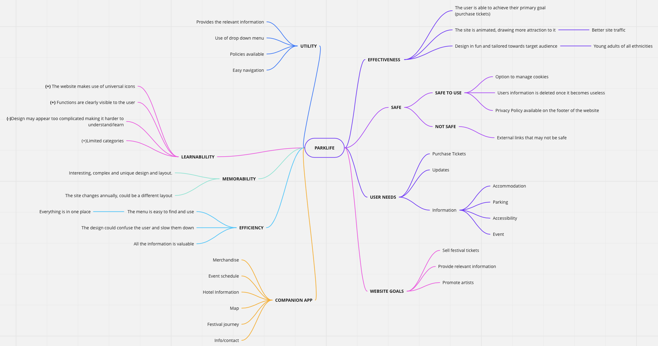
Parklife
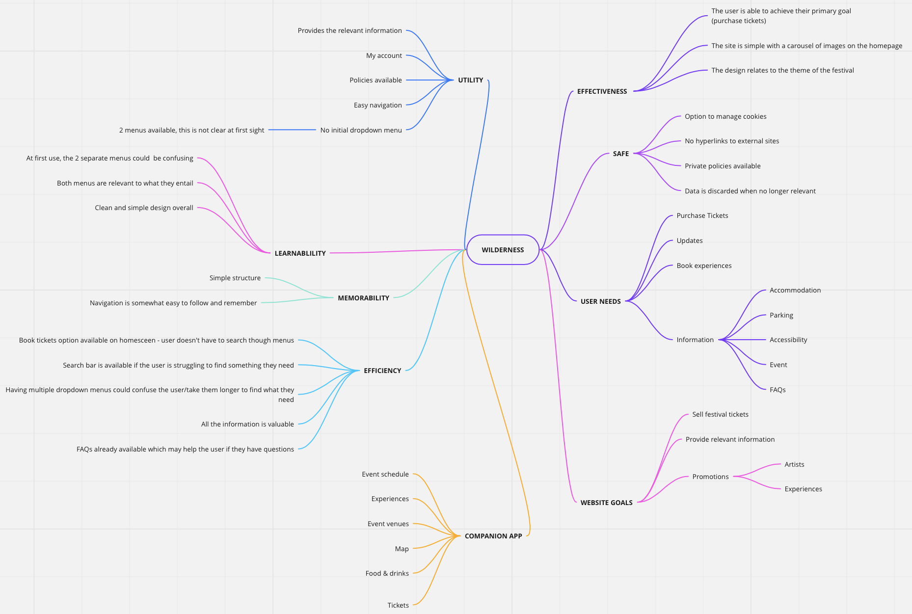
Wilderness Festival
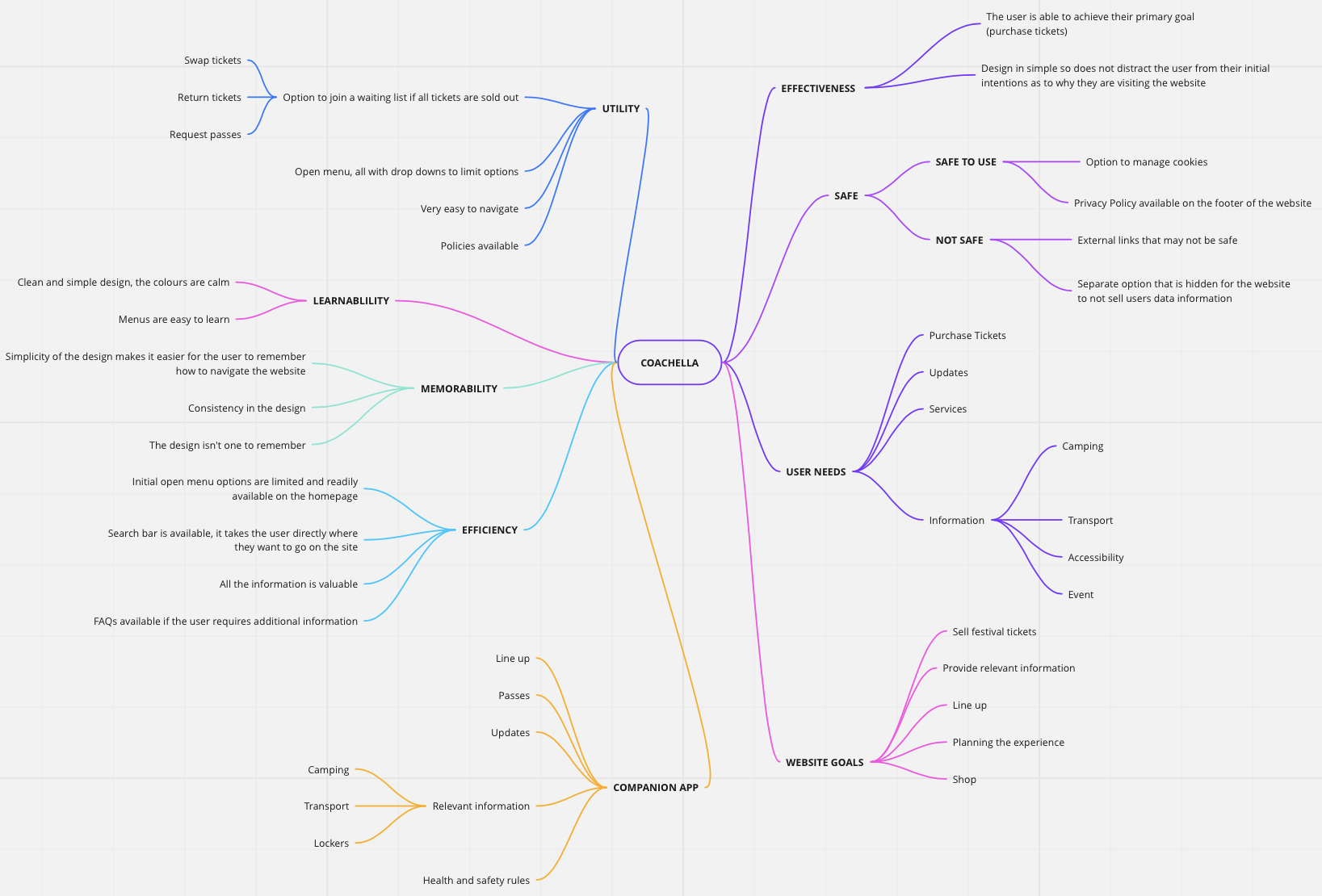
Coachella
Secondary feedback relating to UX on festivals
Above are 3 examples of secondary feedback relating to UX on festival companion apps.
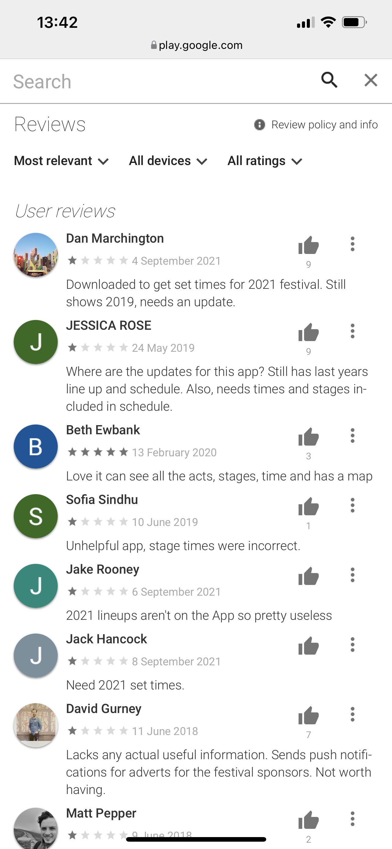
Figure 9 is taken from google play reviews on the Parklife app. The user reviews sit at an average of 1 out of 5 stars, with the majority of them complaining out incorrect information due to the app being outdated.
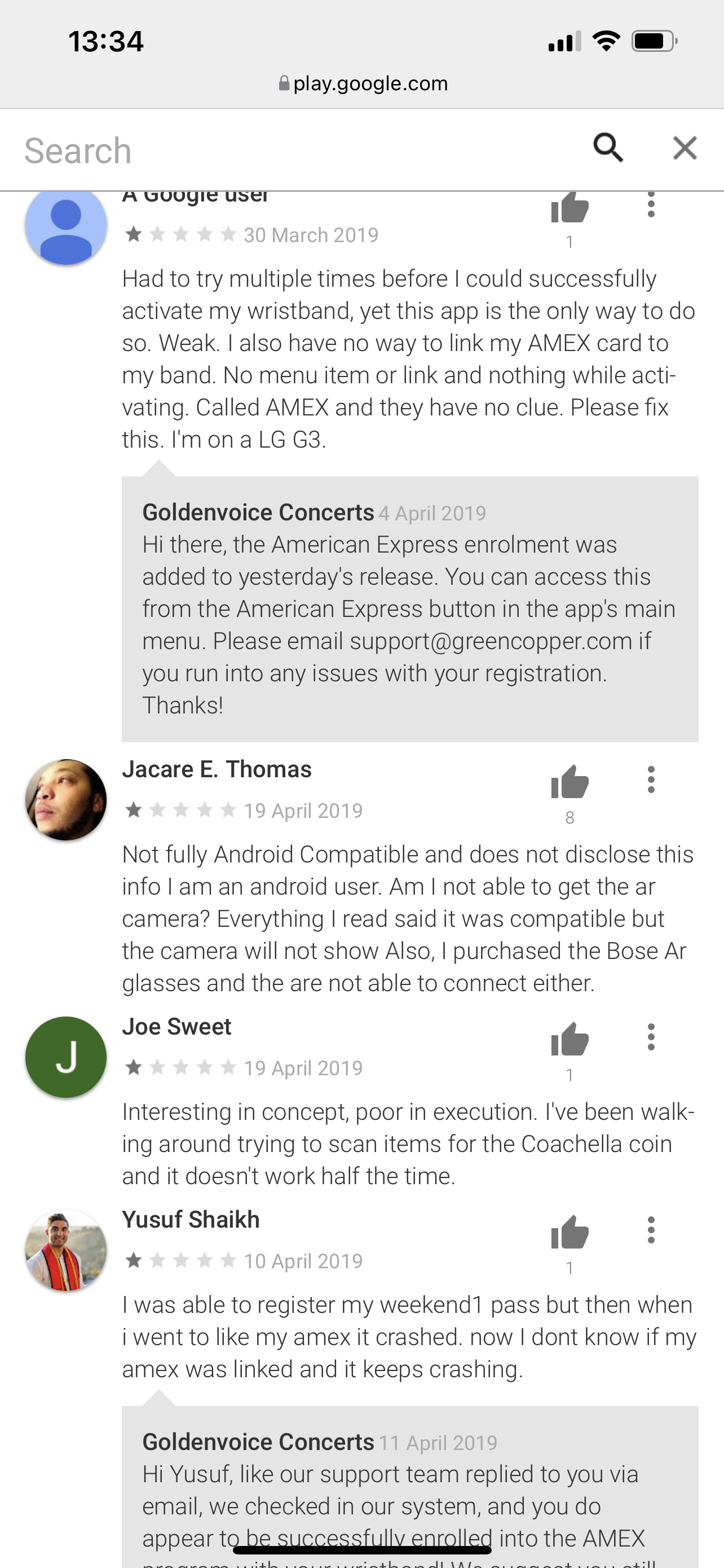
Figure 10 is also taken from Google Play reviews, they’re based on the Coachella companion app. All of the reviews that are available to read on the website sit at 1 star. 2 of the reviews are similar in the fact of the user was unable to link their Amex to their band, thus creating a stressful impact on these users. Another complained about a poor compatibility with the device they were using and another claiming that the app in general was poorly executed.
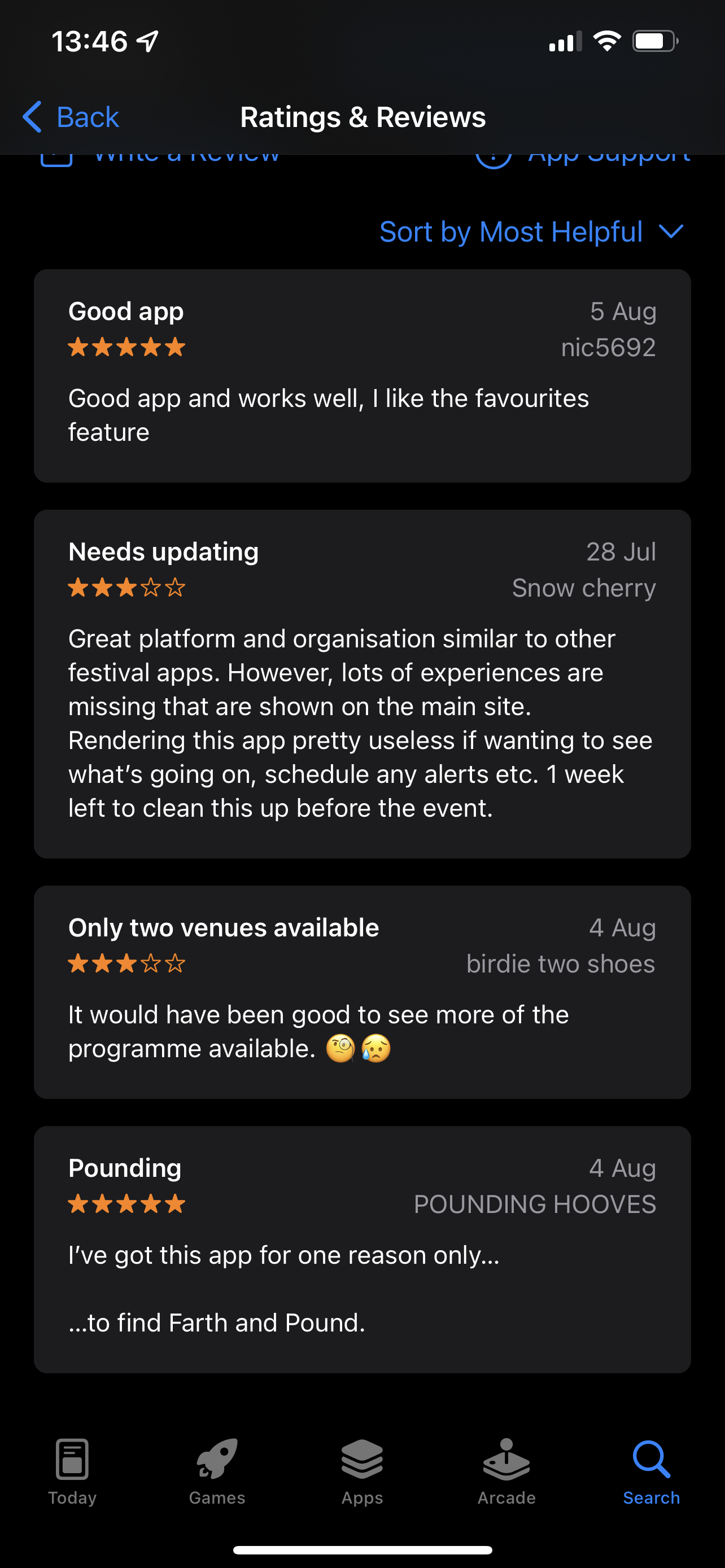
Figure 11 is taken from the apple App Store and is a review on the Wilderness Festival app. Compared to figures 9 and 10, the reviews for this app are a whole level up, they average between 3 and 5 stars. overall, it seems as though the users are somewhat satisfied with the app with the only downfall being some features on the website weren’t accessible on the app.
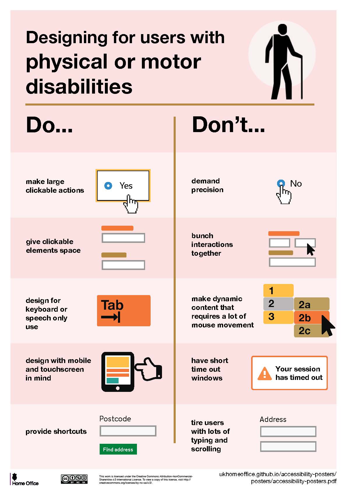
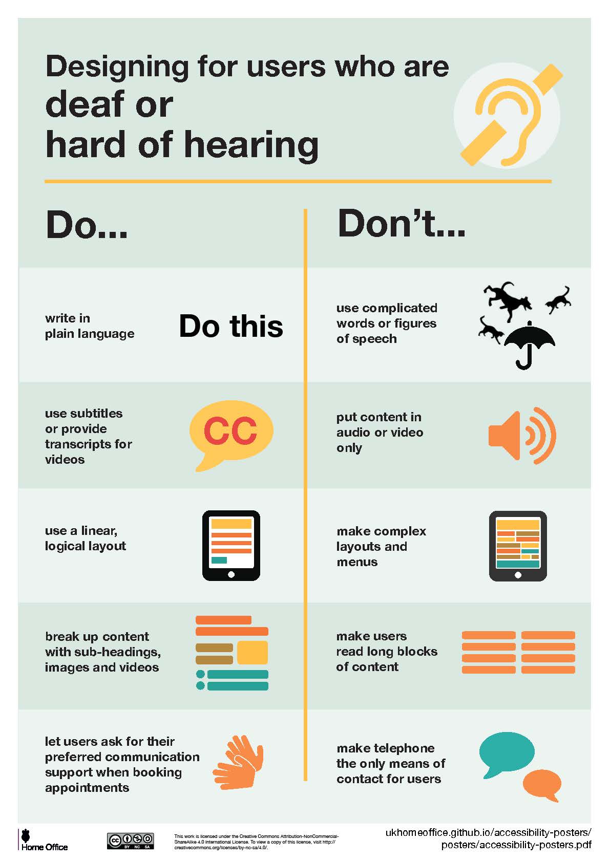
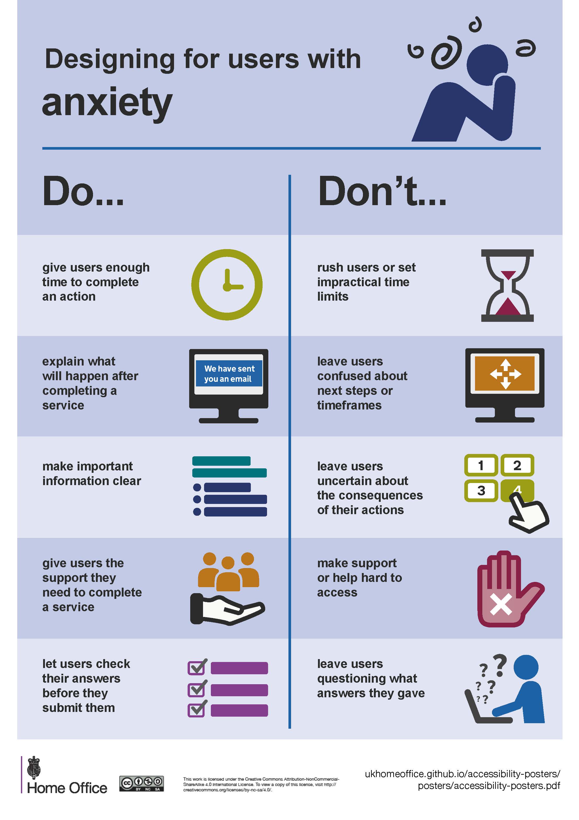
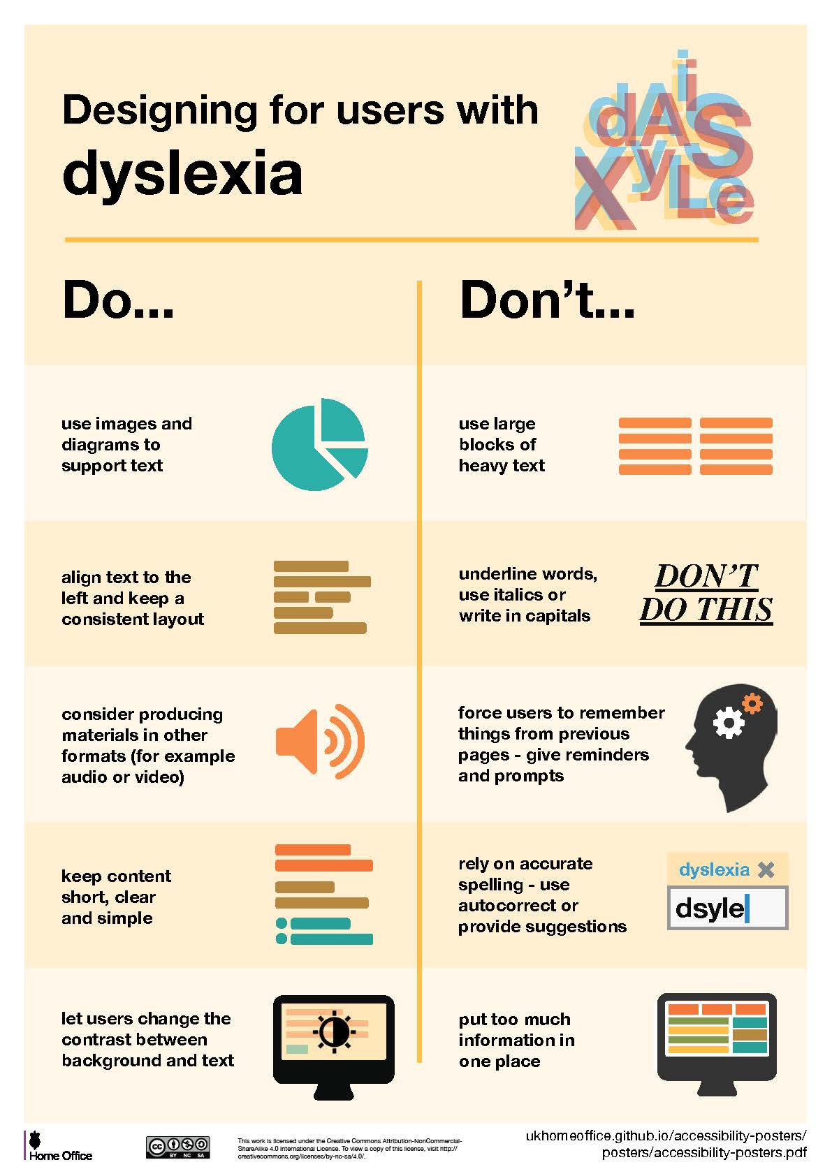
Accessibility concerns
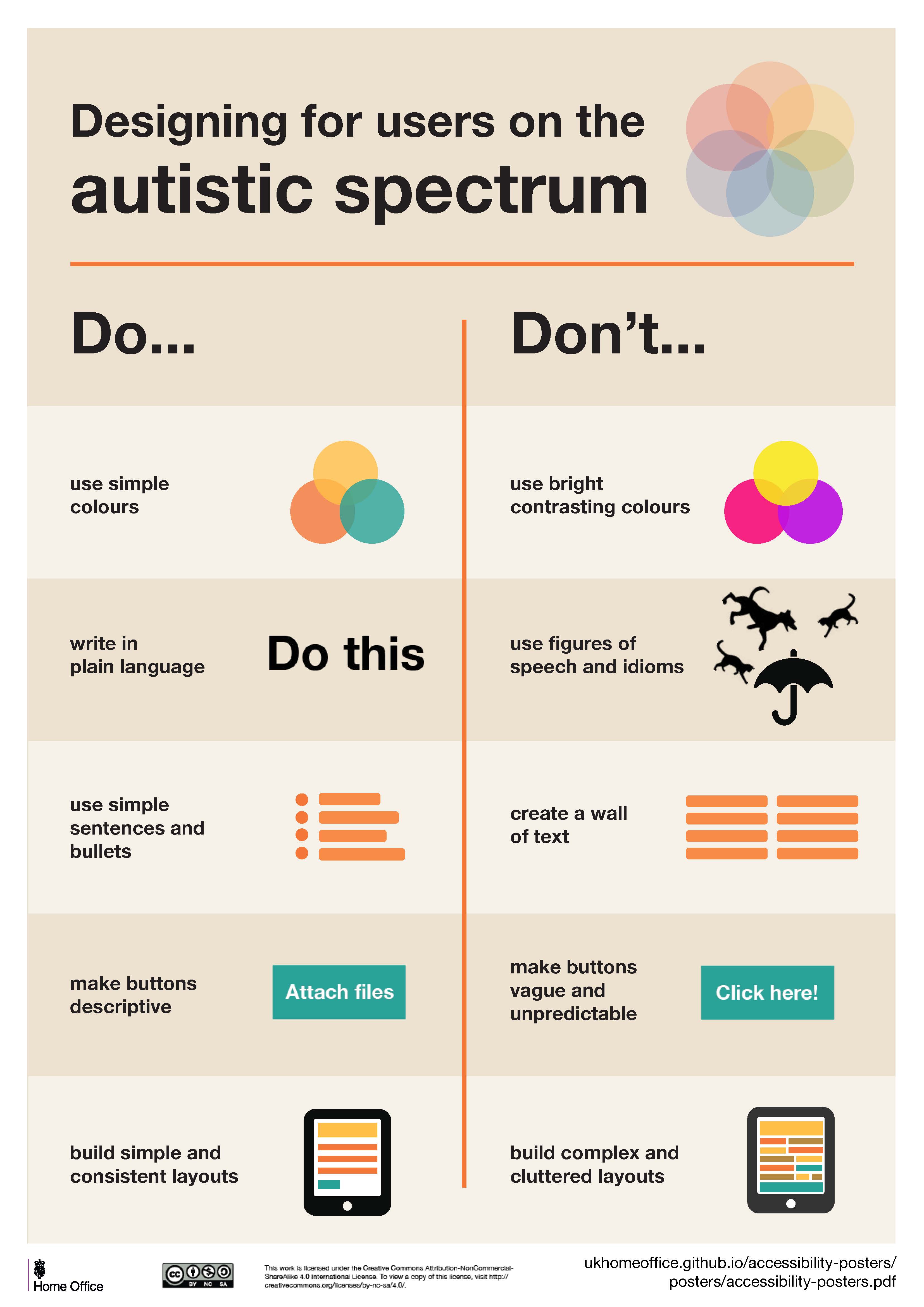
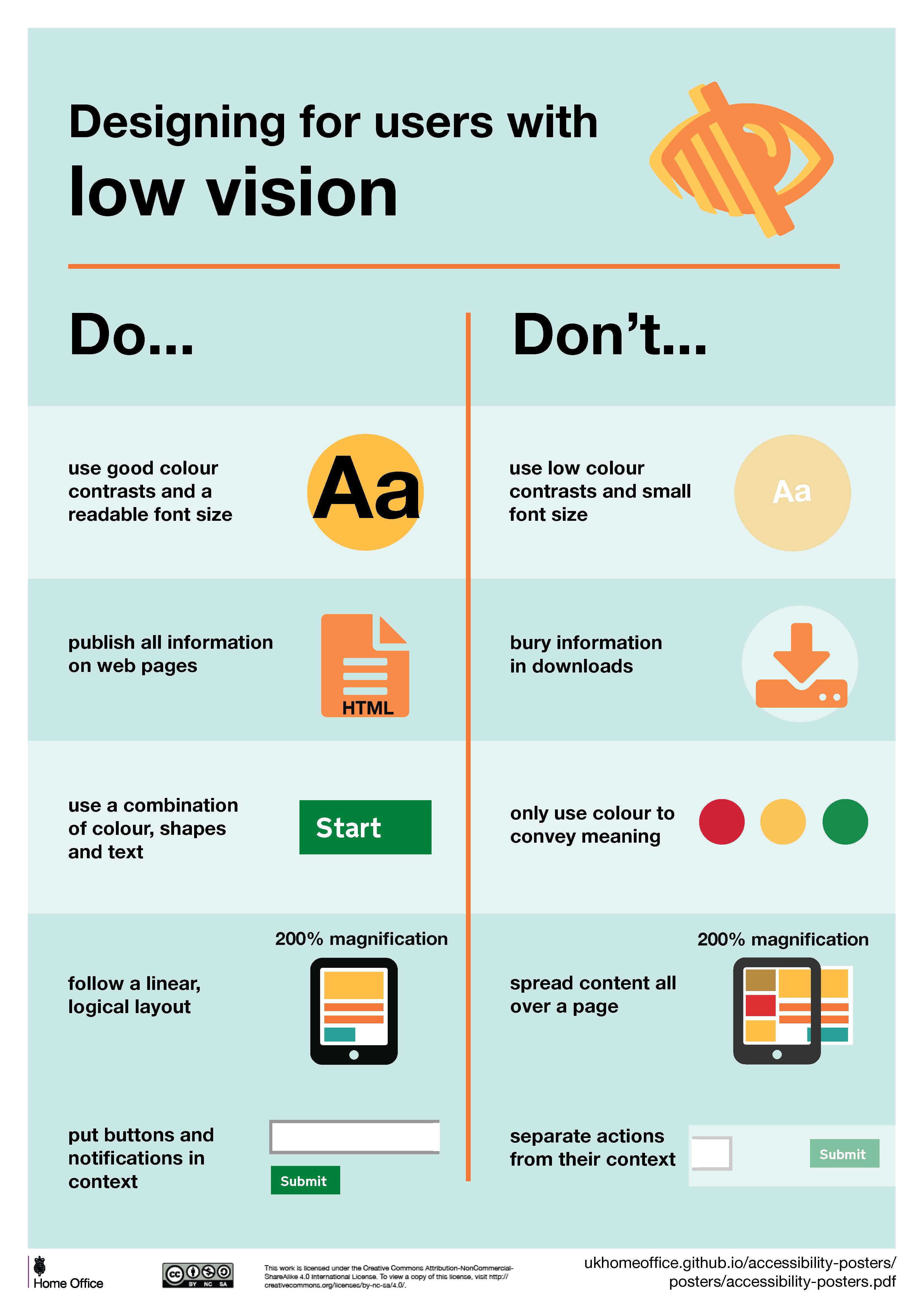
There are numerous accessibility concerns when it comes to UI/UX design. The UK government allows access to a guideline that was created by an interaction designer, Karwai Pun. The list is constructed of 7 areas where particular users may struggle if the design may not consider their accessibility issues. Below there are diagrams showing some do’s/dont’s in the design.

References
- Neilson Norman Group. 2021. Stakeholder Analysis for UX Projects. [ONLINE] Available at: https://www.nngroup.com/articles/stakeholder-analysis/. [Accessed 3 March 2022].
- Simply Stakeholders. 2020. The importance of stakeholders: identifying and prioritizing stakeholder engagement. [ONLINE] Available at: https://simplystakeholders.com/the-importance-of-stakeholders/. [Accessed 3 March 2022].
- Github. 2019. accessibility-posters-set. [ONLINE] Available at: https://github.com/UKHomeOffice/posters/blob/master/accessibility/dos-donts/posters_en-UK/accessibility-posters-set.pdf. [Accessed 3 March 2022].
- Gov.uk. 2016. Home Office Digital, Data and Technology. [ONLINE] Available at: https://hodigital.blog.gov.uk/2016/12/28/designing-for-accessibility-an-update-on-our-accessibility-posters/. [Accessed 3 March 2022].
- Toptal. 2019. Make It Count – A Guide to Measuring the User Experience. [ONLINE] Available at: https://www.toptal.com/designers/ux/measuring-the-user-experience. [Accessed 3 March 2022].
- Fuzzy math. Unknown. The Difference Between Usability and User Experience. [ONLINE] Available at: https://fuzzymath.com/blog/difference-between-usability-and-user-experience/. [Accessed 5 March 2022].
- Google Play Store. Unknown. Coachella Official. [ONLINE] Available at: https://play.google.com/store/apps/details?id=com.goldenvoice.coachellafest&hl=en_GB&gl=US. [Accessed 13 March 2022].
- Google Play Store. Unknown. Parklife. [ONLINE] Available at: https://play.google.com/store/apps/details?id=com.greencopper.android.parklife&hl=en_GB&gl=US. [Accessed 13 March 2022].
- Apple App Store. Unknown. Wilderness 2021. [ONLINE] Available at: https://apps.apple.com/gb/app/wilderness-2021/id1576208052. [Accessed 13 March 2022].